Such was the effect of the Tsing Ma and Ting Kau bridges on architect Frankie Ke upon visiting the property that would be one of their projects, a residence punctuated as much by the view it overlooks as its 3,000 sqft real estate.
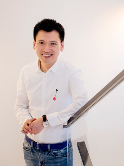
“When we saw the view, we thought all areas should be connected – from the inside out to the garden, toward the sea and sky,” says the founder of KES Interior Design, of the three-storey abode.
Developed by Sun Hung Kai Properties, the standalone unit had originally come with clear, if not visibly demarcated, zones: foyer, living room, dining room, garden. It was nothing out of the standard template although, against the fluid view that lay in wait, the layout felt rather rigid.
So they decided to rework the layout. Like the water it overlooked, says Frankie, the living and dining rooms had to flow – out, toward the garden, into the view, and vertically as well, through the first and second floor bedrooms, up to the master bedroom on the third floor.
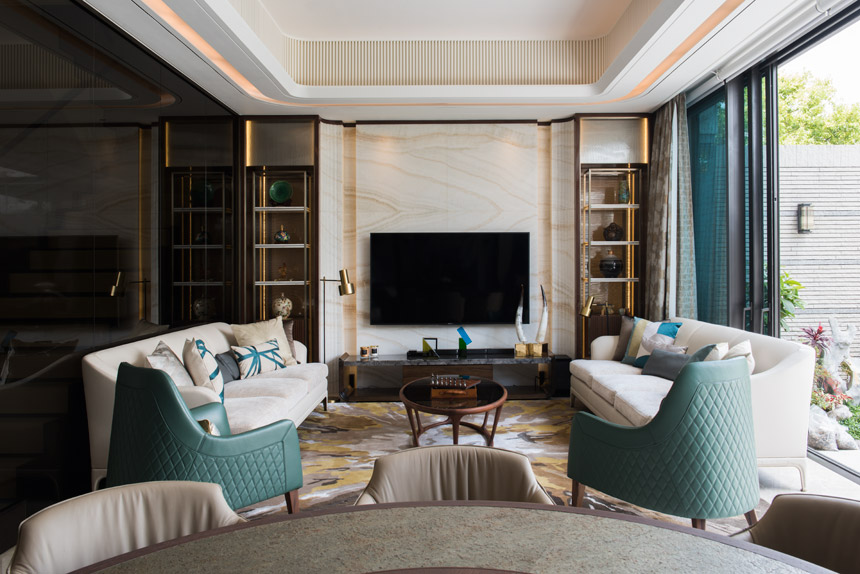
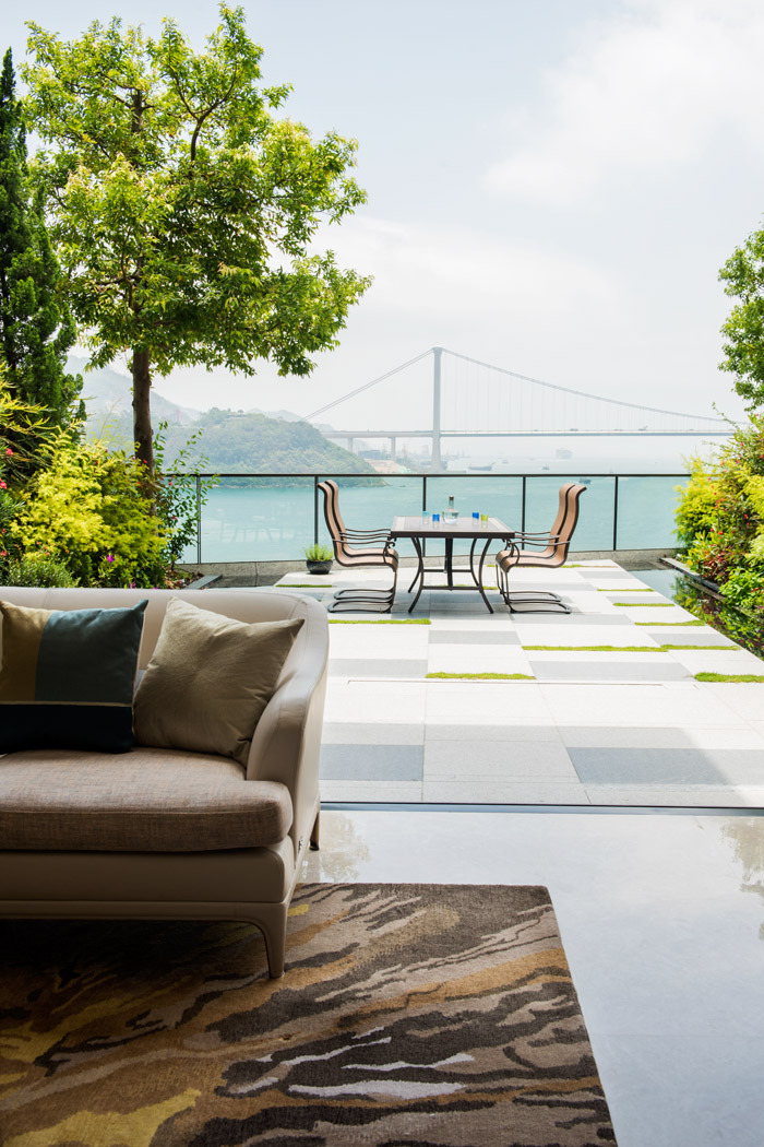
They started by creating a more open feel within the ground floor, connecting it to the outdoor space and enlarging both living and dining rooms as a result. “At the beginning they had no intentions to redo the garden,” says Frankie, “but seeing the view, I had to persuade them to work on it as well.”
Designer Profile: KES Interior Design
The rest of the house’s refurbishment followed suit. At the entrance, metal and wooden slats were installed so that what’s inside comes into view in waves, explains Frankie: first the living and dining areas, then the outdoor garden, then the views. A similar treatment was applied to the floor of the entrance, too, with wavelike patterns subtly priming visitors and residents alike for the magnetic draw ahead.
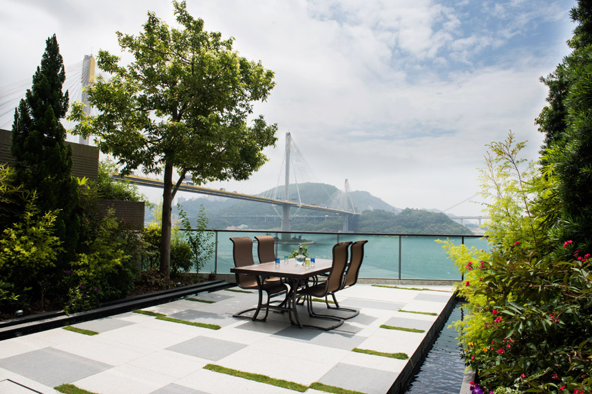
When we saw the view, we thought all areas should be connected – from the inside out to the garden, toward the sea and sky.
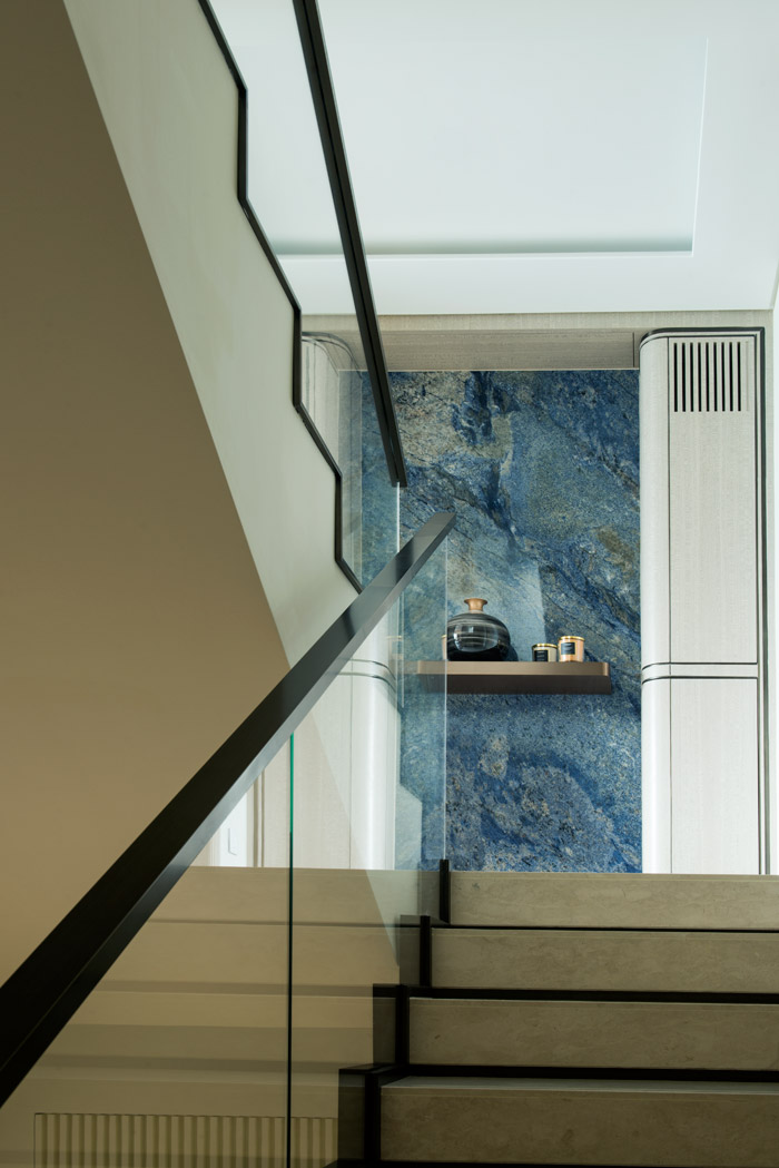
Out into the garden, the pathway was paved with stone, flanked by still water volumes on either side “to bring the water from the sea to the home.” Grass and other plant appointments were set in place to further connect the space to the views across. Back inside, midway up the staircase – which the team also had to widen – a commanding blue marble stone, sourced from Yuen Long, greets comers and goers while harking back to the sea close by.
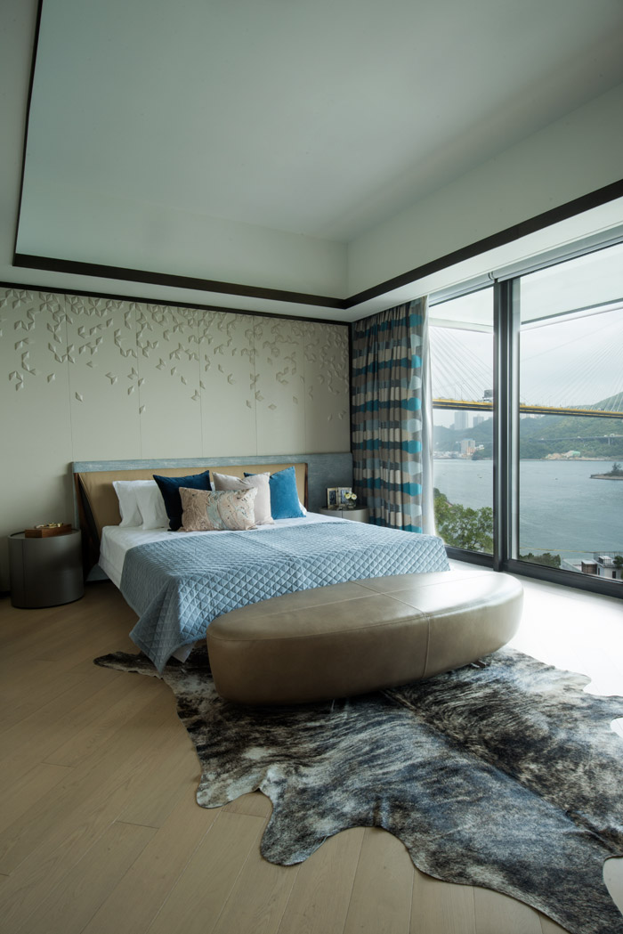
Water touches continue to ebb throughout the upstairs bedrooms. In the master’s room on the third floor, cream upholstered panelling are etched with strokes and lines evoking movement.
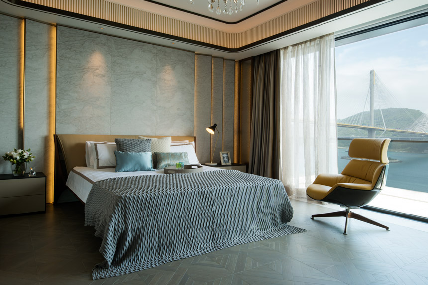
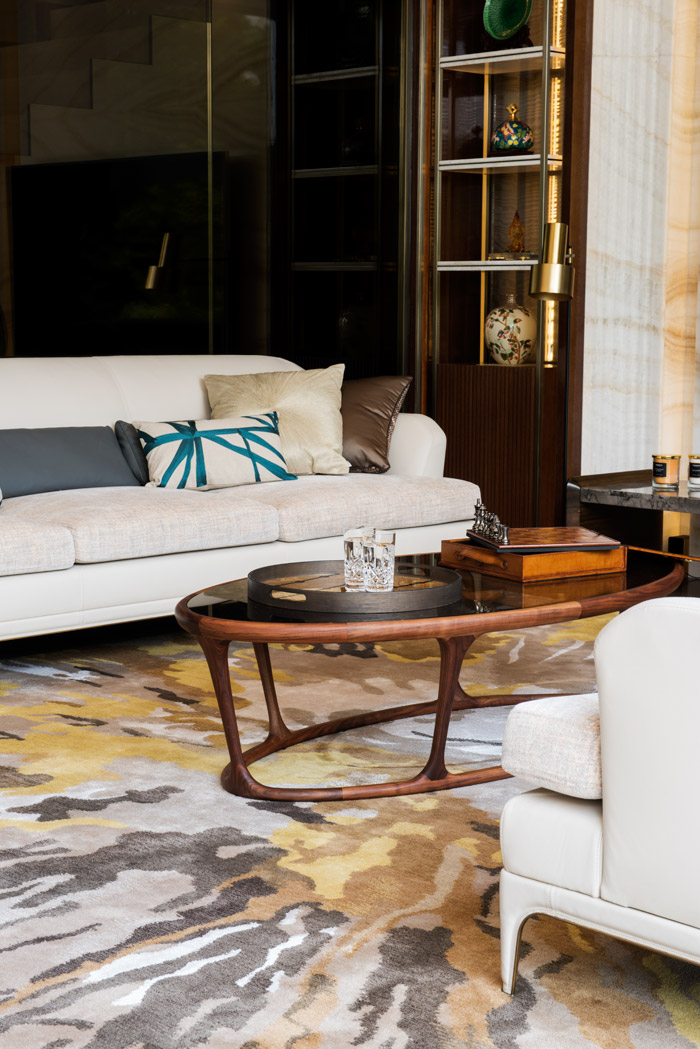
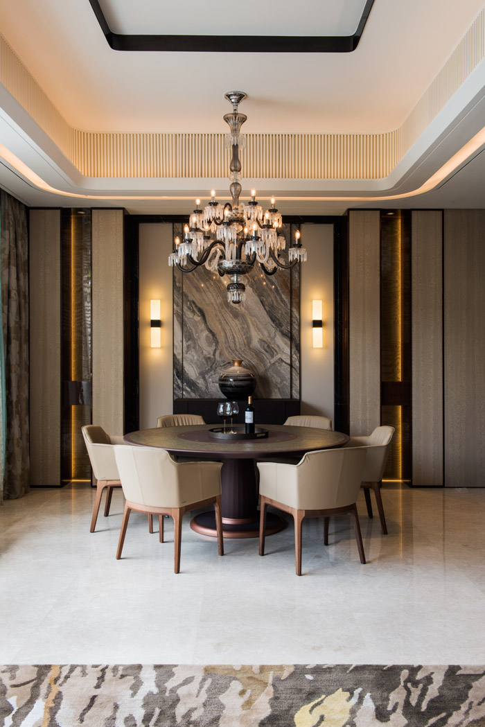
Luckily for Frankie, this was a zero-fuss client with a simple brief – one who loved detail, as well as materials of stone and metal, and had a preference for luxury. “All they wanted was something luxurious, with detailed workmanship,” says Frankie. Care was taken to source furniture mainly from Italy, save for the Crystal Saint Louis chandelier in the dining room and accessories from Indigo.
See more: On The Peak, a 7,500sqft zen sanctuary for a Buddhist family
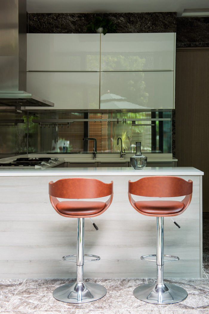
It helped that the house in its original form also had strong points. The bathroom, for instance, as well as the kitchen, carried marble and walnut motifs that fell right at home with the rest of the house’s new, contemporary luxe feel.
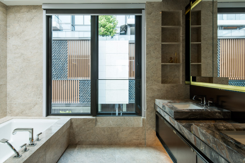
All [the client] wanted was something luxurious, with detailed workmanship.
In the dining room, meanwhile, a marble wall similar to that by the staircase tie in the various touches of hotel suite luxury throughout the home. Lighting fixtures in hand-blown crystal exude warmth when in use, and cede to a clear, glassy sheen when switched off.
As Frankie speaks, it’s tempting not to wonder if, perhaps, there is one way to defy the gravitational pull of a good view, after all: with details so sublime yet so subtle, to see them, you have to turn away.
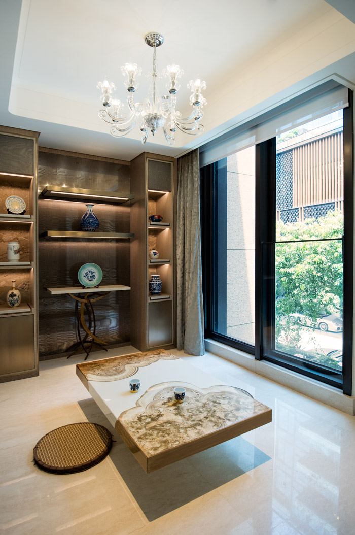
Photography: Edgar Tapan
Production: Emily Leung


