As one of the world’s great maritime cities, the sea has permeated every aspect of life in Hong Kong for generations. It’s no surprise that it also served as the first point of inspiration for Amrita Khanna, interior designer at Zip Code 888, who was tasked with renovating a Repulse Bay home for a couple that overlooked the oceanside neighbourhood.

The apartment has a serenity about it with beautiful views of the sea and light filtering in through the day, says Amrita on her modus operandi. We wanted to enhance that by keeping the apartment calm and uncluttered.
The resulting colour palette tends heavily towards taupes, deep blues and sea greens. In a conscious effort to avoid a rustic aesthetic, Amrita depended on sophisticated geometric patterns such as the one found in the eye-catching carpet in the living room. It was a bold design and they were a little hesitant at first but decided to trust me on this one, Amrita quips. It turned out to be our star feature and the basis for the rest of the design.
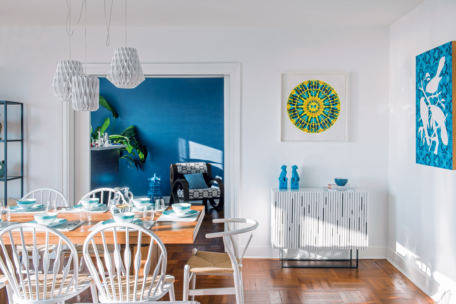
The devil-may-care attitude of the couple greatly informed what could be achieved, with special regard to the comprehensive art collection that they wanted to take centre stage. They were keen to use as much of their existing art as possible so we reviewed all the pieces together and picked the ones that complimented the design best, as well as picking out a few new pieces together, says Amrita.
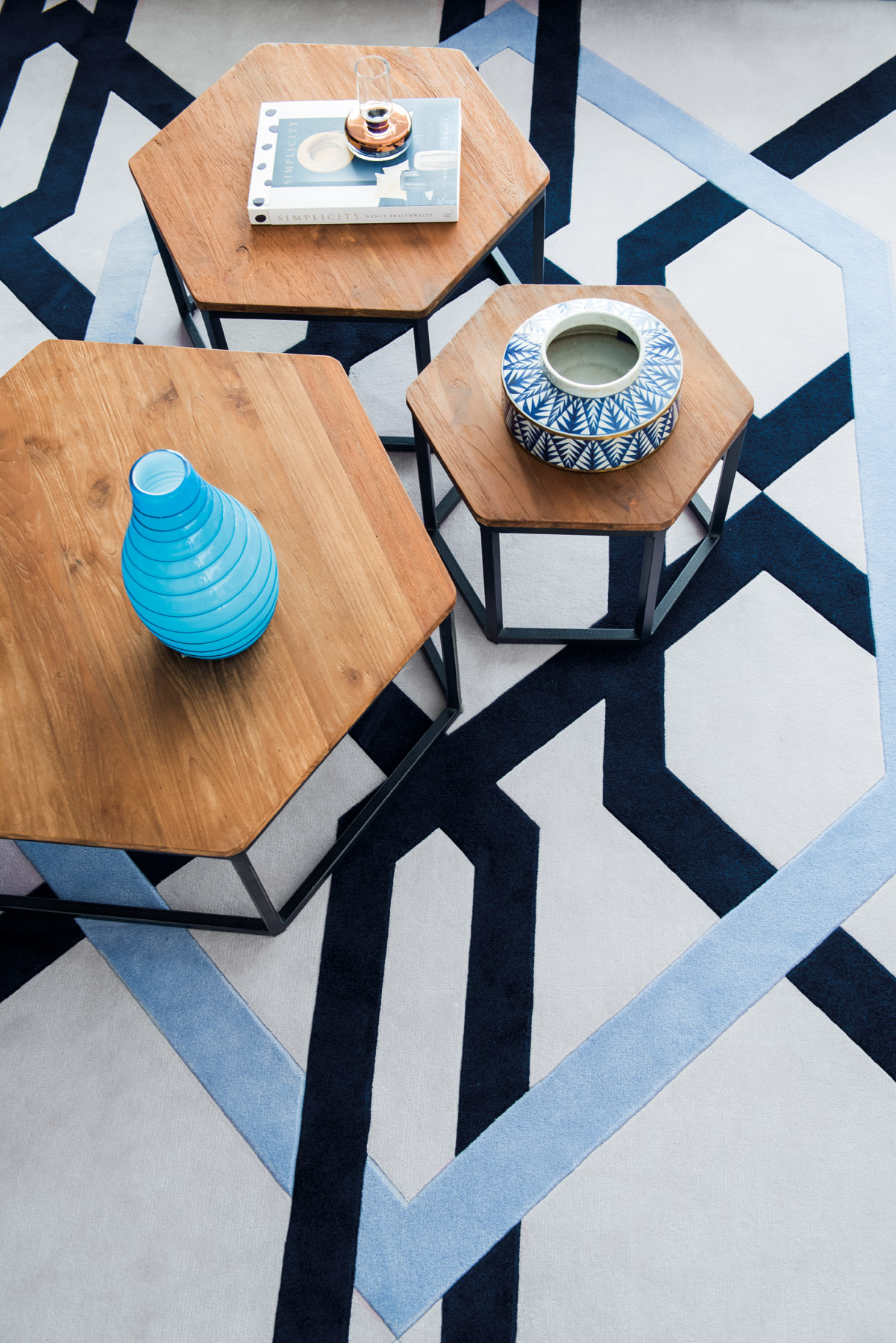
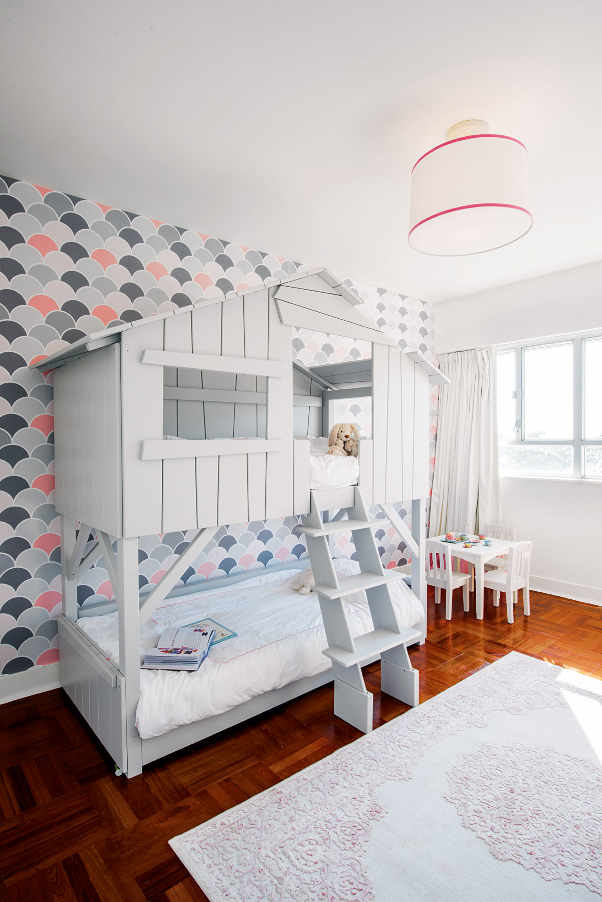
In the hands of a lesser creative mind, so many attention-grabbing elements and patterns would have become muddled into an incoherent mosaic, but Amrita’s expert eye for layering was vital to ensuring that the home exhibited a strong and consistent aesthetic throughout. With the carpet having set the tone, she tackled the wallpaper, which then informed the curtains, custom upholstered couches, and finally the softer touches like cushions and accessories.
It helped that the clients were willing to wait and do it right, Amrita adds. The whole process took between 4-5 months as many of the elements were ordered from the UK. They knew what they wanted and were happy to wait for it.
That kind of conviction to a certain aesthetic certainly carried the project through what otherwise would have been a tight timeframe with speed and haste – and none the less beautiful. The lovely lady of the house mentioned that she looks forward to coming home and enjoying her new space, Amrita confesses. That is every designer’s dream.
For more inspiration, pick up a print or digital copy of our textiles-themed April issue, on newsstands now.
The post How this Repulse Bay home was designed around a single carpet appeared first on Home Journal.


