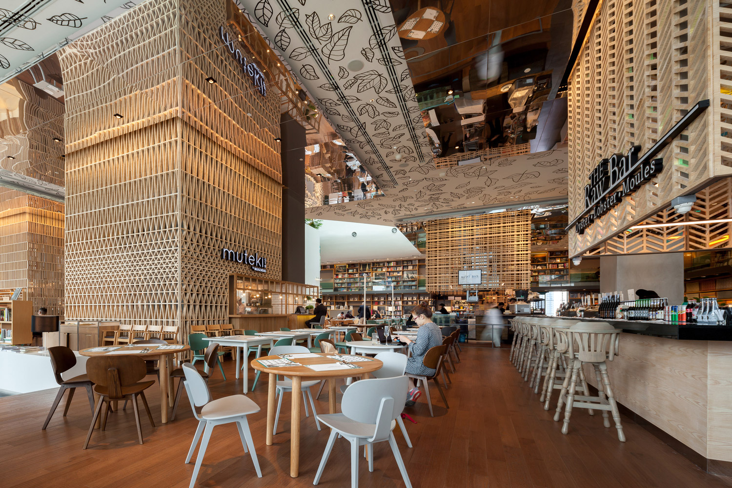
Asian cities are no place for the timid. With megalopolises like Tokyo, Bangkok and Hong Kong boasting some of the highest population densities in the world, there’s often nary a pocket of quiet to be had within their confines. However, recent lifestyle shifts across the region have allowed a curious phenomenon to come into being – expansive, well-appointed co-living” bookstores that come across more as public spaces, combining print with curated lifestyle boutiques and dining options, where visitors are free to read as much and stay as long as they please while under no obligation to hand over cash.
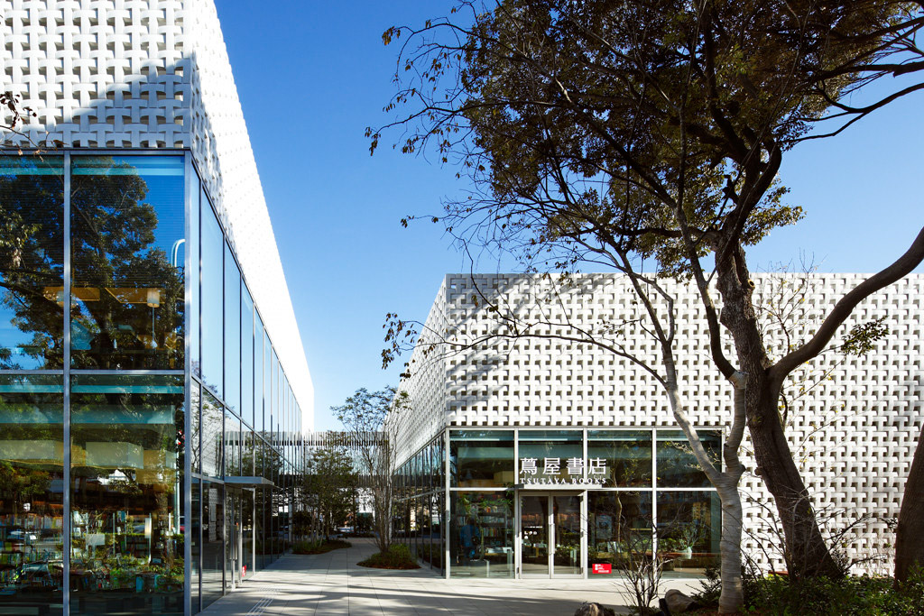
Among the pioneering projects of this new category is the flagship T-Site Daikanyama campus in Tokyo, designed for Japanese nationwide book rental chain Tsutaya by Klein Dytham architecture (KDa). Opened in 2012 and set amongst a trendy, low-rise neighbourhood, T-Site’s three buildings encompass light-filled volumes juxtaposed against These same design principles were transmuted this year into another large-scale co-living” space, Open House in Bangkok’s Central Embassy luxury mall, that was awarded a grand prize at the 2017 Design for Asia Awards, recently held in the Hong Kong Convention & Exhibition Centre.
We took this opportunity to sit down with KDa’s Mark Dytham to discuss the factors behind the rise of these lifestyle spaces as well as the importance of buildings, and cities, that are easy to read.

Congratulations on your DFA Award! Open House and T-Site have been described as town squares for their respective cities. Why have these designs emerged at this particular moment?
It’s a lot to do with online retail becoming quite strong. People are buying more and more online, but they still want to shop and go out and do things. The browsing experience online is very poor. It’s fine if you know what you want, but terrible if you’re trying to discover something. So we’re building these browsing spaces but they also allow you to buy. People don’t go there, browse and take a photo and buy it online. They tend to buy it in the space.
The other thing is that we’ve become more and more mobile – we don’t need to work in the same place, and in co-working spaces like WeWork, the whole office space might just become nomadic. Especially in megacities like Tokyo, Bangkok or Hong Kong, the apartments are very small and nobody really wants to go back to their apartment, so this is like a third space or a living room. Those three things together begin to make places like T-Site or Open House possible.
What effect do you hope these spaces will have on the urban fabric?
They make cities more liveable. If you go to Bangkok, you spend all your time sweating. You’re either moving, eating or spending money shopping, but there’s nowhere to pause, to take a respite, to sit down and relax, so you’re stressed all the time. We hope these spaces will allow people to relax and consider themselves or what they’re doing, and just take a moment to themselves. Certainly in Tokyo, we’ve found that these resting spaces encourage people to buy more because you get to spend more time in these shops.
At the same time, there’s no overt pressure to shop as well.
That’s the key thing. As soon as you pressure people to shop, you lose their goodwill. In Open House and T-Site, if you’re generous to the client, the client will be generous back. That’s why they don’t take a picture of it and buy it on Amazon instead.
Highlighting this is Tsutaya’s initiative to take over libraries around Japan. There’s one in Takeo in Saga Prefecture – the city mayor went to Tsutaya and said, I like your bookstore. I’ve got a beautiful library, but no-one goes. Can you help? The public library is now managed by Tsutaya. They’ve put in a magazine street, a café and power plugs at every seat. Tsutaya also has a T-Point loyalty card which you can swipe to take a book out for free, instead of a library card. Now, schoolkids get rewarded for reading more. The library opens from 8am to 10pm and people are queuing up to get in. People are trying to get rid of print, but this goes to show that print is a really beautiful thing that will not go away.

A lot of your designs utilize distinctive facades. Is there a particular effect you’re looking to create?
The key thing is we want our buildings to be easily read, so anyone can understand. The tessellated T’s of T-Site actually make a massive T. You don’t need any architectural education to understand our buildings. People say about our work is a bit like [Japanese alphabet] hiragana – it’s yomiyasui, easy to read. We think it comes from when we first arrived in Japan. We could not speak Japanese so we couldn’t explain our projects. We’d just make a model and show it to the client. The work had to be very simple, very clear, and speak for itself.
How does Japan’s unique environment affect architecture?
We have strict zoning and architectural regulations but visually, we can do anything we want. There’s no planning committee. A guy just checks if it’s going to stand up, if a shadow falls on the neighbouring site, and if the zoning is OK. No-one asks you why a building is a certain shape, so it’s very refreshing for an architect to have that. In Europe, [strict visual regulation] is perfectly fine because there’s a history there. Buildings are built out of stone, they’re there for 400 years, so we have to be contextual. But in Asia, everything is traditionally built from timber, so we have fire, typhoons, and buildings aren’t permanent. Architecture is very ephemeral here. We knock things down in Tokyo quite quickly, because that’s how it is.
We’ve had many buildings disappear already. Many of our interiors have gone. We just sort of accept it in a way. The flip side is buildings are built more efficiently – double glazing, better insulation. Everybody thinks it’s bad to knock down a building after 20 years but everything is upgraded to be better. They generally recycle everything. It’s not right or wrong, it’s just a different way.
The post Architect Mark Dytham on why bookstores are the town squares of the future appeared first on Home Journal.


