Through a crisp colour palette, clever spatial planning and natural elements, this soothing home embodies the popular "less is more" design ethos.
Nestled within Tung Chung's Coastal Skyline, this residence boasts a pristine white palette, emphasized by clever spatial organisation and adorned with natural, minimalist oak wood elements. The resulting ambiance inspires reflection on the revered "less is more" design ethos coined by the legendary architect, Ludwig Mies van der Rohe.
Alexandra Suen, arctitudesign's esteemed design director, channels a deep passion for architecture and design. His meticulous planning of this 1,400 sq-ft duplex prioritised smart space use. The upper floor comprises private quarters whilst the lower floor houses communal areas, such as the inviting living space, stylish dining area, and functional kitchen. To compensate limited TV wall space, an oak screen has been affixed to the area. Its semi-hollow construction allows light to pass through, ensuring the entryway adjacent to the wooden screen is still well-lit. Adopting a pure white background, this design focuses on space management, adhering to a minimalist approach, and utilizing an unadorned, natural oak wood concept –echoing famous architect Ludwig Mies van der Rohe's design mantra that less is more.
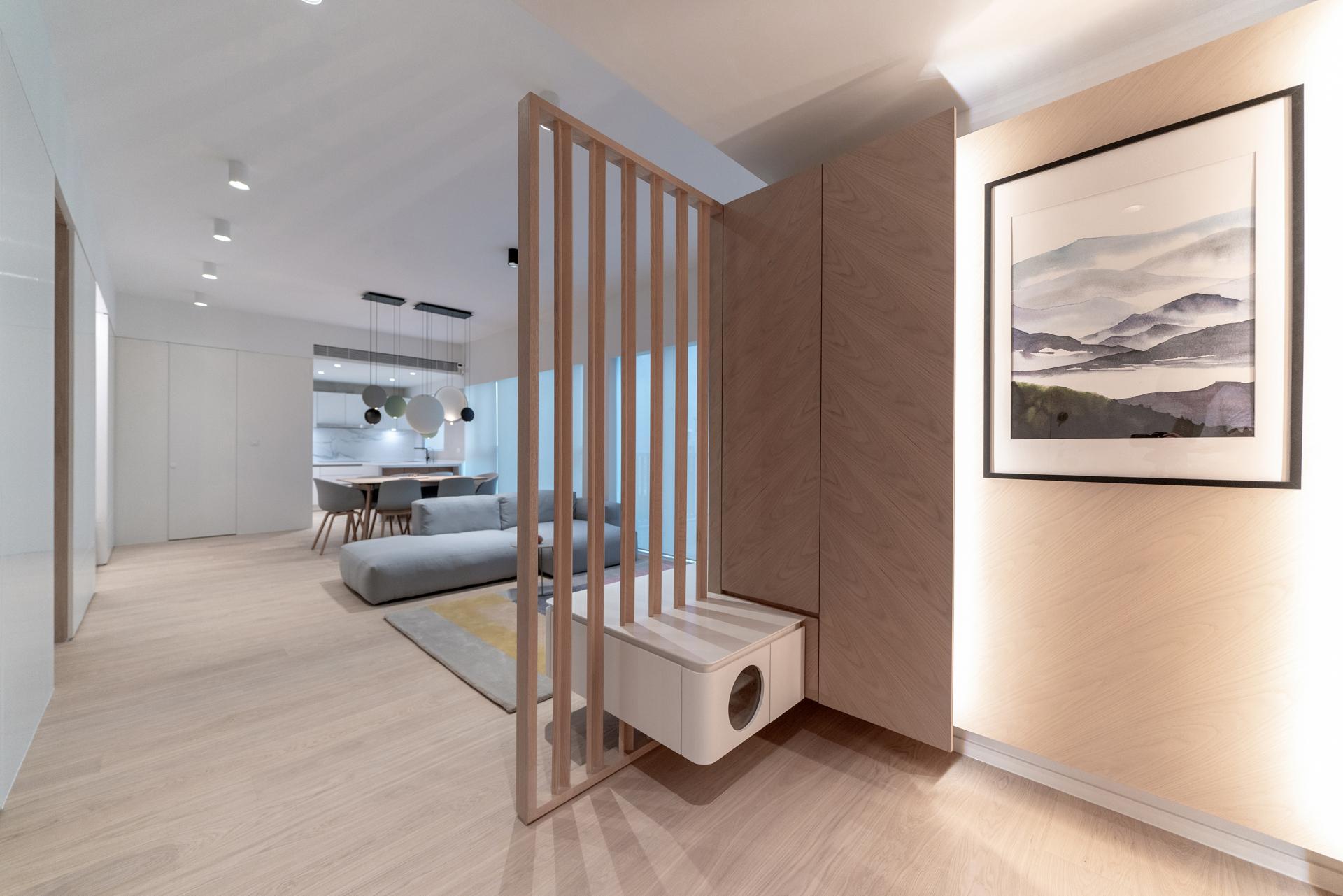
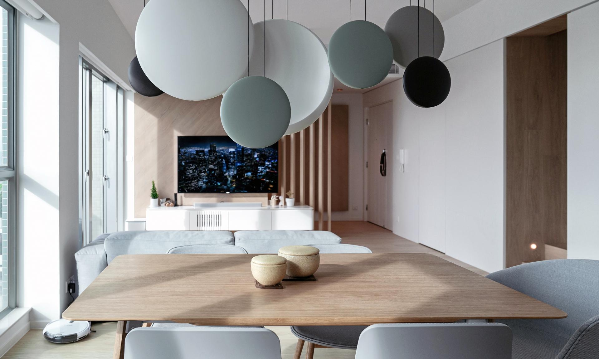

Simplicity reigns in this space, with the intention to minimize any extraneous elements - there are no obvious doors in the living and dining room, supported by hidden door designs that promote an overall tidy and straightforward hall. The pure white walls remain uninterrupted, with only the addition of an oak staircase leading to the upper floor. Alexander, responsible for the design, describes their ethos, "We use only a few materials to create a distinct atmosphere, and our preference lies with oak." Despite limited material options, attention is still paid to providing a unified and visually normalized effect.

Ascending the staircase to the upper level of the home will bring you to a shared space, featuring a gray wall adorned with a world map, which proudly displays the countries that the couple has traveled to. In an effort to promote sustainability, Suen notes that the wall is made with PET, an eco-friendly material. Beyond its surface-level allure, the design also boasts a conceptual depth that adds to its overall appeal.


The upper floor has a clever division of space between the master room and the children's room, using sliding doors to separate the sleeping and working areas. The overall aesthetic is kept uniform with clean white walls. To add depth, the headboard and bed wall are tinted gray, breaking the monotony of the room's white palette.


For simplicity's sake, the master bathroom is doorless, yet maintains privacy through thoughtfully placed partitions. Designed with user experience in mind, this residential project prioritizes functionality and space efficiency.
Follow us on Facebook, Instagram and YouTube, and subscribe to our newsletter to get the latest news and updates.


