Within the ebullient melting pot that is Hong Kong, where waves of styles, influences and sensibilities are often in a tug of war for attention, having a stripped-back respite of one’s own is a true luxury. Much rarer, however, is to come across one that is equally imbued with idiosyncrasy and personality.
Such is the feat achieved by award-winning interior designer Joseph Sy and his team at Joseph Sy & Associates with the eight-month renovation of a 1,300sqft apartment perched atop the Mid-Levels hills. Oozing a minimalist elegance laced with whimsical, personal touches, every corner of the three-bedroom, two-bathroom abode tells the story of the paediatricians who call this home.
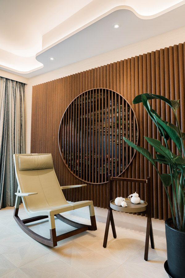
“Modern Chinese,” says Sy of the style he was enlisted to create by the married couple. A beige-toned palette and soft lighting create a warm ambience in the living and dining area, juxtaposed with pieces of Eastern-style furniture in stark colours and curves. There’s a dark wooden slat wall, underneath which a mural rendition of Monet’s Water Liliespeeks through, a plush sun lounger and a circular cabinet by star homegrown designer Chi Wing Lo – also behind many of the home’s furnishings alongside Farrington Interiors – that houses an assembly of Lalique collectibles.
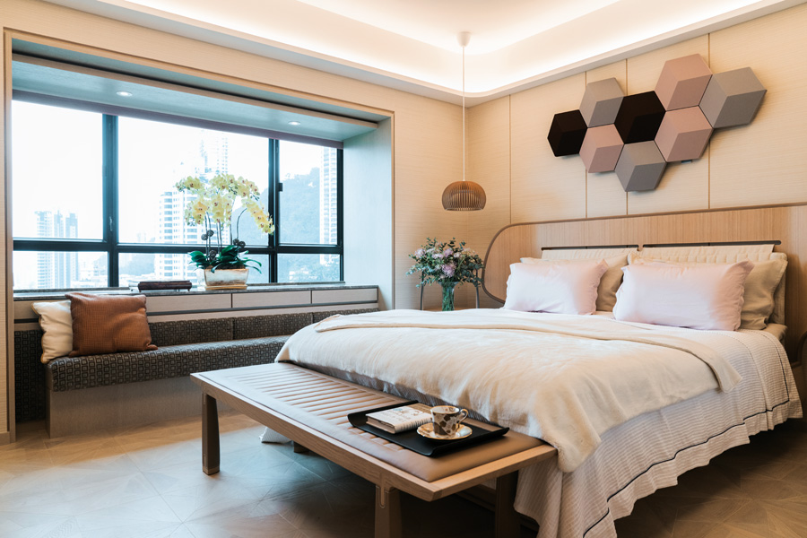
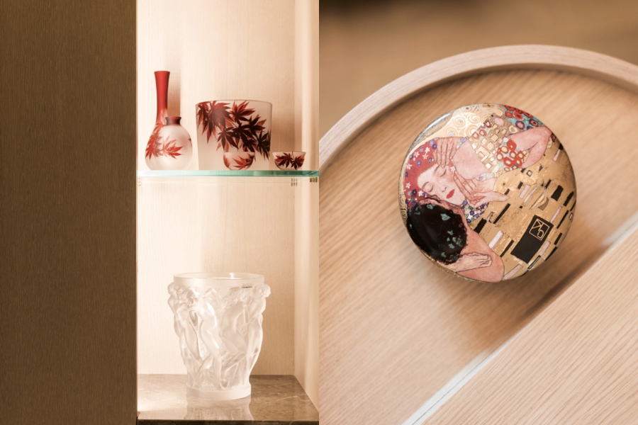
“The clients were very open to new ideas, so we had free rein to design what we believe is suitable for their lifestyle,” recalls Sy. It’s noteworthy, then, just how much of the owners’ personalities can be found peppered throughout the lair. Vintage glassware aside, flora and fauna (the owners count orchids among their favourite flowers), top-notch Bang & Olufsen sound systems, stuffed toys and patterned china adorn almost every room.
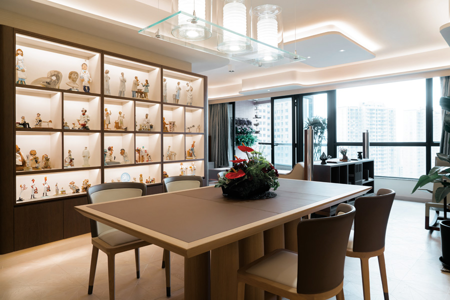
The homeowners’ proclivity for collecting and their passion for their professions shine in the spotlight – quite literally – in the home’s unequivocal centrepiece: a stunning floor-to-ceiling timber display cabinet crafted specifically to showcase the paediatricians’ kaleidoscopic collection of medical figurines. Some 50 hand-carved wooden or porcelain statuettes of patients, doctors and medical accessories take pride of place on the shelves, each under its own spotlight.
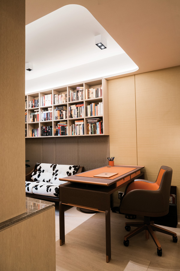
The process of building the cabinet into the landscape didn’t come easy. “The living and dining room walls are not parallel,” explains Sy. “Because of that, we had to build a secondary layer of wood panels with punctures and hidden lights. The challenge was to build a wall unit that would function, yet also complement the furniture by Chi Wing Lo.”
And complement it did. “The wall unit is my favourite feature of the flat,” says Sy. The result, made apparent throughout the urban sanctuary, is a seamless blend of both the essence of the homeowners and the design ethos of the abode. Worth the effort? It most certainly was.
Photography by Sunfai Ng


