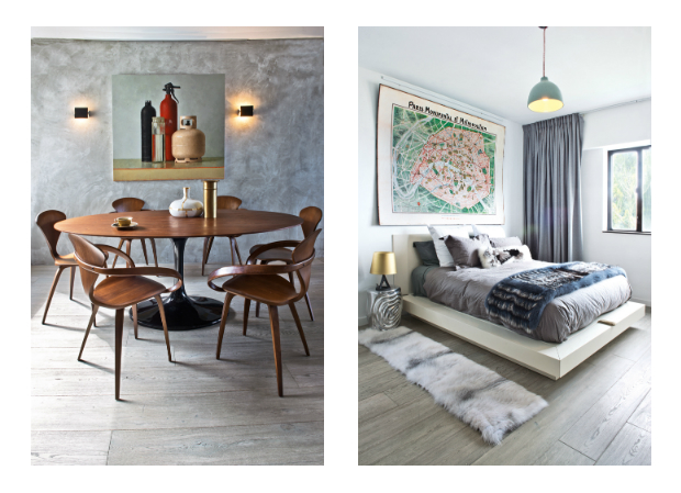
Step inside a Peggy Bels-designed interior and you’re bound to identify her bold, singular style. The smooth, cement-effect walls, the pale, unfinished wooden floorboards, and the bespoke metallic doors and handles bear traces of her consistent design language. While some interior designers find themselves needing to compromise their creative vision to satisfy a client’s brief, Peggy strikes a balance between her clients’ needs and staying true to her definitive look and feel.
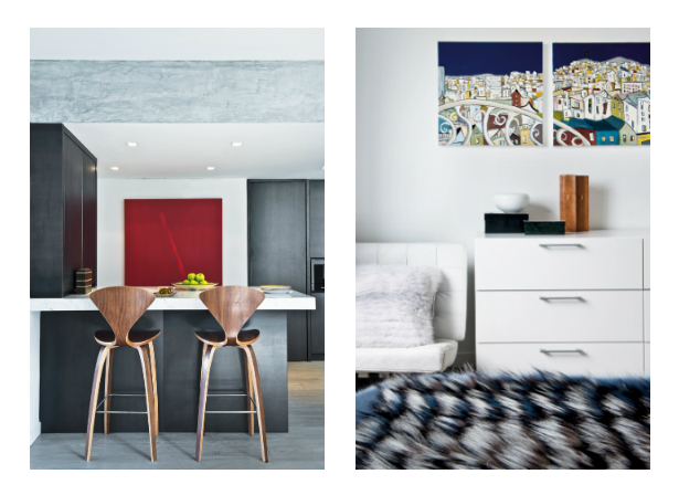
When the flat was first handed over, the existing layout was boxy, closed in and clad with dated parquet flooring. Because of this, the French homebuyers enlisted Peggy to inject some personality into the space. They wanted to renovate the flat to give it a more contemporary look, and make the living and dining areas more open to enhance the feeling of spaciousness,” explains Peggy. The designer sought to combine the communal zones into one continuous area by removing a wall that divided the entrance and the living room. However, there were structural beams that needed to be kept; they were later covered in the same cement finish as the walls, transforming these design obstacles into an interesting room divider.
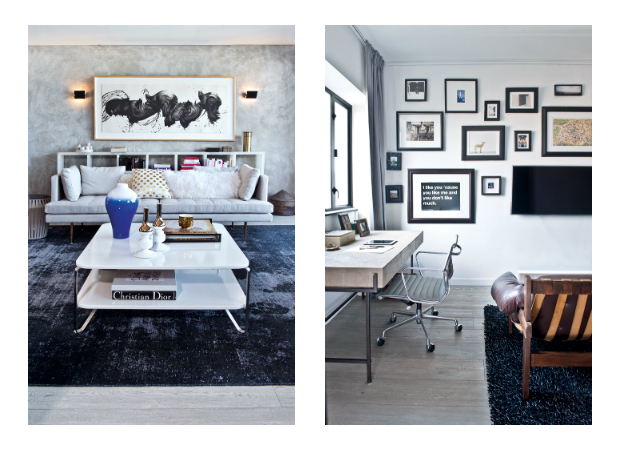
Contrasting materials were crucial to creating a sense of dynamism in the home, seen in the clash of severe, rough metals with smooth, pale grey walls. Peggy has achieved this particular wall finish as the result of mixing cement with water to get a milky colour – it’s become a key characteristic of many of the flats she designs. Similarly, the open, airy breakfast bar and dining area are marked by custom-made black metal cabinetry and a slick marble countertop. These dark backgrounds allow the light colours to pop, creating more contrast and depth,” explains the designer. She’s also equipped the home with many of her favourite finishes, such as the metal doors and grey oak flooring that are in line with the monochromatic mood.
The post Less is More appeared first on Home Journal.


