Entering the fast-changing tech generation, we love symmetry and pursue perfection, but sometimes fail to appreciate the simple ruggedness of nature.

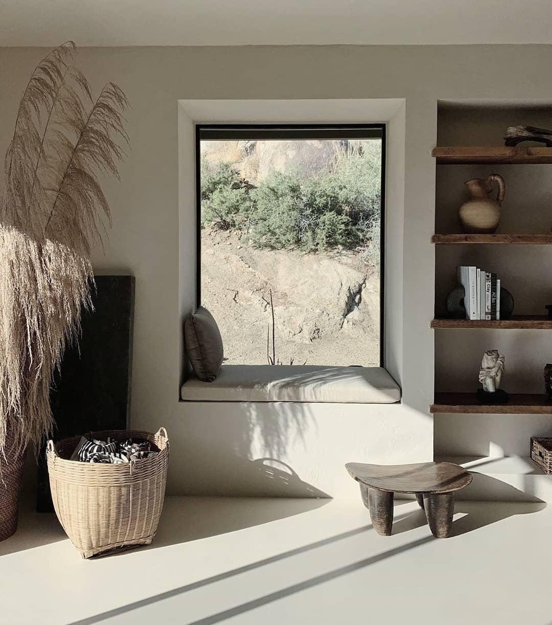
Wabi-sabi, a Japanese-style aesthetic centered on accepting imperfections, emphasises the appreciation of the fleeting, flawed beauty of the world, understanding the subtle colours and natural textures of materials, accepting nature's changes, just like the branches, curved from being blown by the wind. Even moss, growing in the corners of walls, are seen as a gift from the Earth. If we see things from this perspective, we can appreciate all creations, and use them in life to achieve peace and contentment in our hearts. This concept coincides with the Greeks' pursuit of ideal beauty, so many similar elements can also be seen in many Mediterranean interior styles.
Here are some ways to incorporate the wabi-sabi aesthetic in a contemporary setting:
TIP 1: BLENDING SPATIAL STRUCTURES WITH FURNITURE
This is based on the notion of appreciating the material for what it is. You can shorten the distance between the furniture and the structural components of your home, for example, let the sofa or storage cabinet become a part of the floor and walls, removing the need for a bed frame and let the energy flow freely between the space and the object.


TIP 2:DON'T MODIFY MATERIALS
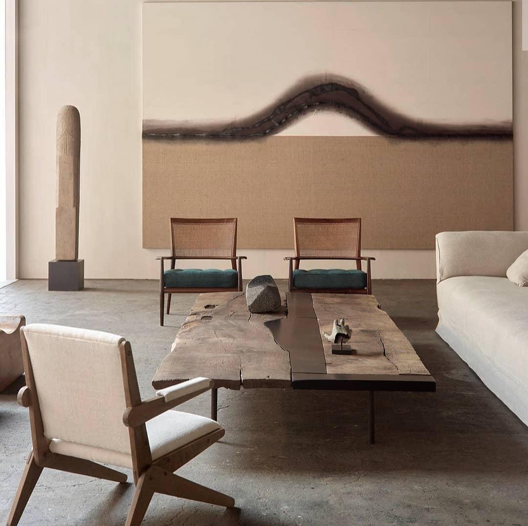
Undecorated materials make the best decor. For example, a textured lacquered wall lined with a simple and neat desk is the ultimate display to modern solitude. A natural wood grain coffee table paired with a modern and simple single chair immediately give a sense of poetic peacefulness to the space.


TIP 3:SIMPLE LINES
To prevent the rustic decor from looking too old or worn down, adding sleek modern elements will be the finishing touch that ties everything together. Embellishing the space with characterful leather couches, trendy lamps, or an artistic armchair gives the space a modern edge without overshadowing the natural, organic look.


Photos:axelvervoordt, Jessica Menda, Casa Cook Hotels, React Architects, The range by ronbay, Shade Degges photography, Nathan Lindberg design


