Perched atop an old residential building in Milan, this pint-sized 332sqft flat does not merely encounter the issue of size, but also a lack of bright light resulted from its original configuration.

When design firm untitled architecture was tasked to revitalise the home, their first order of business, thus, was to transform the home’s geometric layout so that ample natural light can be introduced into the room, changing its atmosphere and expanding the sense of space of the interior.

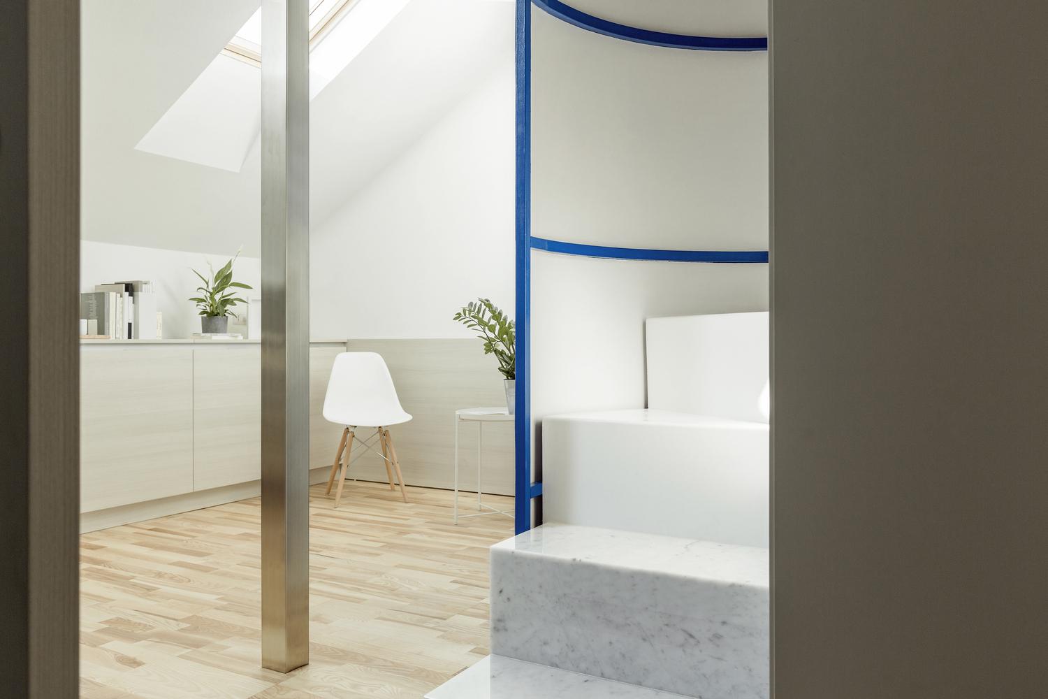
The loft’s layout takes on an interesting criss cross shape, which includes four main areas: the kitchen, bathroom, living room and office.
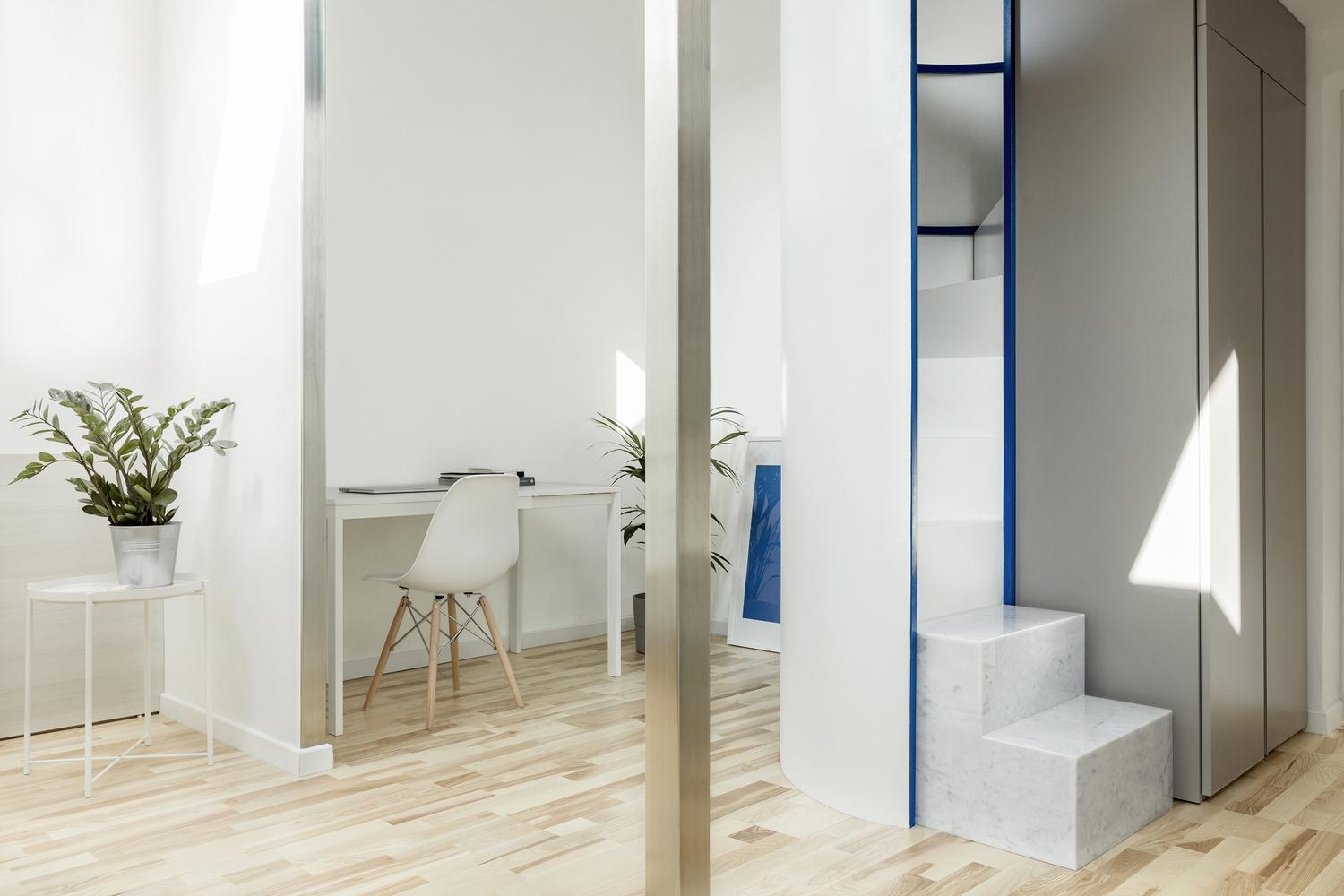
All these areas are framed around an anchoring central element: a stainless steel column. Meanwhile, the bedroom on the mezzanine floor creates a unique visual image with the bathroom located right below.

A semi-cylindrical staircase – crafted out of natural marble (for the first two steps), steel (the middle section), and finally the wood (the final two steps from the bedroom) acts as an sculptural piece on its own that connects both floors.
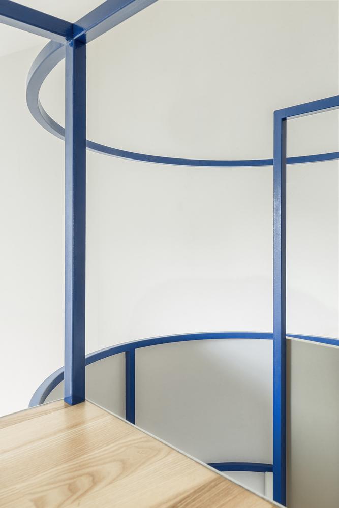
The sinuous nature of the staircase offers a sharp contrast against the home’s primarily rigid lines and austere geometric effect. Lightweight pipes are also employed throughout the home for support, their streamlined nature blending into the aesthetic seamlessly.
Because of the limiting space, the design team smartly embedded furniture such as beds, tables and sofas along the perimeter of the flat, so as to free up as much flexible space as possible.

Similarly, a simple, understated yet functional approach is seen in the choice of materials, too, such as the rough white plaster on the walls and ceilings, oak for flooring and light wooden furniture. These materials are also sprinkled throughout the rest of the home, creating a smooth visual continuity. The pared-back, neutral-toned design approach also succeeds in allowing the irregular, unexpected geometric layout of the flat to stand out.
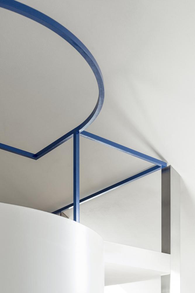
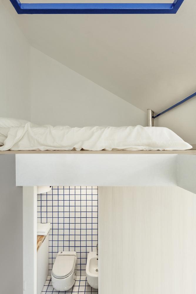
Stainless steel panels that adorn the edges of the four dividing walls also accentuate the core design elements of the central column. Meanwhile, the bathroom is a crisp, simple space, swathed in blue-lined white square tiles, of which the same blue is used for the staircase’s handles thus elevating the visual continuity.


Two enlarged sky roofs work wonderfully to bring abundant natural light into the apartment; with one in the kitchen and another one right above the bedroom; one can imagine many a romantic night with some star-gazing before bed in this intimate space.
Photos via Giovanni Emilio Galanello
See also: Au Naturel: Turn Your Interiors Into Your Own Personal Greenhouse


