When this homeowner was looking for an interior designer to turn his dream vision into reality, he knew he had found the right man for the job when he came across the featured work of Joseph Sy.
I loved the way Joseph used luxurious materials together and the effect of the overall space, the homeowner reveals. Clearly, he feels he made the right choice, as the overall result of the expansive duplex encapsulates his lifestyle, passions and interests while being a stylish, functional home for his family, including his wife and two grown children.
The man of the house took charge of the design brief, working closely with Joseph to turn the space into a home in which his family could live comfortably. Having resided in San Francisco and Shanghai before relocating to Hong Kong, the homeowner confides that he had looked at hundreds of properties before deciding on this one.
See more: In Mallorca, a cliffside villa blurs the line between indoors and outdoors living
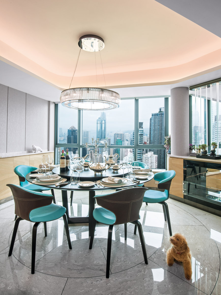
For me, it was the view that sealed the deal, he says. Victoria Harbour is very glamorous, especially at night, and the panorama here looks like a postcard. I don’t think I’ll ever tire of the view. In terms of the decor, he knew he wanted to create a modern-classic aesthetic – something that had wow factor without being over the top.
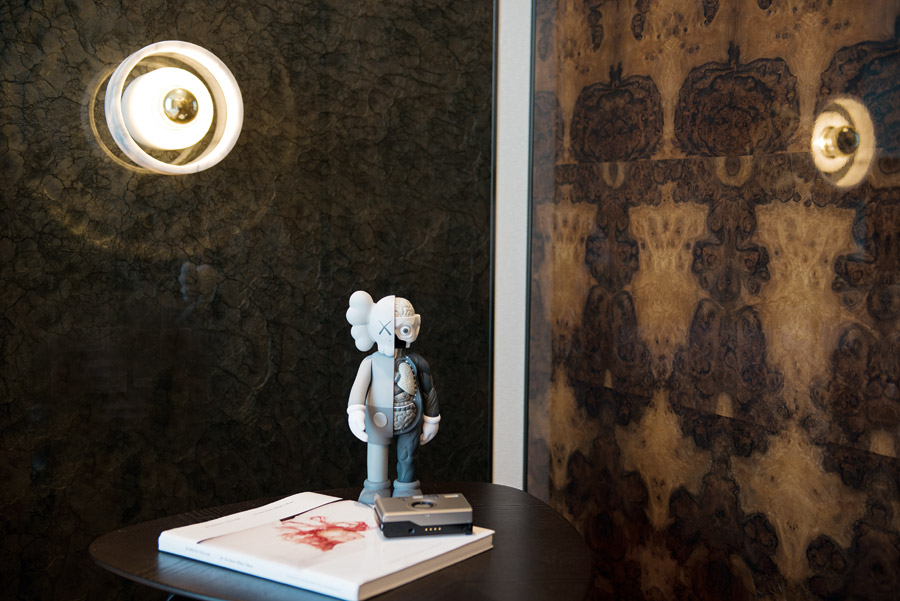
Joseph carefully considered his client’s requirements and conceived a host of clever design solutions, which integrate luxurious materials and fittings to create functional elements. This includes subtly delineating the dining room and living room with a modern fireplace and glass panels above, creating a circular void in the ceiling of the dining room and outlining a circular line on the marble underfoot to echo the shape of the dining table, designing intriguing curved walls to soften the space and using a translucent glass in the powder room so that it wouldn’t directly face the living area.
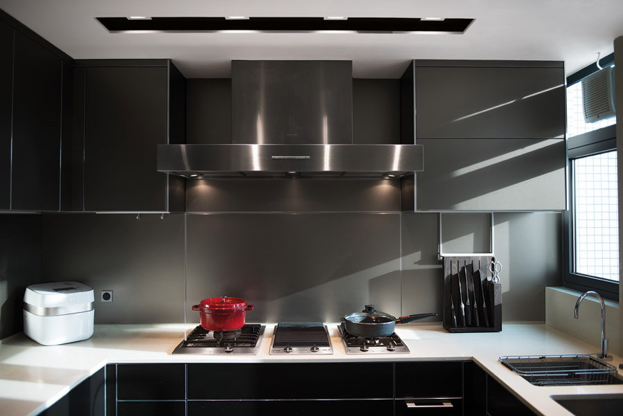
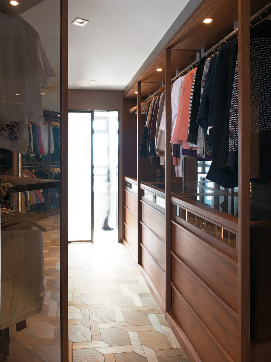
I’m quite proud of the spatial planning throughout the abode, as I feel I have really maximised each and every corner, says Joseph. The client wanted a lot of wow features and never-seen-before appointments, so we looked far and wide to source the best-quality marble, woods and fittings that would really elevate the interiors.
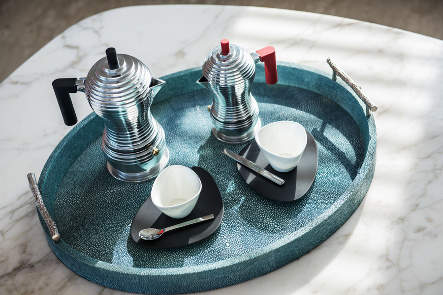
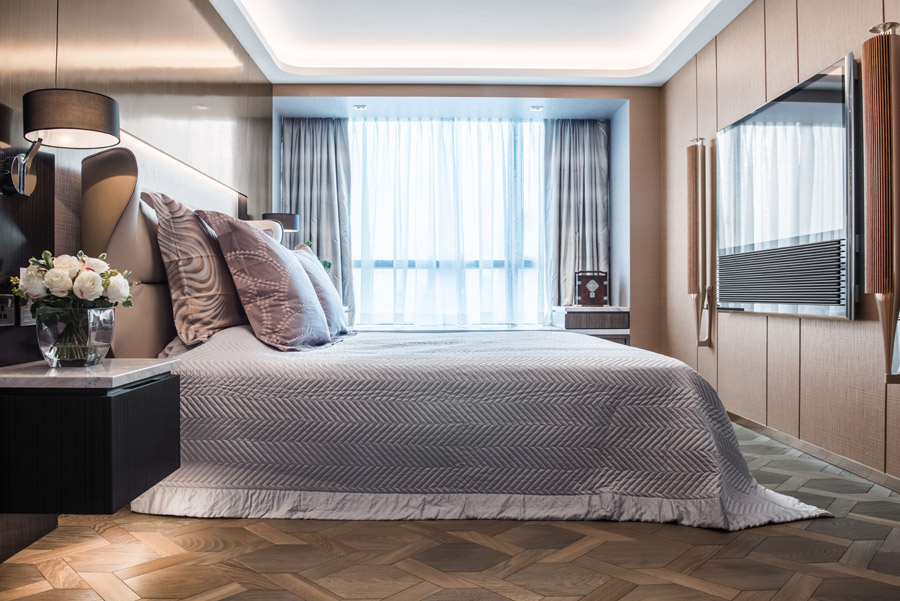
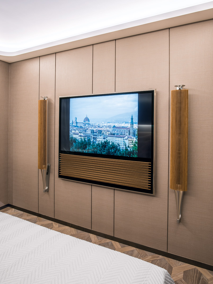
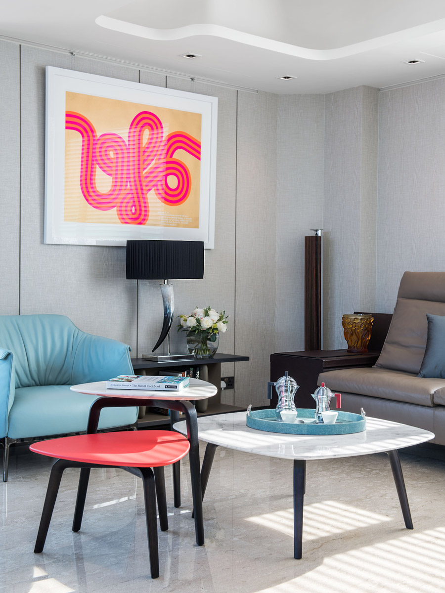
One area of contention was what material to use for the living room floor. As a huge acoustics fan who enjoys his state-of-the-art Bang & Olufsen television and speakers (and being able to seamlessly control them through his electronic devices), the homeowner was insistent on using Italian marble for the floor. Joseph, however, felt that the combination of so many hard surfaces – the heavy marble and the large expanse of glass from the surrounding windows – would be bad for the acoustics.
See more: This Mid-Levels home is a high-tech wellness retreat for two sisters
Without compromising on design or his client’s preferences, he solved this problem by creating a fluted ceiling from wooden slabs that would help absorb sound. This dedication didn’t go unnoticed by the homeowner, who raves: It was a great experience working with Joseph. He really understood our vision and worked hard to deliver quality results.
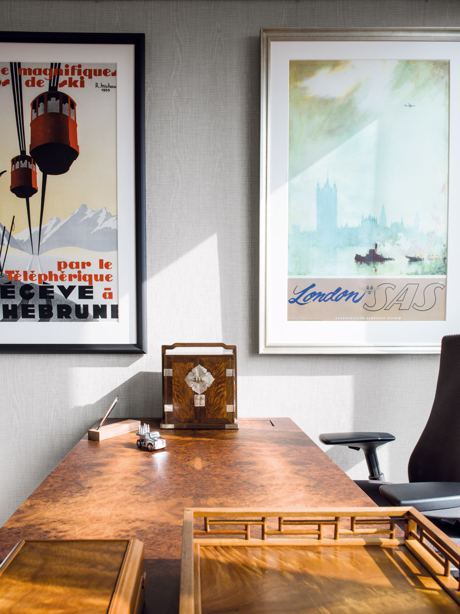
A passionate design buff himself, the homeowner compiled a huge stack of references and clippings on inspirational looks, layouts, wallpaper samples and product info, and recounts how his son often teases him for using all his leisure time on research. His wife, however speaks fondly of this habit, commenting that her husband is picky but has great taste. It’s hard to pick a favourite area in the home, she says. I think it’s beautiful everywhere, but the staircase and the lighting are very special.
The homeowner also ensured that his family was involved with the decorating process so that everyone’s needs were fulfilled. We all flew to Italy together for a week to attend Salone del Mobile for inspiration and then spent three days just in Poltrona Frau to pick out all the furniture, he reveals. We’re lucky to be able to enjoy the space together – and it’s the best feeling to have created a home that you’re always excited to come back to.
See our Designer Profiles section for more on Hong Kong’s must-know designers, and don’t forget to pick up a print or digital copy of our travel and heritage-themed June issue, on newsstands now.
The post A Mid-Levels family apartment combines clever sound design with picture-postcard views appeared first on Home Journal.


