Owning your first home is considered by many as a milestone moment in life. For a newly married couple from Hyderabad, one of the most populated cities in India, it was a treasured space that they wanted to perfect – to which they tapped design firm Design Experiment for the job.


Coined Meenakshi B101, this mid-sized flat exudes an instant calm and relaxed atmosphere. Design Experiment had wanted the interiors to encapsulate something unique from the surrounding bustle; something like a quiet sanctuary where the couple could retreat to for quality time and unwinding after a long day.


A clear vision and strong attention to detail were needed to achieve this: for one, the team at Design Experiment sought to eliminate all excessive accessories. Indeed, the resulting space lacks any usually-seen decorative items such as eye-popping art, patterned wallpapers or coloured accents.

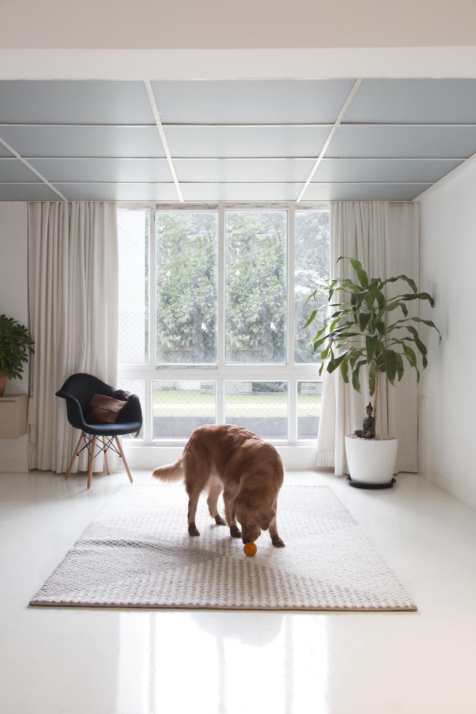
What remains is an airy and bare bones apartment that all at once brims with style; framed by crisp white flooring, warm oak wooden hallways and the occasional light grey marble wall, the space sees streamlined furnishings that are designed to blend into the space (like the swing that is made out of transparent composite) and potted greenery sprinkled around the home.

Among the primary concerns for Meenakshi B101 is the use of natural light, which beautifully drenches all rooms of the apartment thanks to it being reflected via the overall unobstructed layout and light-coloured palette, casting nature’s light and shadows into the interiors.


Another requirement in the brief was that the apartment needed to accommodate the needs of a family that would eventually be growing. Thus, a high flexibility in space and styles was essential to cater to this transitional phase from an urban couple.


The modern need for ample storage has also been smartly integrated into the architectural layout; the home’s front door is in fact a 200kg specially engineered colossal storage unit that could be swift moved out of the way. This strips the need for towering shelves and cabinets that flood many modern homes.


Just as well, the extra room can be transformed into a serious home theatre, guest suite, nursery or children’s bedroom. The balcony can also be remodelled into a cocktail station. Due to this adaptability in design, the entire space thus opens up many possibilities for the varying needs and demands of a growing family.


Anchoring the space is a striking master en suite; its design differs from the main living areas. Rather than a bright coloured design, the walls and flooring of the bedroom are painted in a luscious tactile grey hue, complementing grey and taupe furnishings. This instantly creates a sense of the cocoon, luring its inhabitants into a cave-like world of rest and retreat.


Similar to the main door, the wall separating the master bedroom and bathroom has been removed and replaced by a storage unit; this not only adds to the amount of usable space but the painstaking decluttering makes the apartment feels much larger than it actually is.
Photography by Sankeerth Jonnada
See also: Living with Colour: What’s Your Blue?


