What happens when two terraced houses in Brussels are united into a single-family house of 7,000 square feet?
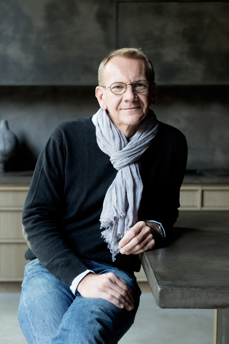
This breathtaking renovation, completed in the spring of 2017, is the result of collaboration between Arnaud Masson (director of real estate company Permis de Construire), Brussels architectural firm K2A, a handful of local artisans and some talented contemporary artists. Both are typical Brussels houses from 1896, featuring their famous three rooms in a row, explains Masson. They benefit from an 11-metre façade – kind of a rare dimension in the city.
Looking at the exterior is striking indeed. The vertical tension of the façade and the technical feat of a seven-metre-high window, mounted in one single piece, find harmonious proportions thanks to the creation of an immense horizontal bay window and a suspended garden, giving the impression that the original home has been somehow placed on top of it.
The transition between the city and this living space has a particular aura – and the entrance hall sets the scene with the generous use of natural and raw materials. In keeping with the wabi-sabi philosophy of imperfection, this simple, unpretentious journey rediscovers nature through clay-coated walls and smoked oak.
Behind such projects, the human factor is essential. Passion, know-how and commitment, too.
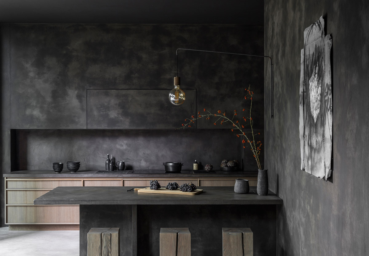
Flooring on the ground floor features pastellone (a natural product made of lime and marble powder), while the kitchen and bathrooms are done up in tadelakt plaster that’s commonly used in Morocco.
Monochrome and minimalist, these elements create a balanced decoration without hierarchy, thus offering the luxury of an uncluttered lifestyle. The smoked oak furnishings, designed by Masson together with K2A and made to measure by the Belgian carpentry company Recob, seem to merge into space. The creation of false partitions in clay conceals the kitchen storage, so that one can only see the beauty of the space.
See more: Two brothers reside together in this monochrome man cave in Happy Valley
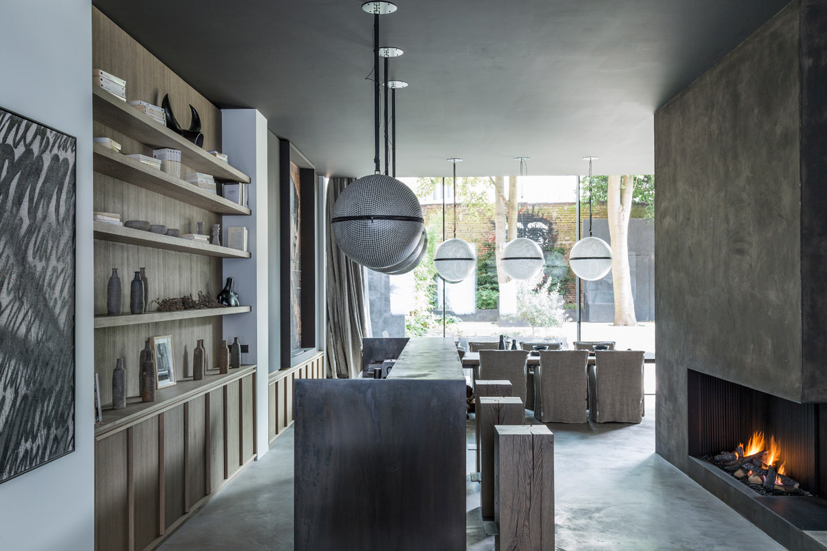
I make no compromise on the quality of materials and of craftsmen, explains Masson. It must not be forgotten that behind such projects, the human factor is essential. Passion, know-how and commitment, too. From the laundry room to the guest room, via the kitchen or living area, nothing is left to chance or treated in a shallow way under the pretext of placing resources in the space next door.
For a headboard, one wall of the guest room has been covered with panelling trimmed with a grey linen fabric. In a nod to Mondrian the master bedroom is designed in MDF and painted in matte black in a library mood. The organic form of the bathtub, with its treatment in tadelakt, beckons a sensory experience, while in the cavity of the shower, the smart wooden boxes – again drawn by Masson and shelf-mounted on a raw steel bar – conceal the various shampoos and other toiletries.
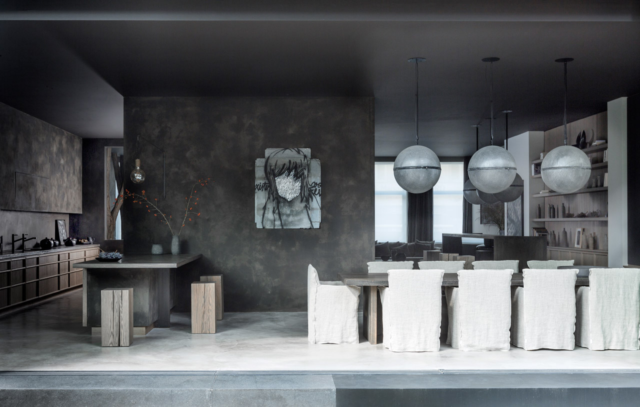
On the top floor, the concrete body of the cube-shaped extension has a mirror, suggesting that it is a glazing when seen from the garden, and a shield from the inside, thus helping inhabitants avoid any feelings of vertigo. The principles of feng shui are respected, but the codes of contemporary architecture are discarded in favour of the design of a cocoon. The unique, versatile look of a place drives me, says Masson. I like both the idea of creating a cocoon where one comes to recharge himself with his family by the fireplace, but also a place to share and celebrate with lots of people.
See more: 10 design and lifestyle essentials for the discerning man
Intriguingly, Masson invited street artist Ted Nomad to take part, giving him carte blanche for the giant realisation of a monkey head on the wall at the bottom of the garden. The artist was inspired by the tall trees and played up the ambience of an urban jungle. The fundamental concept is the sense of immediate well-being generated by the moment one crosses the threshold of a house and how it extends into all spaces, concludes Masson. This sensation is given the energy of the place and the pleasure of watching it – without getting tired of the desire to settle in each room.
This story was originally published in our July 2018 issue as “Primitive Place.” For more inspiring masculine homes, pick up a print or digital copy, on newsstands now.


