The Chinc’s Workshop team met in Canada. We grew up in Toronto but moved to Hong Kong and were all working separately in design. Finally, we decided to collaborate and founded the workshop in 2008. We’re proud of our Chinese roots so that’s where the name comes from.
The home we worked on is a second one to a British-Chinese couple. They have a flat in Sai Kung but as their offices are in the Sheung Wan area, they decided to invest in another home closer to the office.
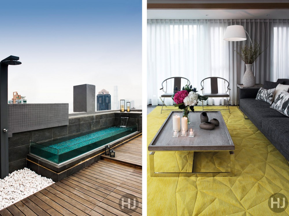
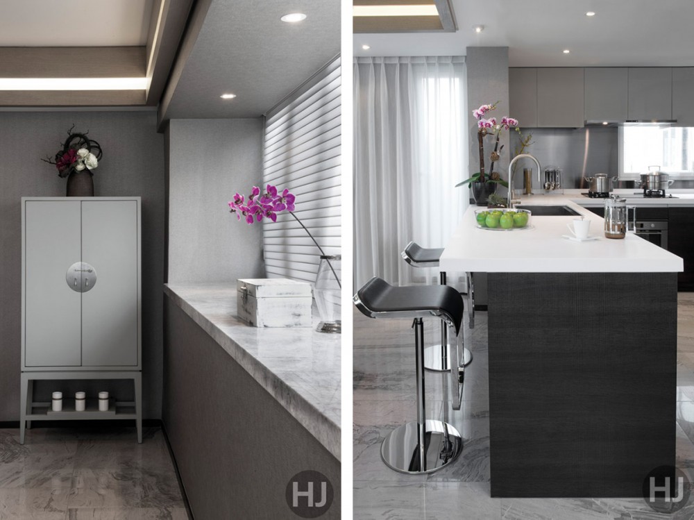
The first floor is an open, flowing space where living, kitchen and dining areas merge into one. Marvelous wraparound windows offer spectacular views of the city from the 30th floor. For the open kitchen, we decided on a breakfast bar where the family can enjoy a casual meal. An eye-catching feature in the living room is the custom made 3D rug from Carpet Collection in Hong Kong. We picked out a fun and vibrant lime-green hue to break up the monochromatic look. The sofa is from Horizon Plaza, and the coffee table is from Indigo Living.
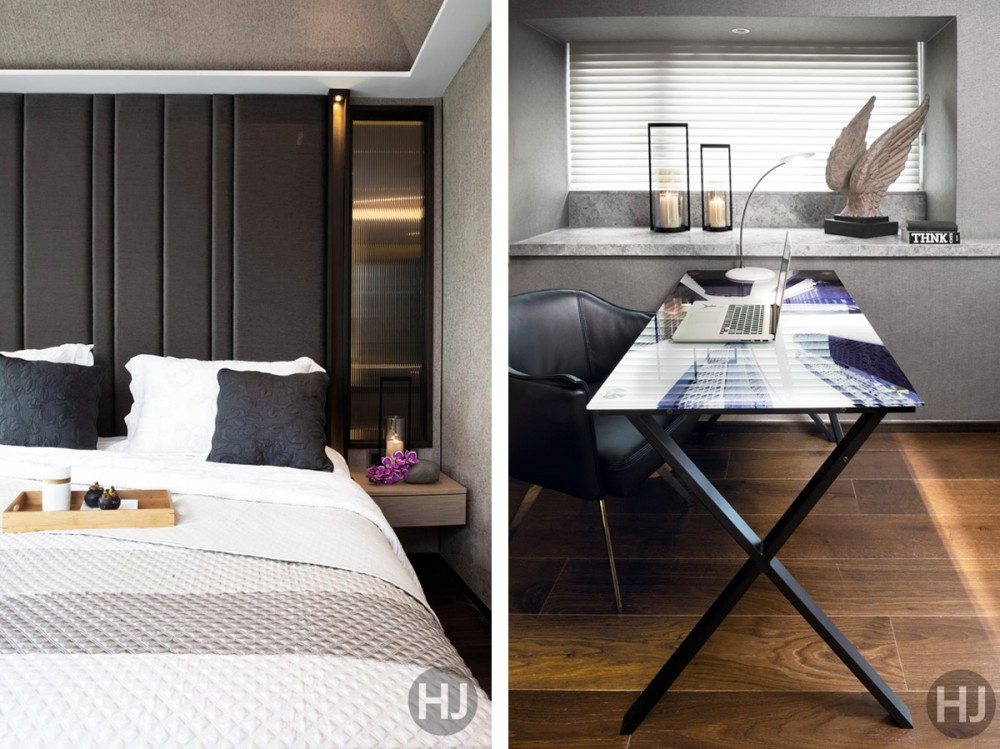
The second floor originally had a long and dark corridor. We knocked down a wall to open up the space and created a glass room that can be converted in to a guest room with closable curtains. The study was previously two separate rooms that we combined into one. The desk is from Tequila Kola.
For the master bedroom we wanted to create a feeling of being wrapped up in a cosy space. Here we used soft, silky materials and a lot of upholstery to help achieve that cocooning ambiance. We agreed on using refined materials like velvets and linens, and opted for walnut floors for warmth and texture. The bedding is from Zara Home.
The rooftop area has a stunning view of Central. To bring warmth to the glass and concrete materials we introduced natural elements, greenery, lots of wood and a water feature. The water feature is soothing and relaxing to lounge by, and on a hot summer day it doubles as a soaking pool. Our clients love to entertain so we created a party zone that’s perfect for dining al fresco.
Our clients were very open-minded; it’s their second home so they felt free to have fun with it. In it’s basic form it’s a bit masculine, but we balanced it out with soft furnishings, pops of colour and oriental accents. The owner loves antiques and the flat is peppered with vintage treasures. The cherry on top is definitely the rooftop area, with a view like that I’m amazed that they even use any of the other areas.
The post Downtown Panache appeared first on Home Journal.


