It’s fairly easy to make a home look beautiful if you have two crucial elements – light and space. Natural light instantly uplifts a home, making it feel warm, inviting and somewhere where you’d like to linger. Space, on the other hand, is the key ingredient to crafting a feeling of grandeur. In a crowded city like Hong Kong where the standard size of a flat is 300sqft and the view often consists of the buildings next door, both light and space are considered luxuries.
When designer Peggy Bels encountered this apartment in Sheung Wan’s Po Hing Fong Street, it didn’t have either light or space. The flat looked and felt tiny with the bathroom taking up all the space in the middle of the room,” she shares. It was also very dark; it had small windows facing an abandoned outdoor area.” While it appeared that there wasn’t much to work with, Peggy, who takes on a lot of dramatic transformations, considered it as a challenge. For some reason, I tend to get a lot of ‘makeover’ projects,” she shares with a smile. She thought that this particular one as an undertaking that’s quintessentially Hong Kong.
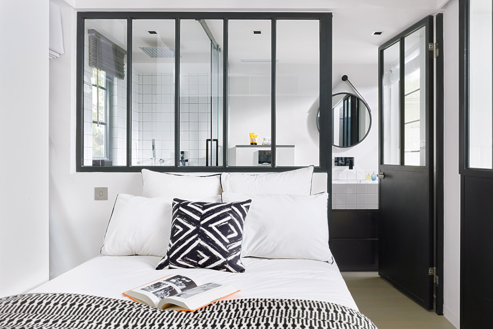
Graphic accesories liven up the monochromatic space.
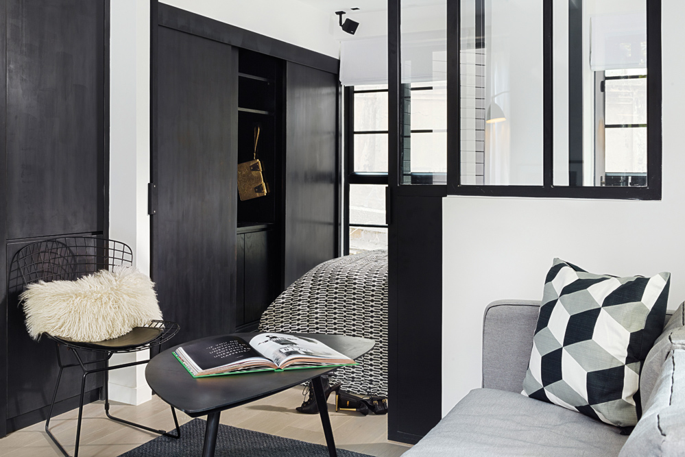
There's a distinct Scandinavian feel to this small home.
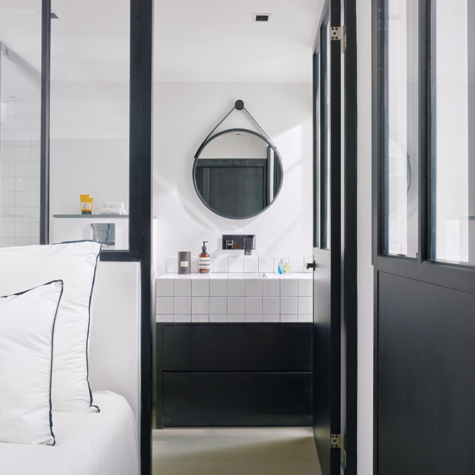
The inclusion of a rainshower adds a touch of luxury; the ensuite bathroom looks out onto a pocket garden.
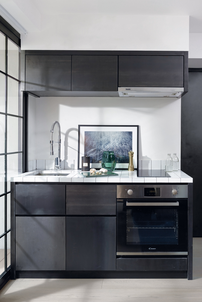
Given the limited space, Peggy designed integrated appliances and storage for a seamless look; the finish of the cabinetry is distressed metal.
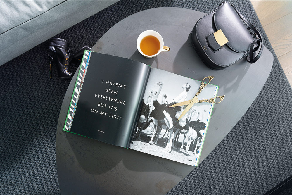
Some of the homeowner's belongings mingle on a side table.
The post How Peggy Bels created more space in a Hong Kong microflat appeared first on Home Journal.


