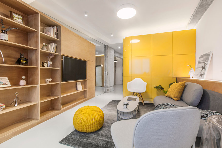
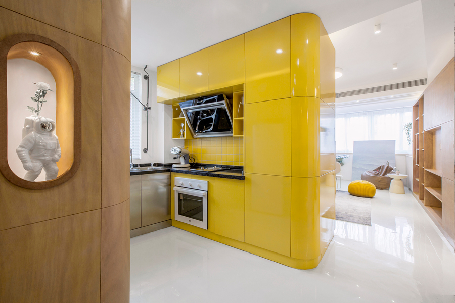
Tasked with re-booting a small apartment on Kangping Road in Shanghai, TOWOdesign did away with following the strict grid of the floor plan.
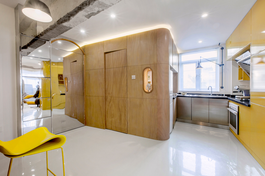
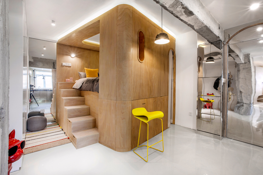
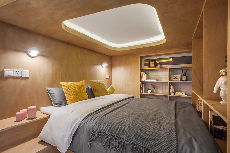
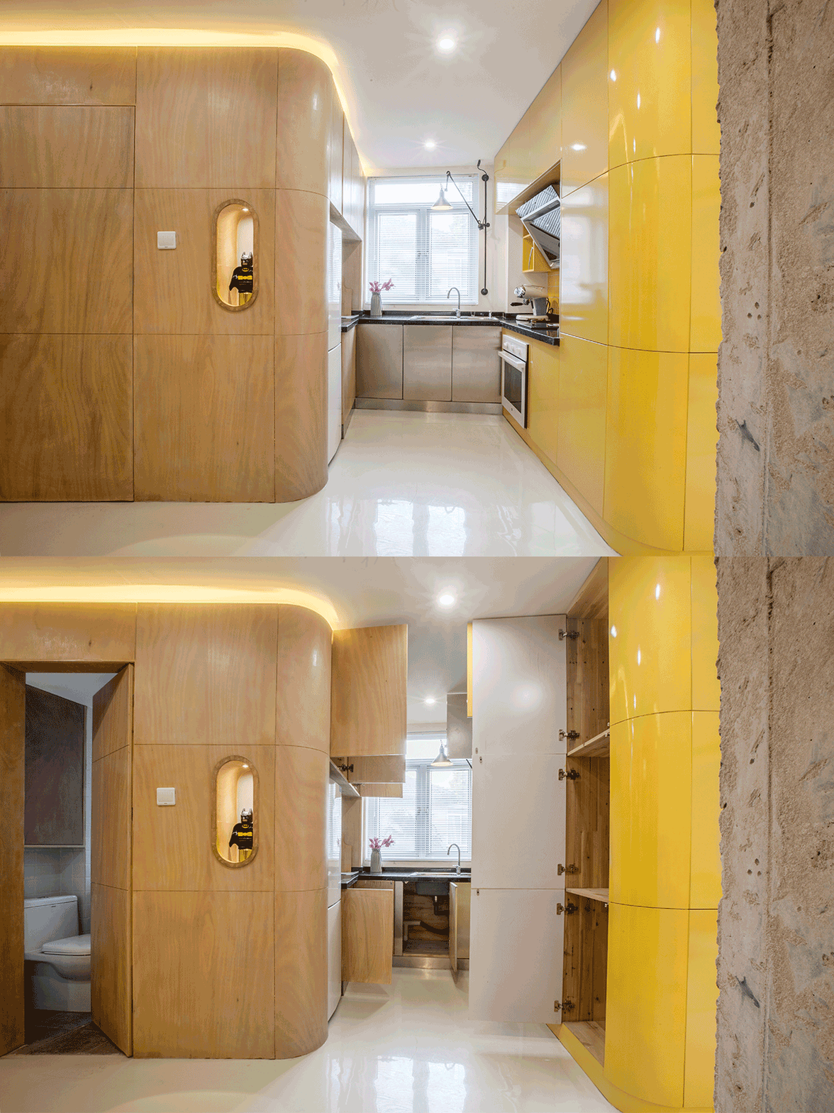
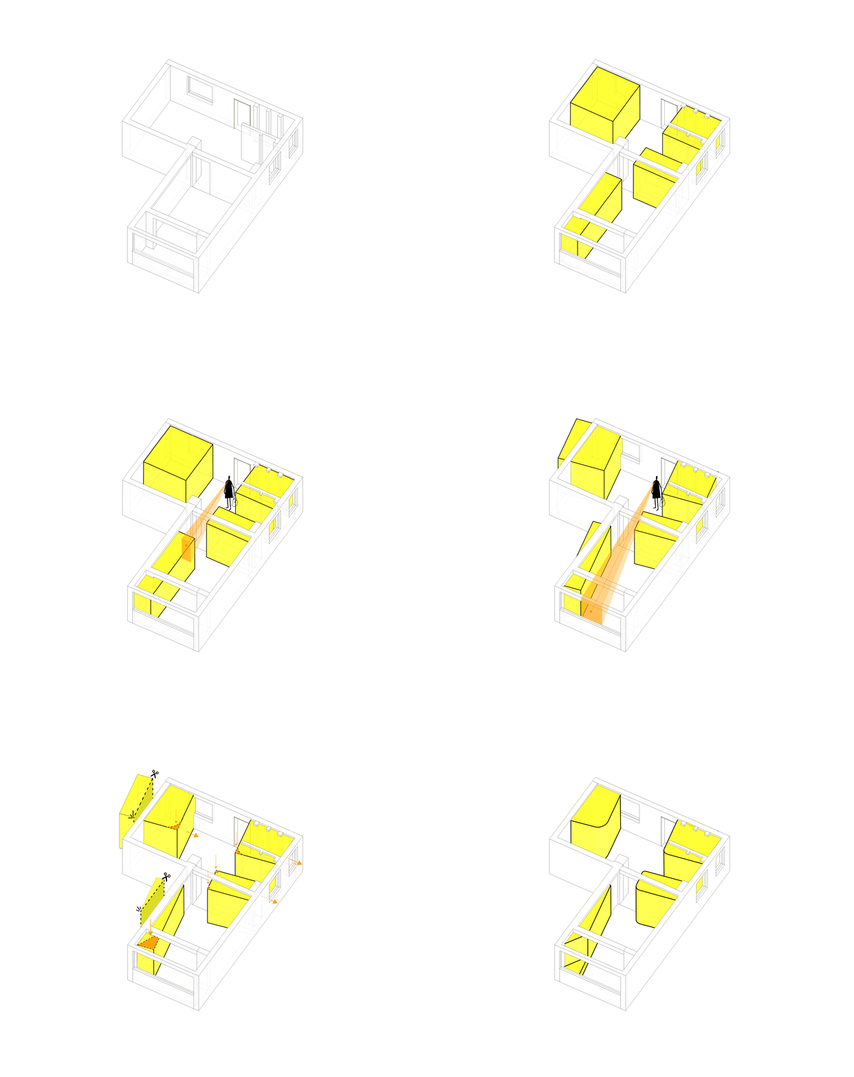
The design firm started out with ‘function boxes’: four box-like volumes integrating fixtures and furniture for rest (such as a loft bed), entertainment (a TV), cooking (a kitchen and built-in dining table), and cleaning (a bathroom and washing machine). These volumes, complete with hidden storage, would slide easily into the apartment’s compact layout in a neat design solution.
See more: Curves and natural light bring life to this 1,250sqft North Point home
However, things proved less simple than anticipated. The function boxes made the room feel cramped, with the multimedia box in particular interrupting one’s flow of vision upon entering the already compact home.
Yet instead of scrapping the function box idea and starting from scratch, TOWOdesign opted instead to make one tiny adjustment to their design: rotating the placement of the function boxes by ten degrees.
See more: 6 micro-home tips for living small yet well, from SCAD interior design professor
The difference is dramatic. Thanks to the slanted positioning, one’s line of vision is widened, making the space feel significantly bigger. The addition of reflective surfaces also add to the sense of spaciousness, with TOWOdesign ensuring they do not mirror the sleeping area, a taboo in Chinese culture.
Check out this video for a tour of TOWOdesign’s 10° Home.
See more: How to style your apartment like Cathay Pacific’s new The Deck airport lounge
For more home inspiration, visit our Interiors tag, and don’t forget to pick up a copy of our August issue and the latest edition of our annual home decorating bible, Home Solutions, on newsstands now.
The post How a 10-degree tweak made this 520sqft Shanghai apartment instantly feel bigger appeared first on Home Journal.


