Natural light takes on a beautifully ethereal quality in Little Tai Hang, the boutique hotel in the eponymous, little-known neighbourhood tucked by the wayside between Causeway Bay and Tin Hau.
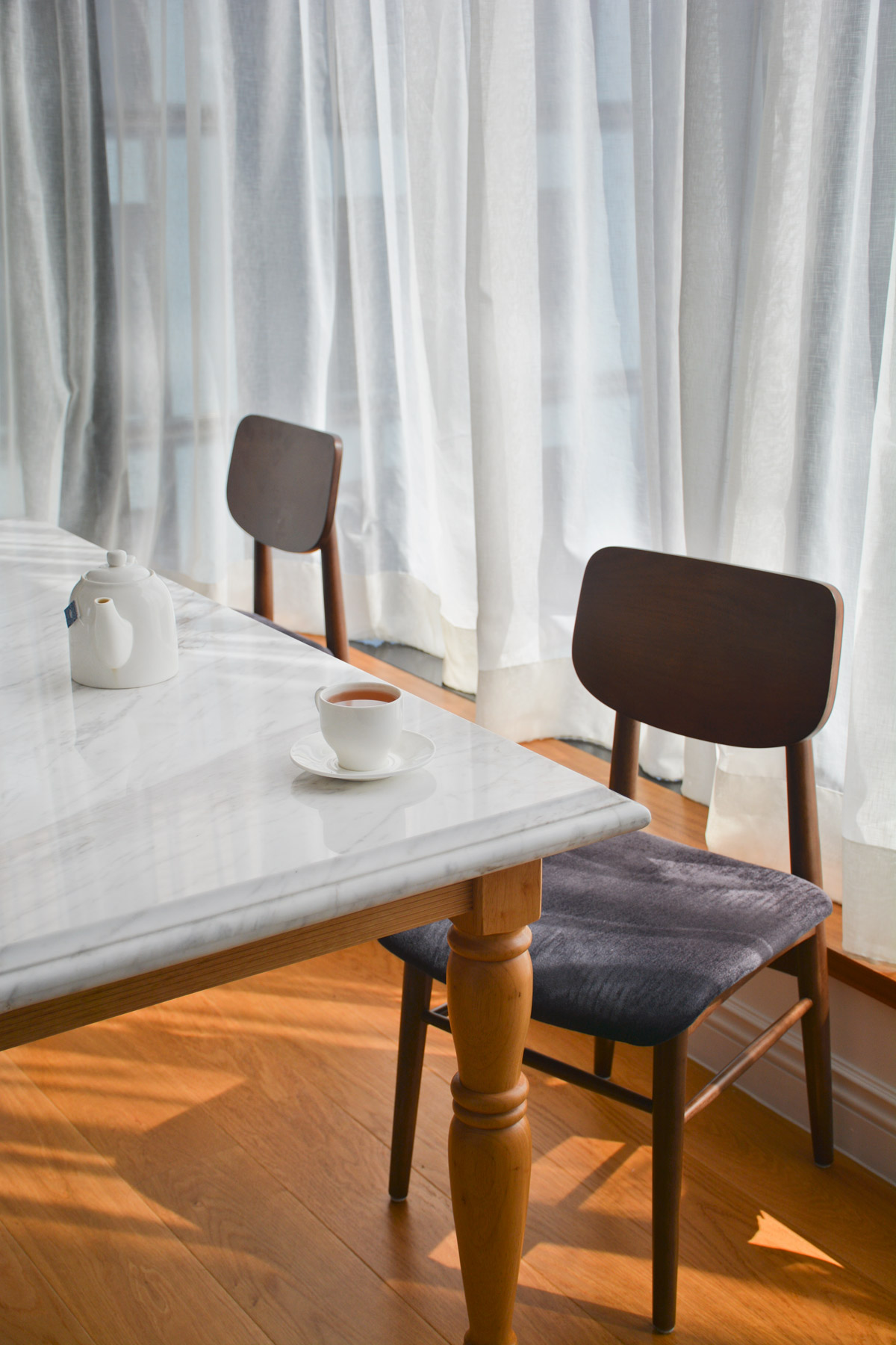
Unobstructed by any neighbouring building or the room’s floor-to-ceiling windows, and softly filtered by gauze curtains, it’s a rare luxury for a complex located next door to one of the most densely populated shopping districts in Hong Kong.
Even rarer still are the views towards the architecturally distinctive Lai Tak Tsuen public housing estate (prominently featured in 2017’s Ghost in the Shell) on the land-ward side, and on the other, an unbounded vista of Victoria Park, Victoria Harbour, and the Kowloon Peninsula beyond.
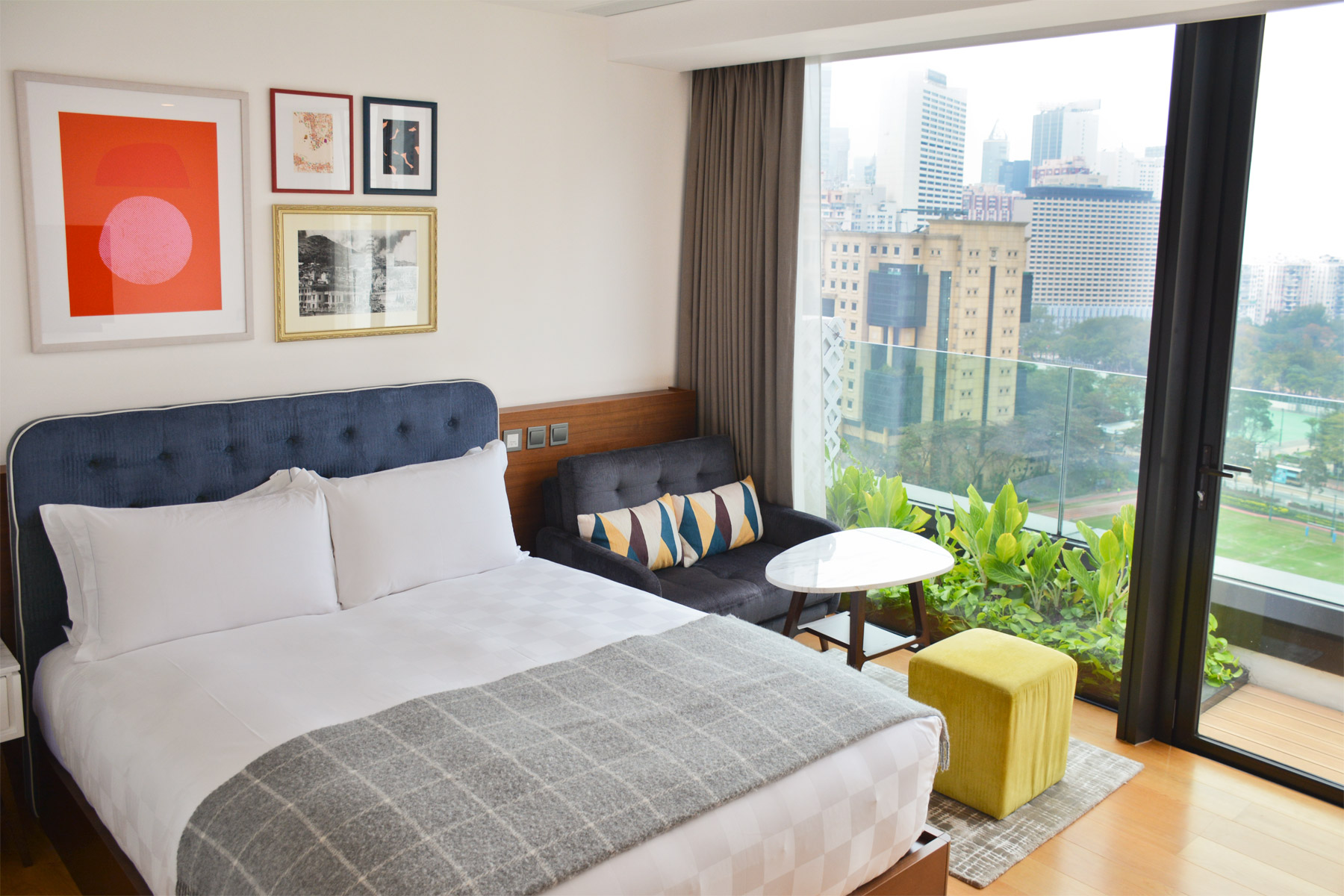
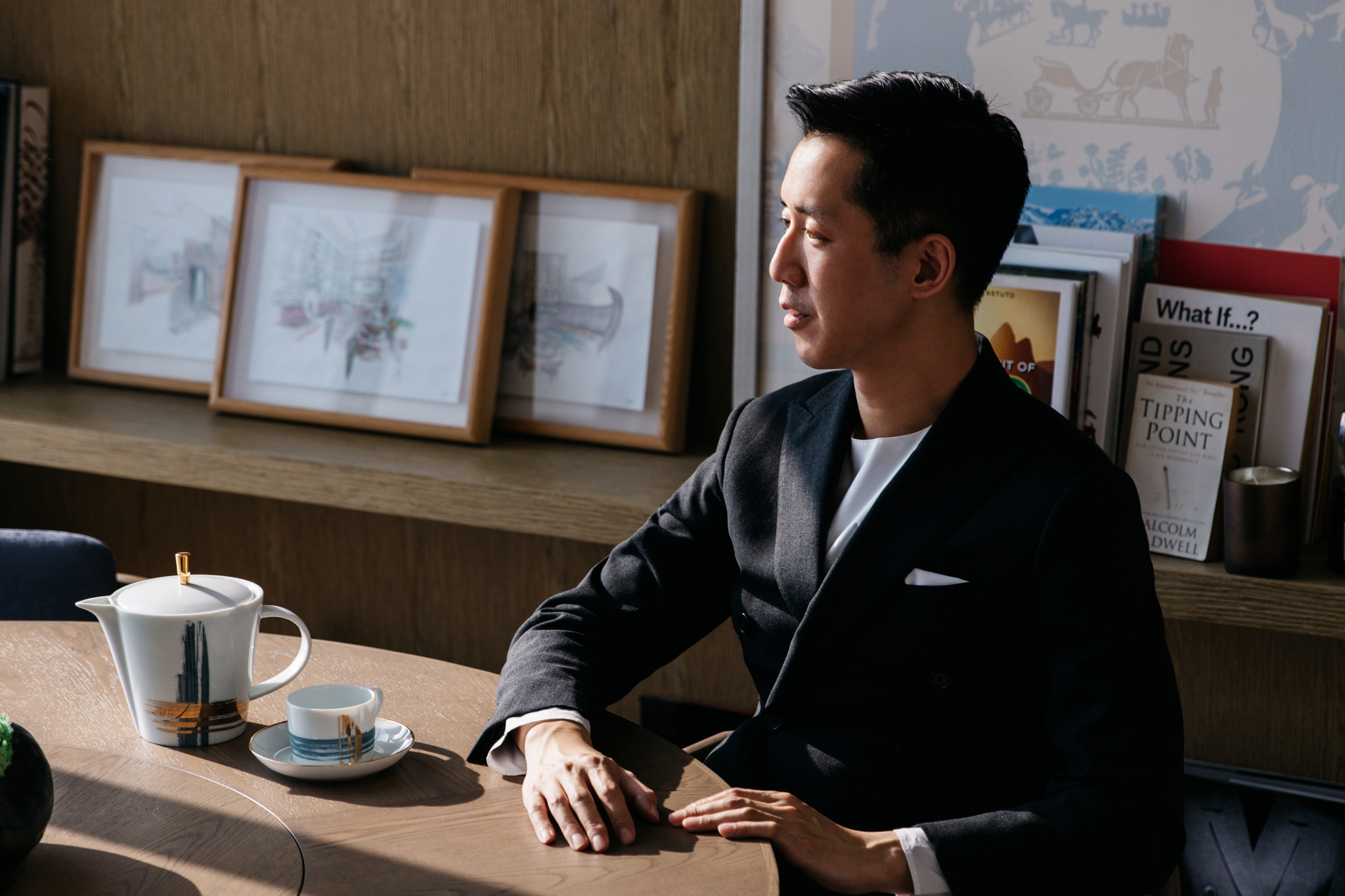
The natural topography is a big thing: Tai Hang is sandwiched between [Victoria Park and the Causeway Bay Sports Ground] and Causeway Bay,” explains the project’s owner and architect, Tommy Pao-Watari. It’s a little bit more sheltered and it’s got a lot of nature in it. It’s very rare that you have this Central Park-esque view that looks into the harbor. We lucked out!”
For all of its quaint charm and geographical advantages, Tai Hang remains a neighbourhood that, thankfully, remains off-radar for most people, lending it a remarkable serenity and laidback atmosphere. Opened just shy of one year ago in March 2017, Little Tai Hang was the area’s highest-profile development in years, yet Tommy was aware of the need to integrate it into the existing social fabric of local history and generations-old family businesses.
I believed in the whole area and I wanted to build upon what was already here,” he says. That’s why I included Tai Hang into the hotel name. The better the hotel does, the better the neighbourhood does, and we’re able to attract more interesting tenants and demographics to this area.”
In a nod to the neighbourhood’s history, Little Tai Hang’s hand-drawn logo depicts four characters – Frog, Duck, Tiger and Monkey – who could quite easily have walked out of an original Winnie the Pooh children’s books. The idea for the mascots was inspired by the stream that gave Tai Hang (big waterway” in Chinese) its name, and the families and their children who would have based their livelihoods, daily chores and playtime around it, in the process creating an ineffable sense of home. Through the characters and the nostalgia they represent, Tommy adds, I didn’t want the brand to take itself too seriously and I wanted people to have an intimate connection with Tai Hang.”
I didn’t want to overcomplicate things. A lot of people fall into the trap of trying to say too much – they have too many colours and flashy details and that distract you.
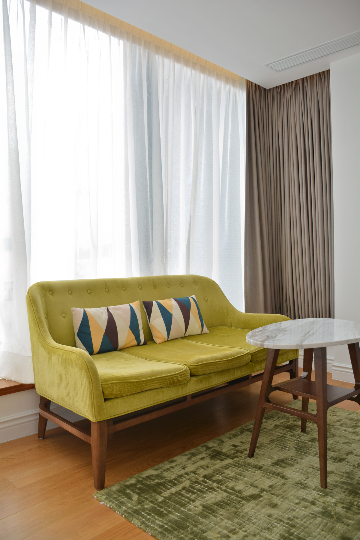
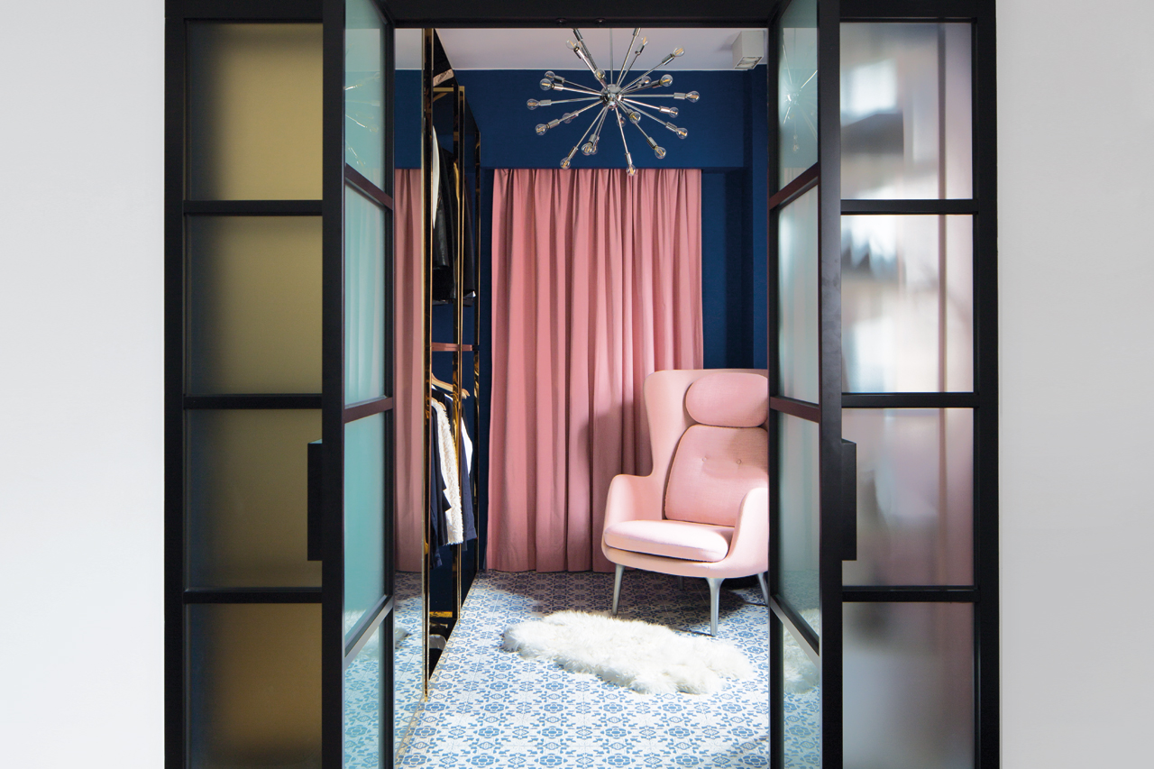
The hotel’s interior design is equally whimsical, yet no less thought out. Best described as a mix of mid-century Scandinavian design and a minimalist, storybook aesthetic, its 91 suites – primarily devoted to serviced apartments – are decorated in a more neutral and consistent palette of whites, greens, blues and a few accents of yellow in soft, woven fabrics and warm woods, in deference to the stunning views.
Highlighting constraint as the crux of his design language, Tommy says, I didn’t want to overcomplicate things. A lot of people fall into the trap of trying to say too much – they have too many colours and flashy details and that distract you. Glossy surfaces, mirrors, gold and exposed concrete are really nice, but they don’t feel warm and welcoming.”
It shouldn’t be so nice that you don’t want to damage anything, or so clean that you feel like you can’t let loose in a space.
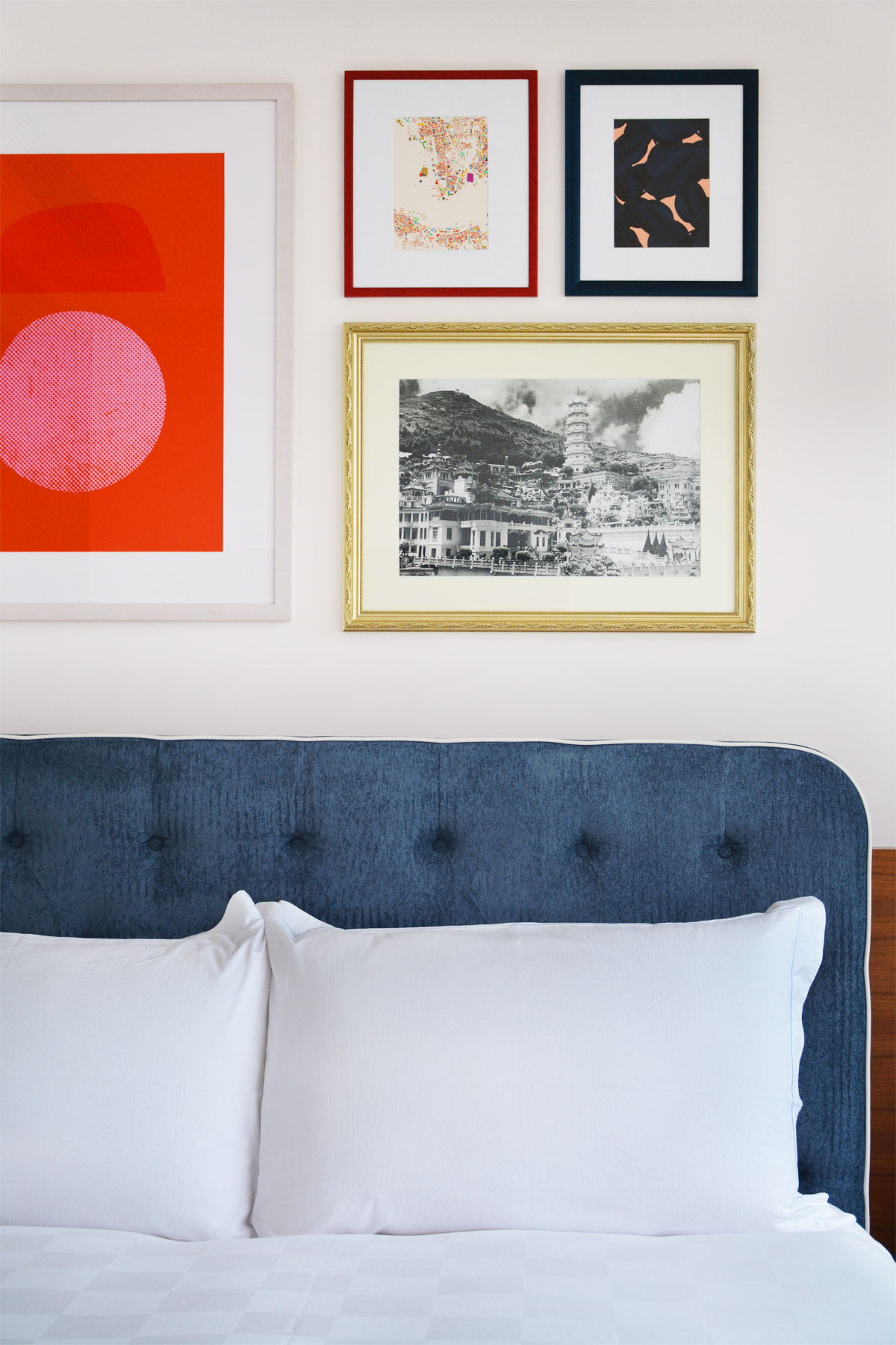
In addition, the whitewashed walls and natural wood floors not only keep construction costs down, but also to serve as a canvas for each suite’s eclectic selection of art prints, some of which were made by Tommy’s mother and artist-turned-businesswoman, Cissy Pao. This results in rooms that are humble yet grow more charming with use, very much by purposeful design to suit the majority of the tenants, who stay for upwards of several months and demand something very different from an overnight hotel stay.
It shouldn’t be so nice that you don’t want to damage anything, or so clean that you feel like you can’t let loose in a space,” Tommy explains. You collect a lot of daily clutter in your personal life, so you have to make space for all of that.”
Above all, practical considerations guided the proportions of each suite to accommodate the needs of the tenants’ quotidian activities. The secret, according to Tommy, is a philosophy as simple as the Goldilocks principle. It’s just about comfortable distances: between the table and the chair, and how wide your living room is… everything is just big enough and just right, just sort of where it wants to be. It’s the small conveniences that really double up and add to the feeling of comfort.”
Similarly drawing on Hong Kong’s rich cultural heritage, see our breakdown of boutique hotel The Fleming’s Star Ferry-inspired design.
The post Lessons from Little Tai Hang: How to turn a hotel into a home appeared first on Home Journal.


