When your job takes you around the world, the importance of creating a space that you look forward to returning to cannot be overlooked.


Commissioning editor for The Daily Telegraph’s travel desk, Trisha Andres, understands this all too well, which is why she enlisted Swedish-born, London-based rising design star Beata Heuman to help conceive her inviting abode in the English capital. "I chose to work with Beata in the first instance because I had a good feeling about her," says Trisha. "She is adorable and down-to-earth, and of course also because I love her style, which is neo-trad with a sense of humour."

Measuring just 520sqft, Trisha’s apartment is small even by London standards, however, despite its diminutive stature, Beata has succeeded in crafting a home that’s big on glamour, grandeur and personality. Period features, including generous sash windows and soaring celings, lay the groundwork for the design scheme, which, Beata explains, takes full advantage of vertical as well as floor space. "We were lucky with the ceiling height, which makes such a difference" the designer explains. "I tried to accentuate the height by using all of that space. Even with lower ceiling heights people tend to only design up to eye-level and in a small space every inch counts."

Minor structural changes were made to open up the flat, including moving a wall to increase the size of the bathroom and creating a doorway between the living room and study. Grey floorboards unify these latter two rooms, while their distinctive palettes define them. The living room shines in soothing white, with a built in bookshelf covering one entire wall and floor-to-ceiling windows drawing the eye upward. The appointments – in particular a custom-made curved sofa upholstered in Casaleone mohair by Beautmont & Fletcher and a rattan coffee table from Tine K Home – introduce sinuous curves into the otherwise angular setting, softening the overall aesthetic and providing balance to the spatial composition.


Trisha’s study, meanwhile, is an exercise in mid-century modernity, with walls in Farrow & Ball’s refined calke green, whose sage notes are prefectly offset by brass detailing and masculine dark wood furnishings. Serene and yet inspiring, it encapsulates the dwelling’s inherent ambience, which Beata describes as "elegant, fresh and not too serious".

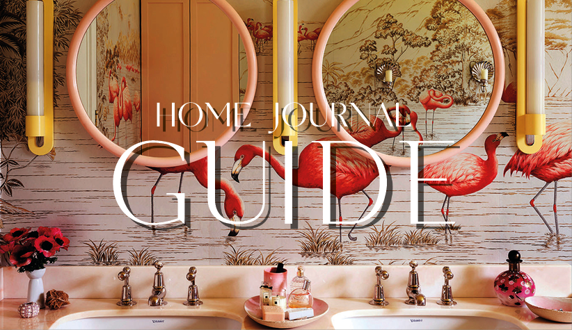
These characteristics continue through to the bedroom and bathroom, which are visually related to the main living areas through brass accents. The bedroom itself is dominated by a geometric headboard designed by Beata and covered in a printed fabric from La Maison Pierre Frey-owned textile house La Manach, which adds personality to the space. The compact bathroom was redesigned to include plenty of storage in the form of a tambour-fronted vanity and mirrored cabinets. This, for Beata, addresses one of the major challenges of designing for smaller spaces – where you are going to put everything. "You have to think carefully about storage," she says. "If you don’t have designated places to put things away, the place can get cluttered and messy and that in turn makes it feel smaller and claustrophobic."

Her final words of wisdom for when it comes to decorating a more diminutive area? "Add a bit of grandeur and choose everything with great care," advises Beata. "The good thing about doing up a small space is that you don’t need that many things to make sure what you get is really special – it all adds to the overall impression." And taking one look at Trisha’s handsome home it becomes immediately evident that a little grandeur goes a long way, and bigger certainly doesn’t always mean better.


