Design firm hoo creates a space that breaks all the rules.

Make a small space appear bigger with more than white walls and foldable furniture
Facebook SharePinterest ShareTwitter ShareShareURL copied

In a recent design project for a young couple and their two cats, YC Chen, hoo’s founder and creative director, took an unconventional approach. “Common wisdom tells us to use light colours. But we did the opposite in this flat because, frankly, it’s really boring to follow the rules.” When deciding the course of how to design a small home, many resort to the standard advice: white walls, collapsible furniture and interiors packed with light-reflecting surfaces to make the space appear larger. But there are many other great ways to maximise space without being so obvious.

The clients had been long-time fans of hoo after having seen their projects in local publications – and they were very open-minded when accepting new creative concepts for the design of their home. To make the space feel contemporary and liveable, the hoo team adopted a palette of flattering pastels and approachable Scandinavian designer furnishings. It’s a look that’s been embraced by hoo in many of their projects, particularly in smaller homes. “About five to six years ago, we suggested that our clients look closely at the Scandinavian aesthetic, especially those with smaller units,” recalls YC. “I like minimal, but it’s not very realistic unless you lead a really minimal lifestyle. With the Scandinavian school, it’s a pared-back look but with a human touch. It’s cosy and features interesting details, seen in the materials and colour choices. All of our projects really aim to convey a human touch.”
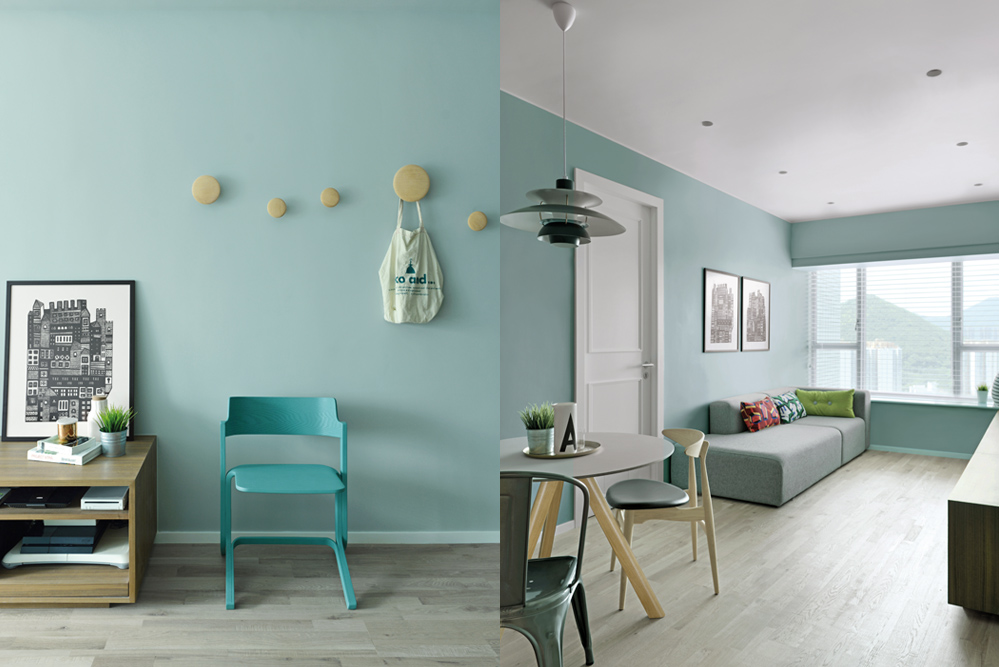
Scandinavian design pieces dominate the living room including the pale blue RU chair by Shane Schneck for Hay along with Muuto's The Dots coat hangers. Mismatched chairs from Tolix and Carl Hansen paired with a Louis Poulsen pendant light marks the petite dining area.
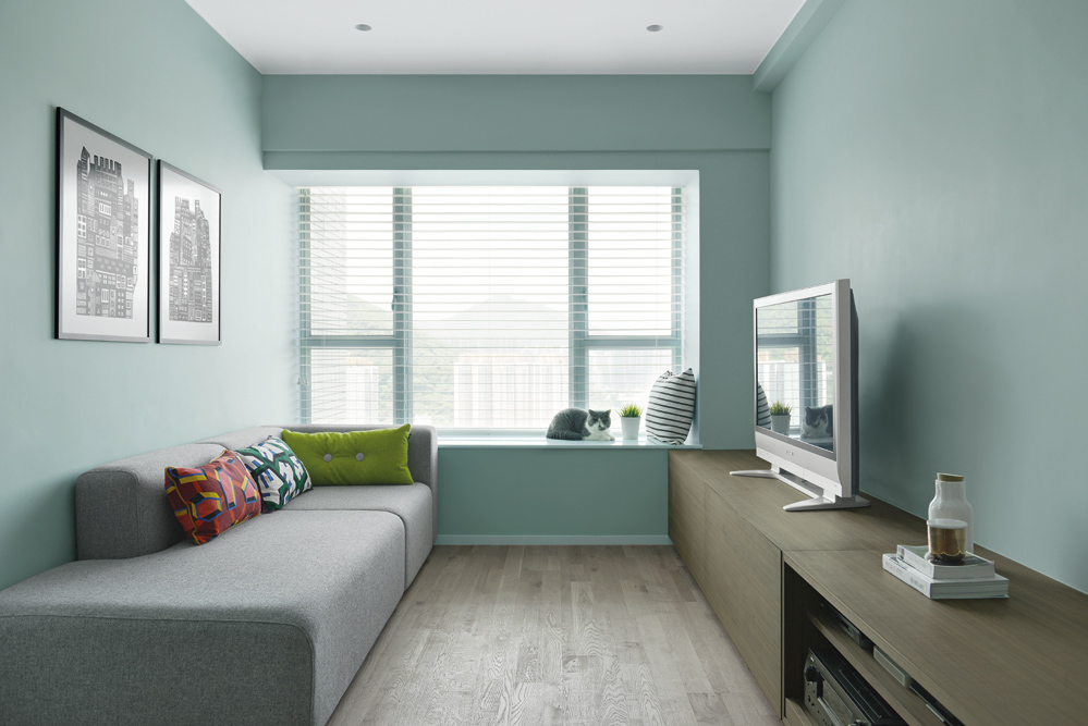
One of the couple's cats lounges by the windowsill adjacent to a grey sofa from Hay.
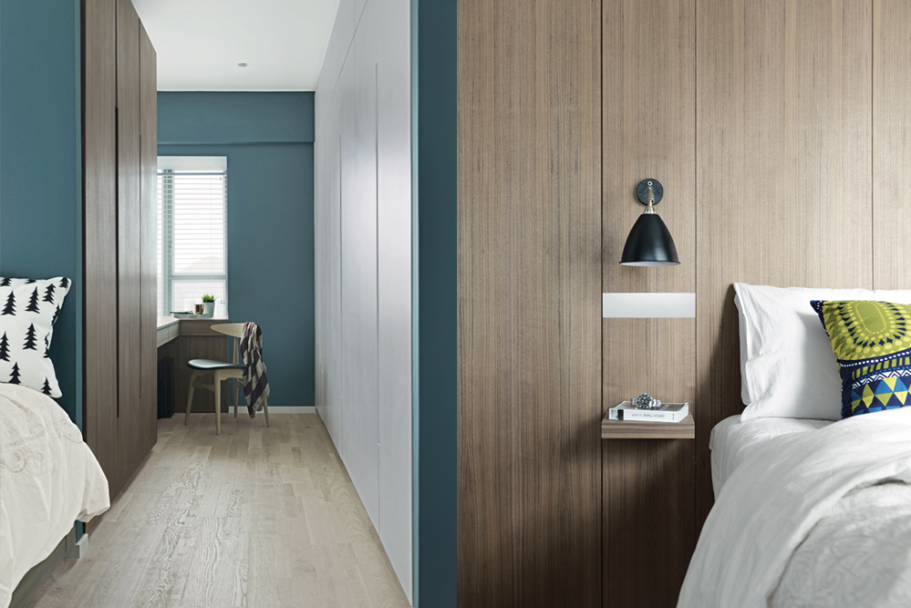
A feature wall in teal leads to a compact study tucked behind the en suite bedroom – it's a sunbathed nook that serves as a comfortable workspace for the owner. The bedroom's wood panelling creates a sense of warmth; the built-in nightstand and light is a clever space saver.

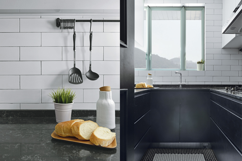
In the kitchen, metal rods keep cooking utensils organised yet within reach; the honeycomb tiles were arranged into a monochromatic floral motif.
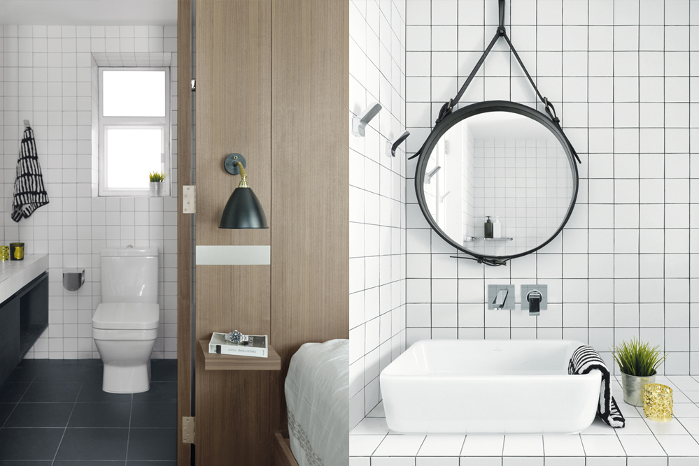
The monochromatic bathroom, clad in white ceramic tiles and black grouting, is a study in clean lines; the hanging mirror is from Gubi.


Photography: hoo Studio
Interior styling: YC Chen

Tags: InTheMagazinehooSmallHome
Load more

We use Cookie on our website
In order to provide you with the best possible experience, this website uses cookies. For more information, please refer to our Privacy Policy.

Yes, I understand