There is something to be said of odd spaces – of floor plans so unusual, any purpose for its use is unclear. One might be better off tearing the place down and rebuilding a nicer one in its wake.
Yet in the case of Apartment T111, a 550sqft home that, when outlined on paper, resembles an irregular dumb bell, Colombo and Serboli Architecture (CaSA) have demonstrated how unusual parameters have equal potential for chic results – possibly even more so.
On the top floor of a building in Barcelona’s hip and happening Sant Antoni neighbourhood, Apartment T111 had undergone demolition for its new occupant, a young Italian professional who wanted a home for herself that could also be host to gatherings. Clean lines, plenty of light, and a bathroom connected to a large bedroom (that would equally be accessible to guests) were additional requirements for the peculiar space, spread across a narrow, corridor-like volume connecting two irregular polygons.
It was an interesting challenge for architects Andrea Serboli and Matteo Colombo, who set out to make the space feel as spacious and cosy as possible. But rather than forcefully masking its irregularities, the duo opted to work with them instead – following the direction of the walls, reconfiguring parts of the room at an angle, enhancing their sense of breadth.
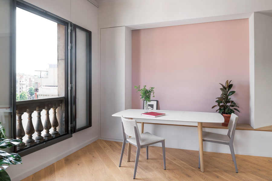
A pastel pink void demarcates the dining room, with its built-in bench that also doubles as storage, much of which has been incorporated throughout the home.
Take a step back and it’s almost as though the blueprint bore no oddity, that the apartment itself was designed to specification – the irregularities deliberate, the quirks, intended
In doing so, Andrea and Matteo may have figured out the apartment’s unique design essence – unlocking from it a minimalist, contemporary hideaway, airy with natural light and a seamless flow, from the resting quarters on one end to the convivial ‘day area’ on the other.
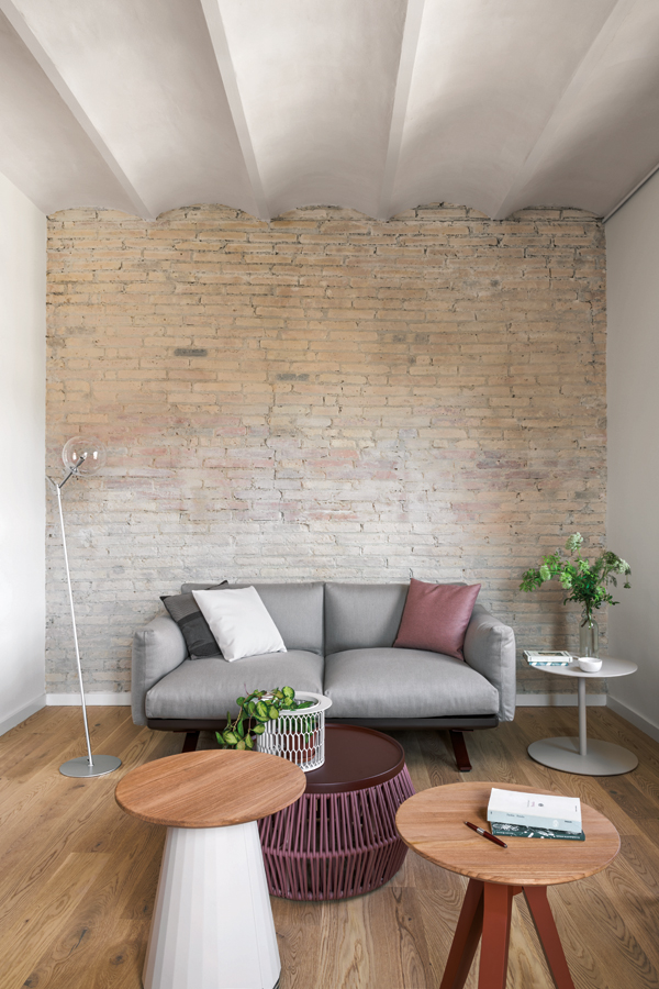
Neutral-coloured pieces by Kettal complement the open-plan room, including the Riva armchair with its tan leather and the grey Boma sofa.
With two balcony windows overlooking the street, the larger of the two polygonal volumes has been designated as the open-plan gathering space. On the farthest side, the building’s original brick wall – brushed over with white paint – marks the sitting area. A few feet away, a bench has been built into a void in the wall. Doubling as storage, it’s designed as seating for the dining space when paired with a large table.
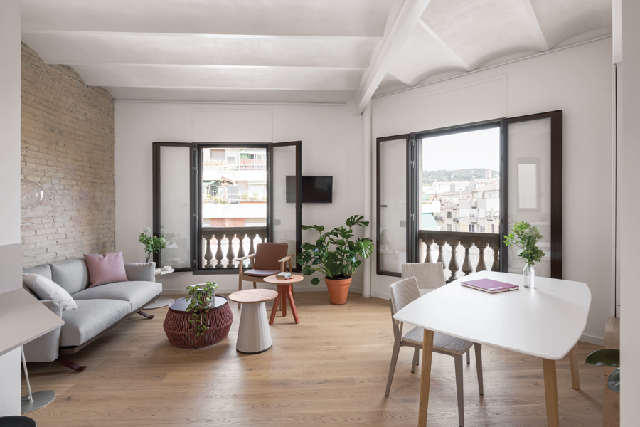
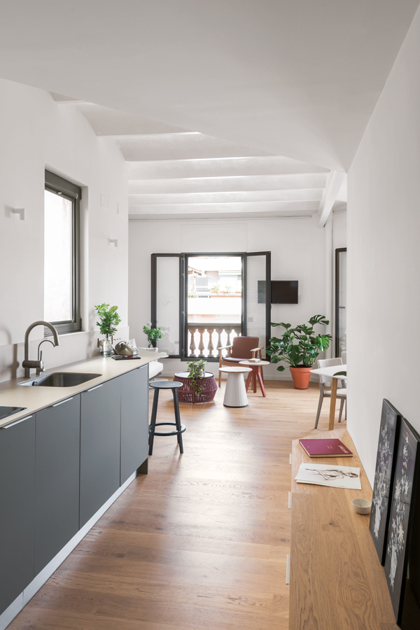
The bench continues past a corner – subtle evidence of the space’s proportions and angles – toward the corridor-kitchen, which occupies the linear body of the home. The porcelain countertop, its grey panelling concealing appliances such as the washing machine, dishwasher and fridge, stretches out to a specially-cut corner to accommodate the client’s wish for a breakfast nook.
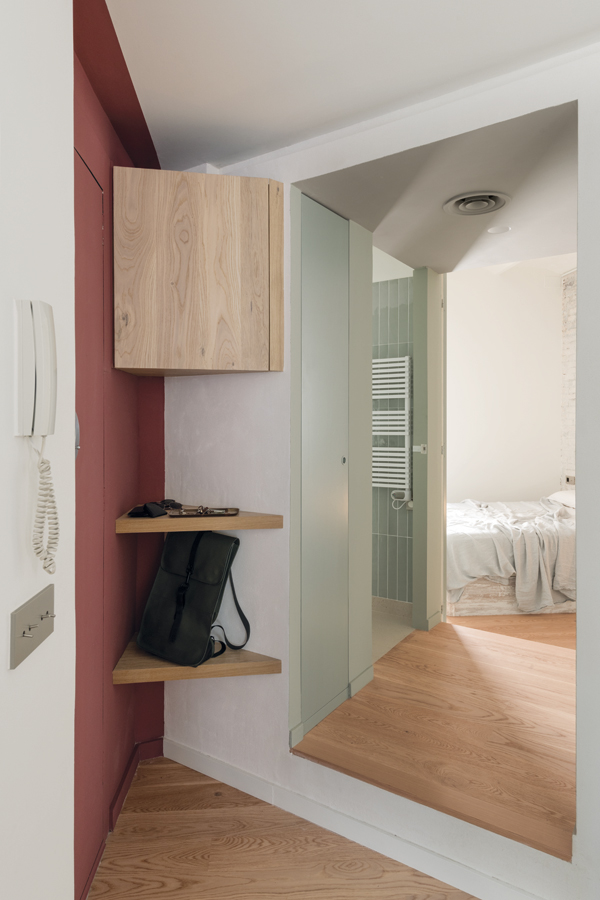
By the opposite end, the entrance area, painted burgundy, is thoughtfully outfitted with oak wood details: shelves to hold trinkets, a box to hide the electric metre. From here, the path to the bath and bedrooms extends once again at an angle, painted a pastel, sage green to demarcate the ‘night area’.
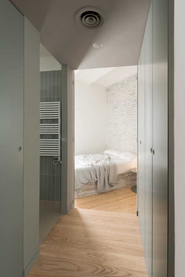
A calming sage motif permeates the bedroom and its hallway, lined with (more) wardrobe storage and access to the bathroom.
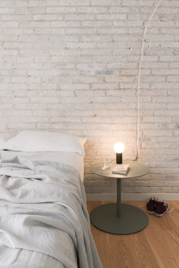
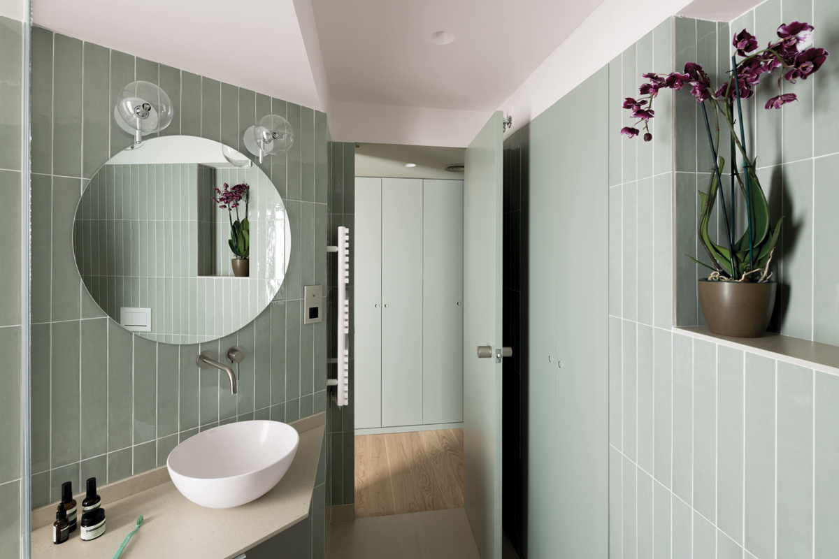
A built-in wardrobe lines the corridor toward the bedroom, a minimalist space marked by the same white-painted, exposed brick detail of the living room. Opposite the wardrobe, a door similar to the sage panelling leads to the bathroom, a spacious volume awash in natural light and vertical tiles that elongate all sense of height. Built-in seating in a palette of wood adds a touch of luxury to the shower, its glass divider filtering light out into the rest of the space.
Take a step back from this considered abode, and it’s almost as though the blueprint bore no oddity, that the apartment itself was designed to specification – the irregularities deliberate, the quirks, intended. If the owner threw a party, and guests stepped through the burgundy entrance, and no one batted an eye, perhaps it’s safe to say that the space, all things considered, isn’t all that odd after all.
