Yoga, minimalism, and entertaining. These three concepts formed the tenets of the creative brief provided by two sisters to Rowena Gonzales of Liquid Interiors, who had been enlisted to help transform their 977 sqft split-level apartment in The Morgan on Conduit Road.
Titled Minimal Yogi,” this project saw the apartment’s two bedrooms, two bathrooms and open-plan living space transformed into a hub that lends itself as well to meditation and relaxation as well as it does entertaining guests. To cater to the clients’ wellness and to ameliorate the allergens from their dog, the home was fitted with an in-built air purification system.
Circadian lighting systems using Philips Hue bulbs were installed in the bedrooms and bathrooms to change colour temperature throughout the day, thus facilitating alertness, digestion and sleep patterns, while blackout curtains shield the homeowners from light pollution. Elsewhere, water purification systems, formaldehyde-free woods, and low VOC paints and varnishes ensured that pollutants, both air- and waterborne, were kept to an absolute minimum.
It’s not about having less, it’s about making room for what matters.
The design mantra that guided the project
Design-wise, Rowena chose to keep the apartment minimal and restrained, with the predominantly light walls and surfaces are broken up with simple blocks of marble, artwork and gold and copper accents for a dash of warmth. Subdued lighting complements the wealth of natural light, while a flush of foliage above the kitchen island enlivens the living space while aiding in air purification.
See more: When a cafe design studio overhauls an oceanside apartment in Aberdeen
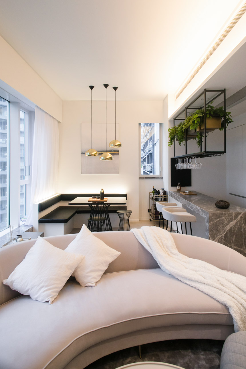
The open-plan space is zoned for different activities with the dining area at the back where a minimal and comfortable nook in the corner with bench seating has been created to enable more people to fit into the space. The angles of the bespoke dining and seating area are softened with the lighter touch of a curved sofa and light troughs create a feeling of natural daylight.”
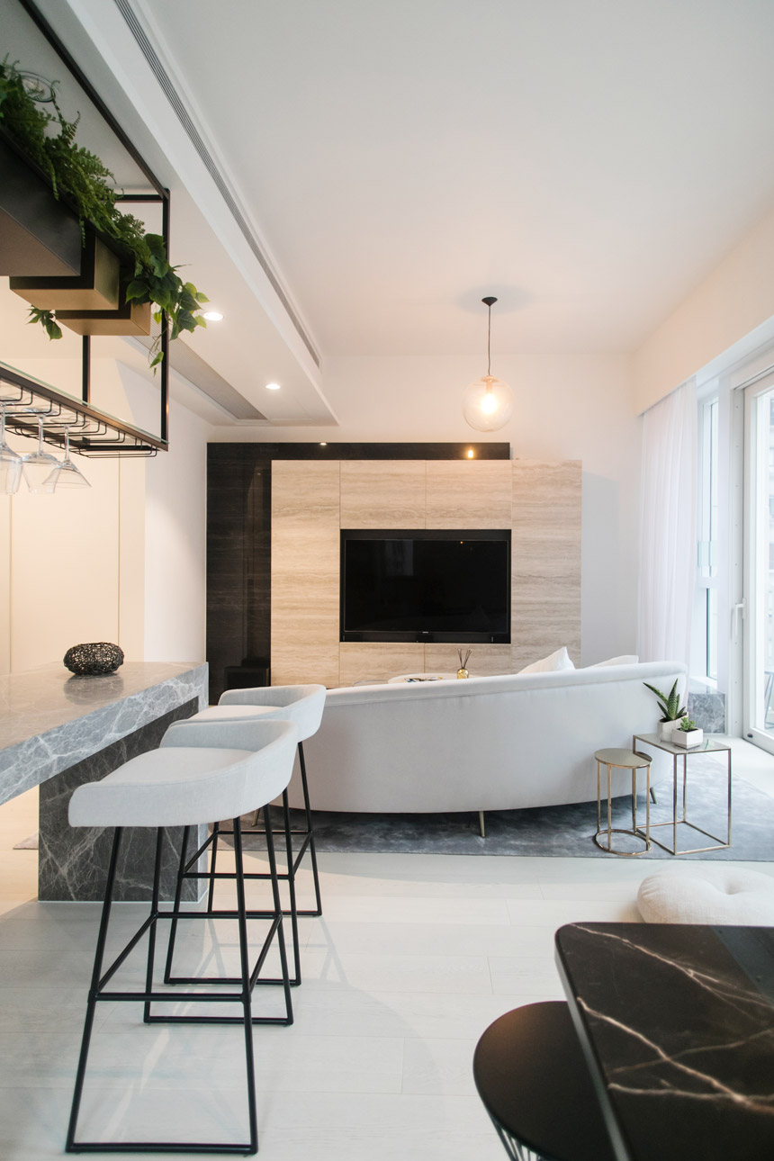
The plain and light materials and textures of the open plan area keep the space really light and airy. The same materials are used throughout, for instance the black marble of the dining table is mimicked on the TV feature unit to create continuity. Space in the middle has been left for meditation and exercise. This room is easy to transform from a social party scene to a space for calm exercise. The bespoke TV unit has been made from a stone tile used throughout the property and it conceals extensive storage, WiFi, TV and gaming systems”
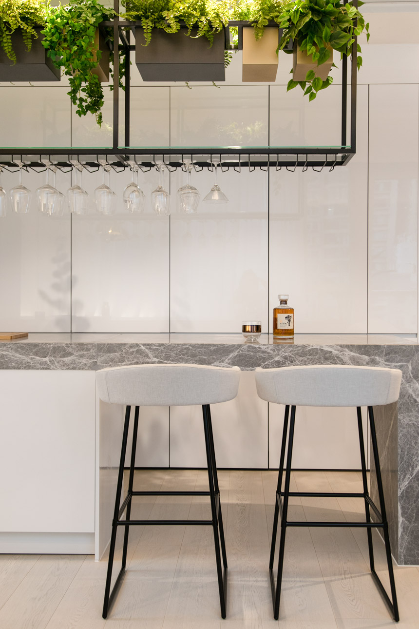
The minimalistic kitchen with a marble bar has a fun feel for entertaining with overhead glass storage, which is also brought to life with air-purifying plants. The greenery takes advantage of the high ceilings and being up high doesn’t take up any precious floor space. The kitchen is concealed within tall, bespoke cabinets and is equipped with a water filtration system.”
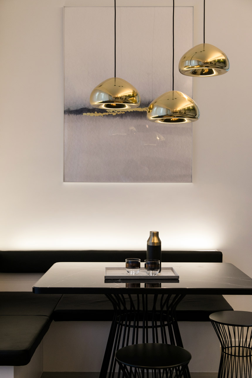
The dining area nook is lit from above with some dramatic metallic pendant lights and the strong black table is styled with a minimalist shaker and tray.”
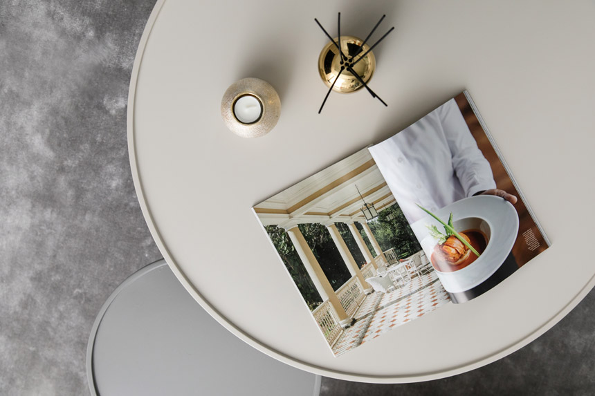
The coffee tables utilise two tones of metal, keeping the aesthetic very minimal. The carpet is made from bamboo silk, demonstrating how sustainable materials can be used in a luxurious way.
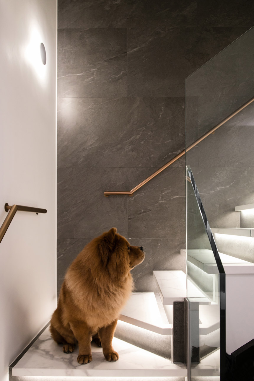
The dramatic lighting of the staircase from beneath the stair treads provides an otherworldly Zen experience, with the backlit circular concrete light resembling an eclipse. All the finishes of the staircase were redone and it was extended slightly beyond the glass; the darker tiled wall creates contrast and the slim handrail provides architectural detail.”
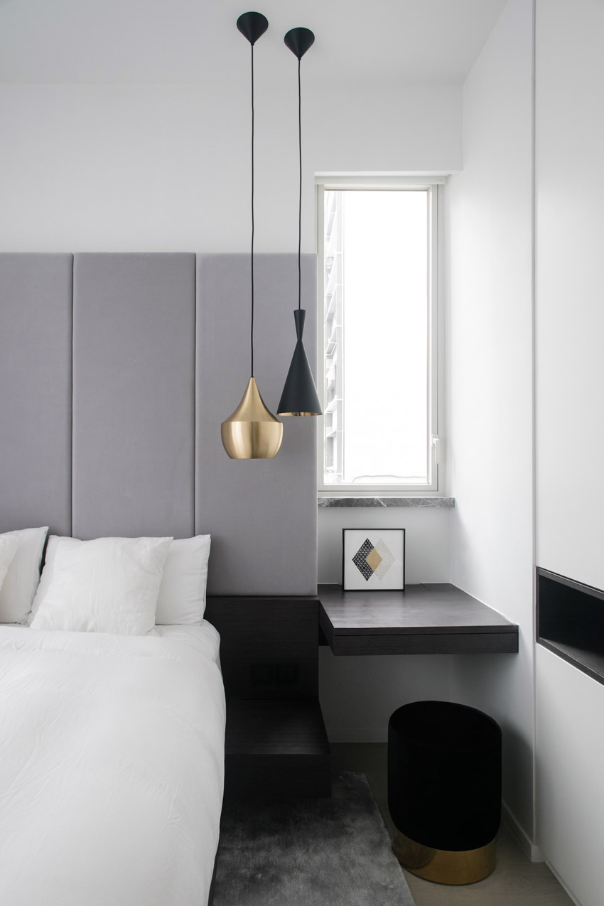
Designed for ultimate sleep quality, the bed has a large padded headboard that aids in absorbing sound. A mini workstation is serviced by office storage and printing equipment stored within the ceiling height cupboards. The cupboards aren’t particularly deep and the niche has been included to open up the space and stop it feeling too restrictive. Inside the wardrobe are open shelves, hanging space and drawers with plenty of full-height storage.”
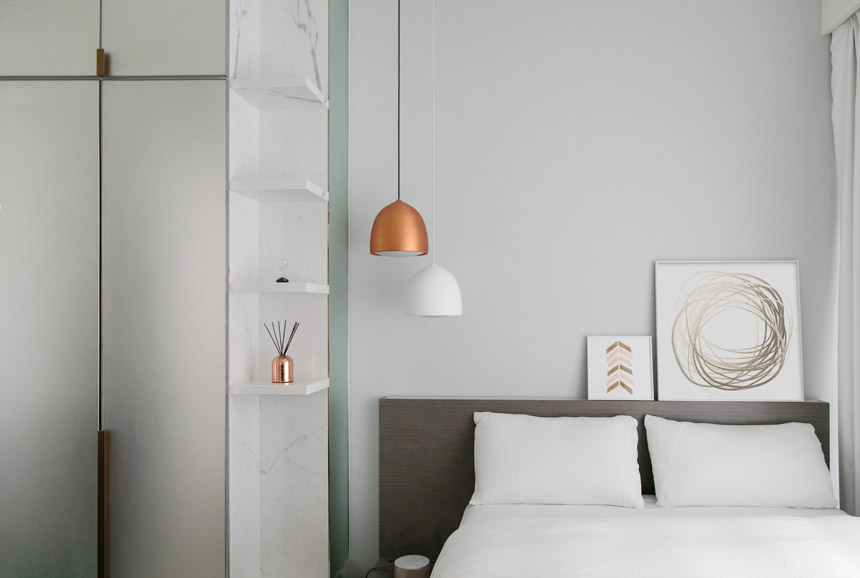
This bedroom was a darker space, so we used frosted glass on the wardrobes, to reflect the light around the room and give it an airy bright feel.”
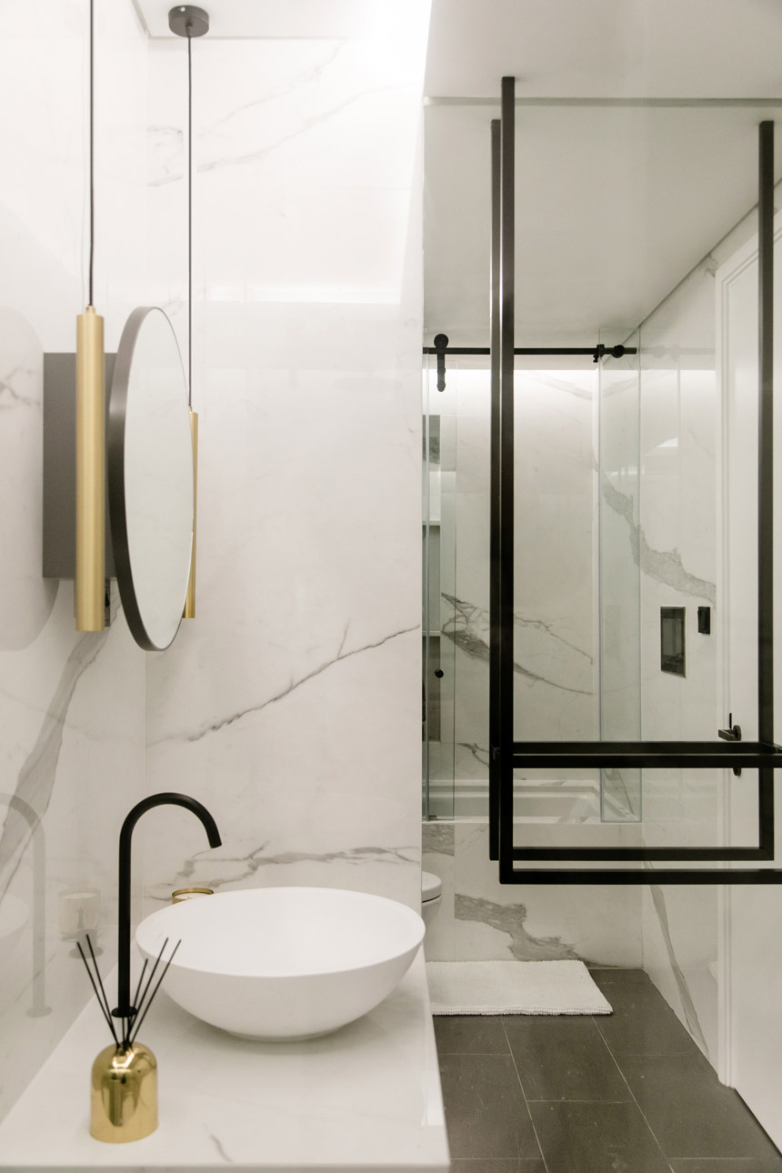
Pale, reflective materials and mirrors were used to create depth and expand the small space in this bathroom. The black metal towel rail creates a graphic detail and light troughs lend a feeling of natural daylight. The clean lines and curves of the bathroom design are complemented with slick matte black features such as the low-flow faucets and brass accessories.”
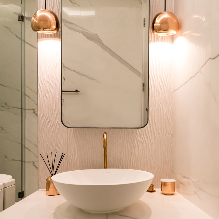
This bathroom is styled with copper highlights and a carved stone feature wall behind the mirror. A light trough gives feeling of natural daylight and low flow faucets reduce water consumption.”
Space-saving fixtures used
- The bed frame was fitted with hydraulic lifts to gain access to the space underneath the bedding for storage.
- Recessed open shelves were built into the staircase to hold books and treasured possessions that could be displayed.
- The hallway console doubles as a shoe cabinet.
- Folding doors were utilised to hide the kitchen sink area when not in use.
See how two brothers chose to decorate their bachelor pad together, and don’t miss the rest of our featured homes under the Interiors tag!
The post This Mid-Levels home is a high-tech wellness retreat for two sisters appeared first on Home Journal.


