Speaking of the 700-square-foot Happy Valley apartment he recently transformed into a chic yet masculine sanctuary, YC Chen, the founder and creative director of Hoo, explains: The overall style is a minimalistic industrial feel with a mid-century modern touch.
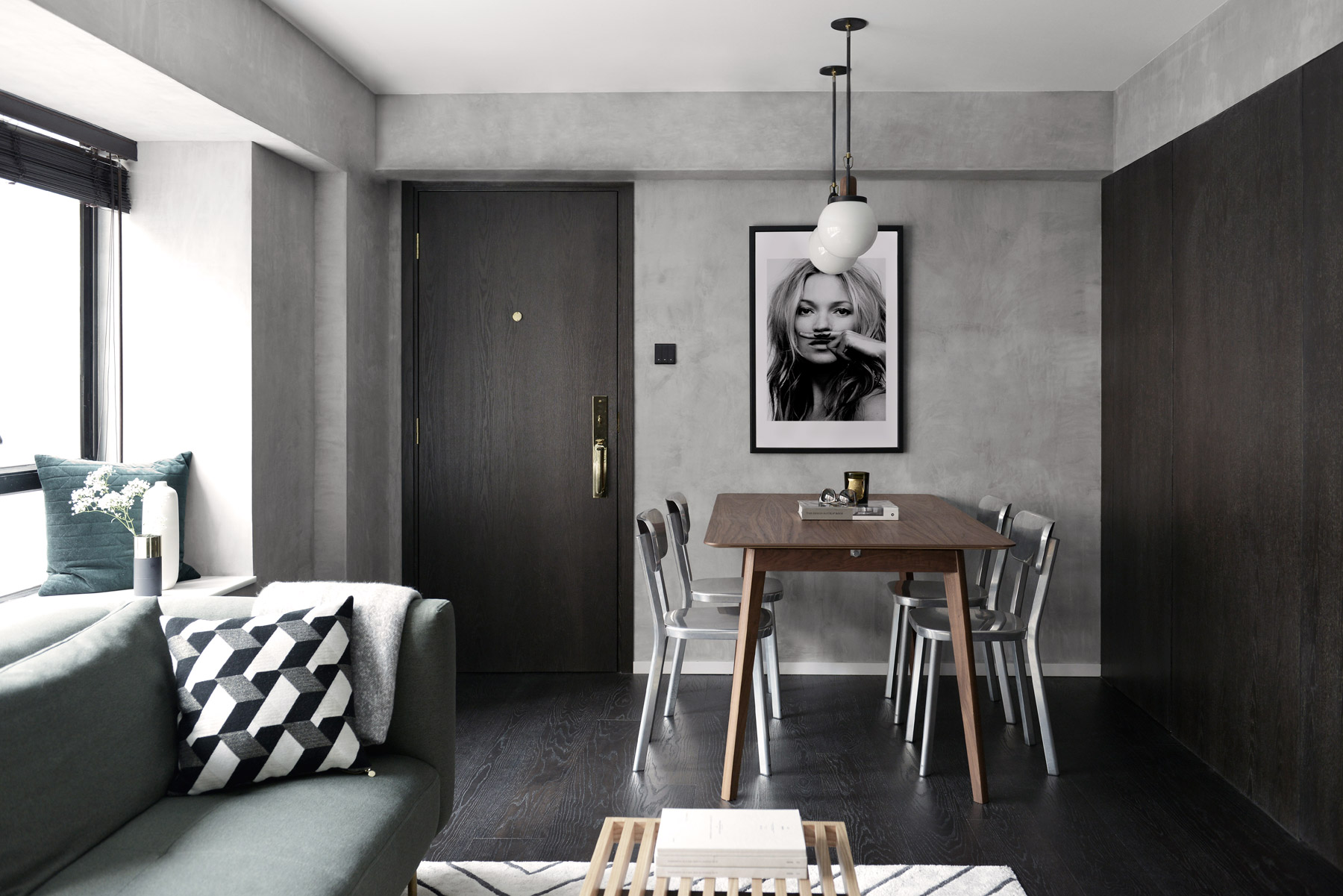
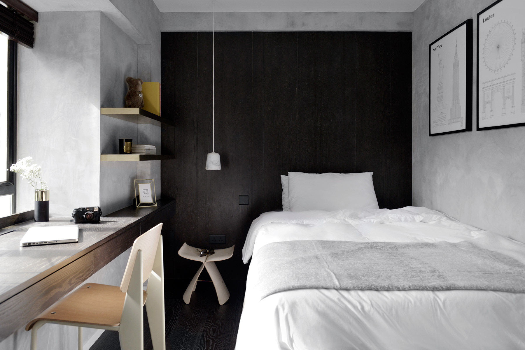
Characterised by pale grey walls with some gradation that deliver a raw, industrial feel, and with dark cabinets and floors marking a contrast, the flat features artistic black-and-white accessories and elements that complement the overall aesthetic, while the generous ambient light in the apartment ensures a fresh feeling throughout.
YC had his work cut out for him when he set about transforming the space from a three-bedroom to a two-bedroom. The apartment is home to two brothers, so he wanted to create two similar-sized, well-appointed bedrooms to suit the inhabitants and to maximise the space. Removing unnecessary walls, he also extended lines of sight through the door placement in the newly created rooms to help the space feel larger.
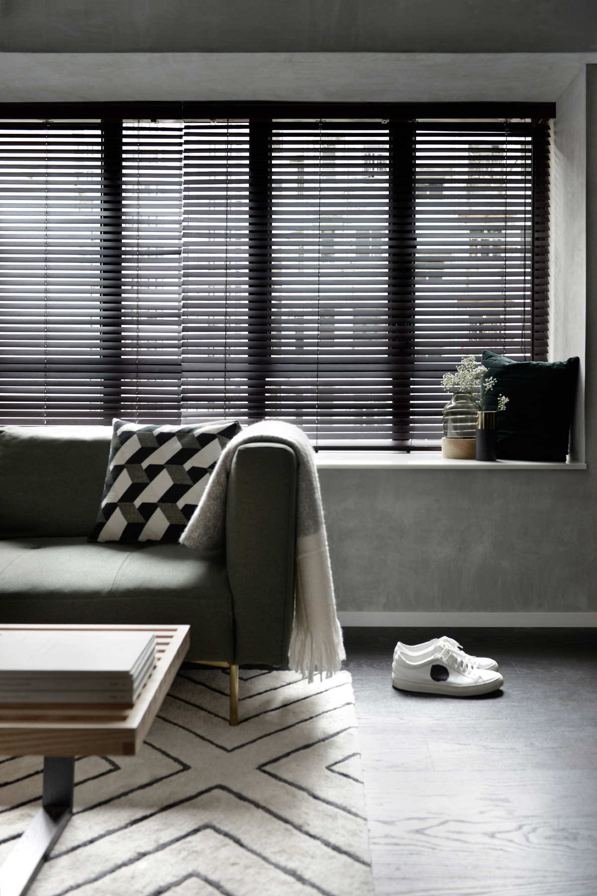
There were stylistic changes as well as structural ones. We wanted to keep everything very masculine, recalls the designer. We didn’t want to go with all-white walls because it would be boring, so we proposed using a cement and concrete wall paint all over to give a very consistent look. We also tried to keep the use of materials to a minimum, so you don’t see too many different ones throughout the apartment.
It’s very consistent because it’s a small space, so we keep the use of materials to a minimum to make it feel bigger and not so cluttered.
The design expertly combines dark flooring and panelling without making the space appear overly dark. These features are particularly prominent in the living area. The theme continues in both bedrooms, but these rooms are made brighter with the addition of white cabinets.
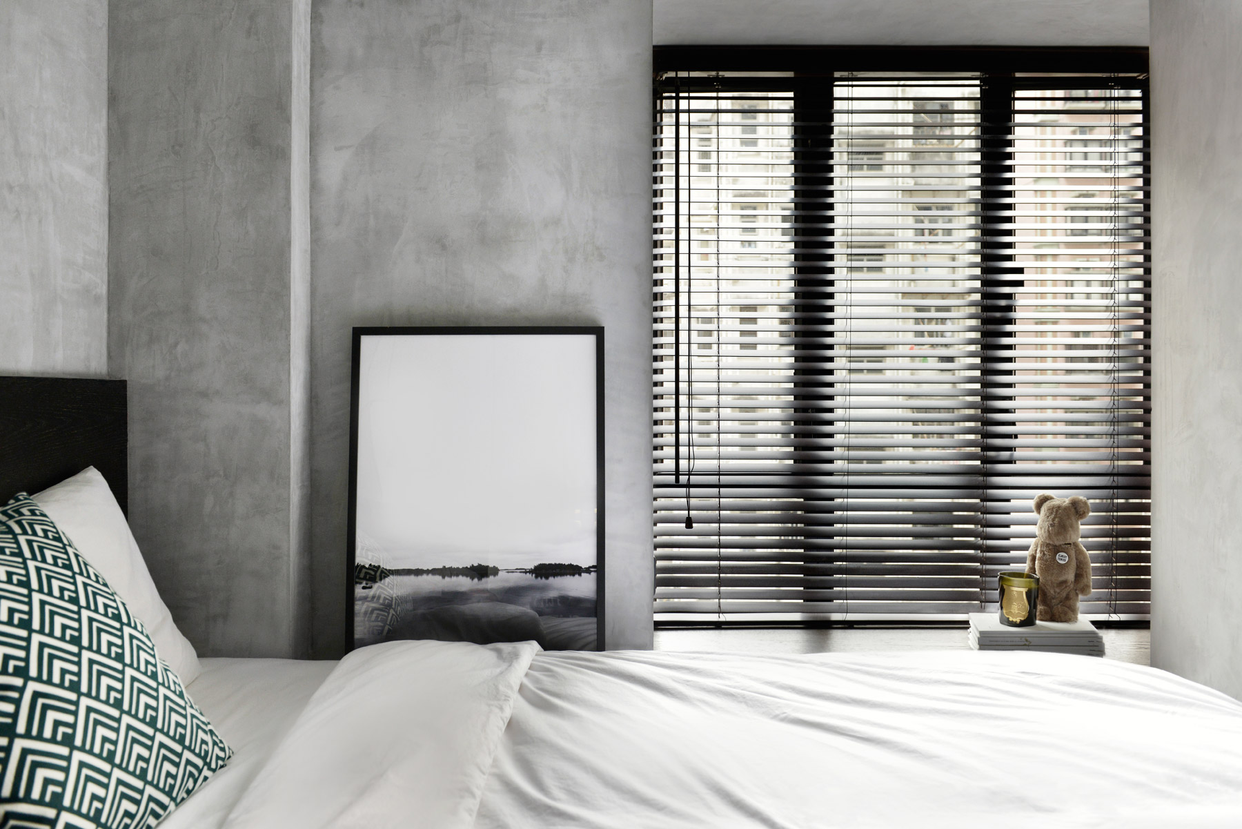
The colour palette is consistently minimal throughout; nevertheless, it was a challenge to achieve. For one, the flooring and cabinet panels were designed to match, but were sourced from different factories and therefore difficult to coordinate in terms of tone – but the desired result was eventually achieved. Sometimes when we do the design, different rooms have a different theme, says YC. But in this case, every space is the same. It’s very consistent because it’s a small space, so we keep the use of materials to a minimum to make it feel bigger and not so cluttered.
See more: A hidden Mid-Levels duplex cleverly combines indoors and outdoors
While the colours and materials are kept simple and consistent, interest is added in the form of the designer mid-century modern furnishings and lighting pieces that the designer has gathered, and of which he is particularly proud. You can see everything is well-matched, yet they were all sourced from different places, he says. This Happy Valley residence is a modern example of making the most of a space in a sophisticated, masculine manner – and with it, YC has crafted the man-pad of the moment.
For more inspiration, pick up a print or digital copy of our small homes-themed May issue, on newsstands now.
The post Two brothers reside together in this monochrome man cave in Happy Valley appeared first on Home Journal.


