Gough Street in Sheung Wan, well known for its hip, delicious eateries and bevy of fascinating homeware boutiques, has been Timothy Oulton’s base ever since the brand opened its first Hong Kong store in 2012. However, the Sheung Wan neighbourhood swiftly proved to be too restrictive a locale for Halo Creative & Design – the design and lifestyle firm that owns the brand. Our Gough Street offices were super-small,” shares Simon Laws, one of Timothy Oulton’s project designers. You had all these people across two different buildings, and nobody spoke to each other.” When the group decided to relocate, one of the criteria of the new location was that it would provide ample opportunities for its 250-plus employees to mingle and exchange ideas.
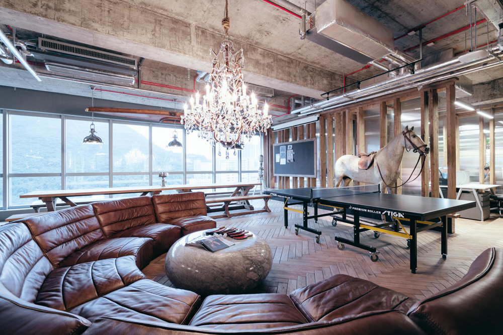
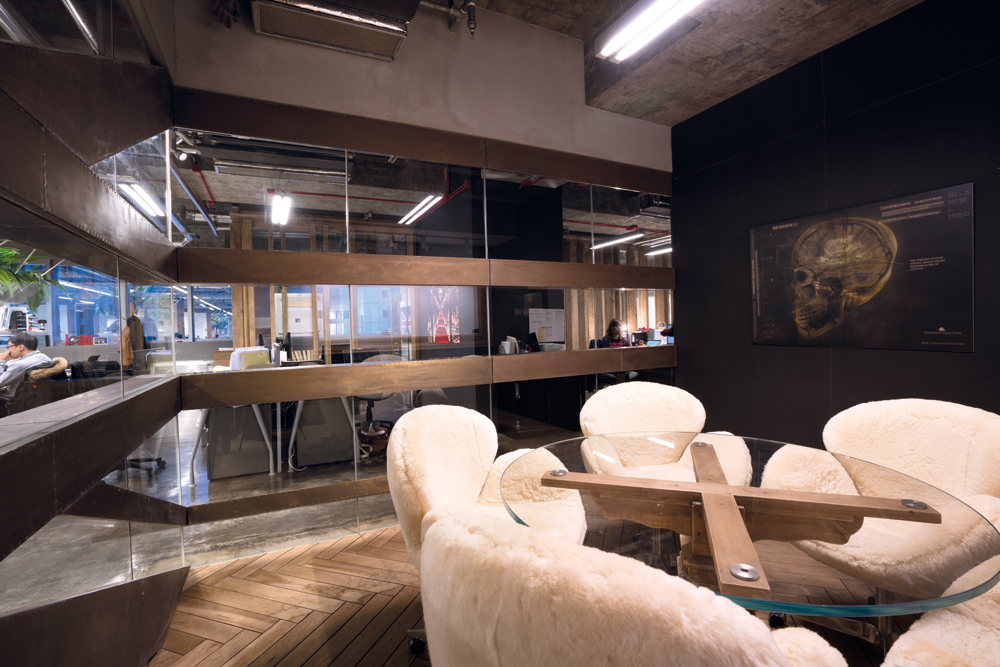
At the end of 2014, the firm made the move to a space in Wong Chuk Hang, the design of which was masterminded by Simon. The owner of the company is a pretty unconventional guy, so we wanted to have an office that didn’t feel like an office,” he explains. Most people think, as they come in, ‘Is this really the office?’ It feels more like a restaurant or a nightclub.” Upon entering, you walk through a long corridor, featuring walls done up in distressed leather and a traditional Roman-patterned floor. The Union Jack and the portrait of Queen Elizabeth emblazoned at the entrance (and inkjet-printed straight onto the leather wall) are quintessentially British and oh so Timothy Oulton – but so is the rest of the space’s design. All of the materials, furniture and special fittings were made in our own workshops,” Simon says. The leather was made by our leather workshop, and the tables and chairs are our standard products.”

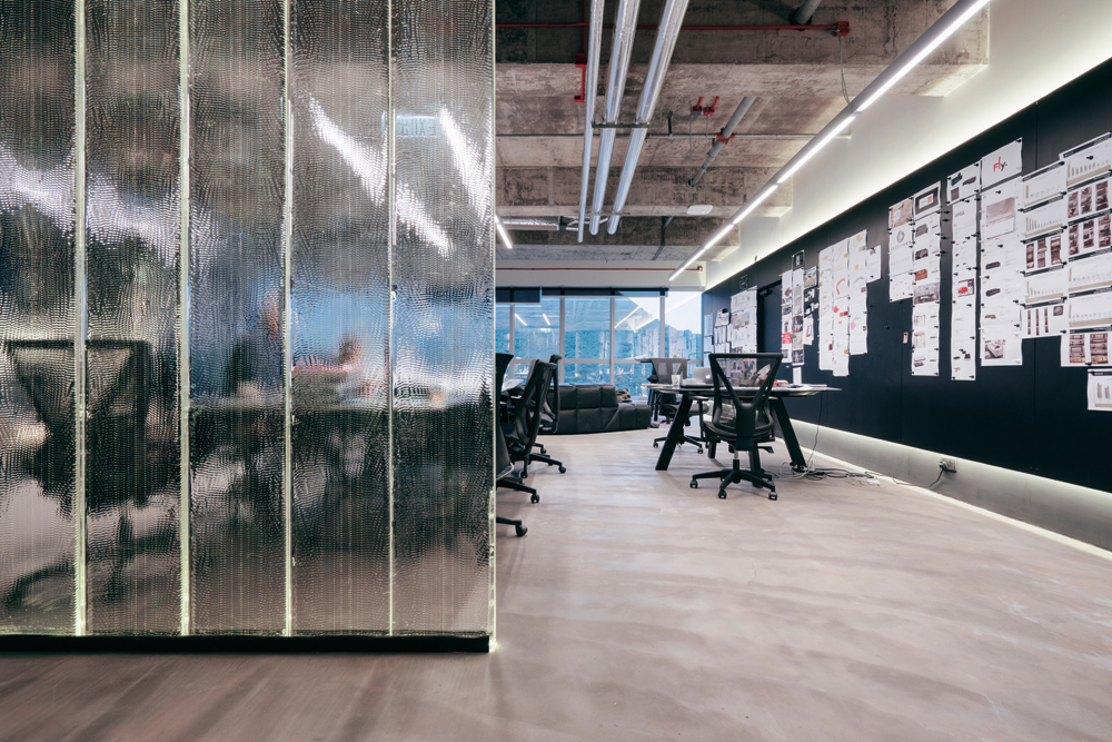
Whether Simon achieved the goal of encouraging more camaraderie among his colleagues is obvious. From the glass-walled meeting rooms to the open-plan layout, and to the ping-pong table and dining tables in the kitchen, everything about Halo’s offices invites bonding and discussion – exactly what a creative firm needs to keep the ideas flowing.

Q&A with Simon Laws
Can you highlight a project of yours that you consider particularly fascinating?
There’s a prefabricated house concept that we’re now selling internationally – a prefabricated dome house. The Dome Home’s interior is all made of reclaimed timber. One Dome Home fits into three containers, breaks down into 80 pieces and can ship anywhere. All the windows and doors are fitted, and you can disassemble it quite quickly. You can use them for whatever you like. The ones in Denmark are showrooms, the one in Ireland is a gym and the one in the Philippines is a restaurant. They’re completely flexible. It’s also got a very unique feeling inside because of the timber – very calm.
What are some of your upcoming projects?
We’re working on a club in Singapore, a restaurant in Hong Kong, a restaurant in Sweden, and some other restaurants in China as well as a showroom. We’ve got quite a lot on. Nearly all of these projects are our first of their kind. The Singapore club, 1880, is in the early days of planning now and should open in early 2017.
Do your clients typically ask you to do projects in the quintessential Timothy Oulton style? Our project styles are a mix. Our Singapore club project probably has more diverse elements than just the Timothy Oulton brand. We branch out from our core aesthetic, tailoring it to what the client needs. We did a hotel in the UK – a small boutique hotel called Glazebrook House Hotel – very much in our style. That brought a lot of interest, but it doesn’t necessarily mean that the jobs we get from have to be in that style.
The post My Space: Halo Creative & Design appeared first on Home Journal.


