Airports are easily some of the most impersonal places in modern urban life, given their natural inclination towards transience; and while airport lounges are supposed to relieve travellers of some of this sense of placelessness, many of them end up sapping the soul with tepid design rather than nourishing it.
Cathay Pacific has struck a different path with its lounges in past years, partnering with acclaimed interior designer Ilse Crawford to design spaces that focus on creating distinct, home-like interiors imbued with a mix of local flavour and the airline’s own roots in Hong Kong. This formula has won over many travellers, who often make their way to the airport much earlier than usual to partake in the exemplary food, tea bar, nap rooms, shower and spa treatments of Cathay’s The Pier lounge (voted The World’s Best First Class Airline Lounge in 2016).
See more: Design dialogue – Ilse Crawford on her creative process
Having established a new design language with Ilse, Cathay’s in-house design team applied it to their newest lounge, called The Deck, with further refinements based on user feedback to make it even more home-like. We spoke with lead designer Keith Tsui on the many thoughtful touches that make the whole, and keep on reading to the end for interior decoration tips that you can use to elevate your own home.
Layout
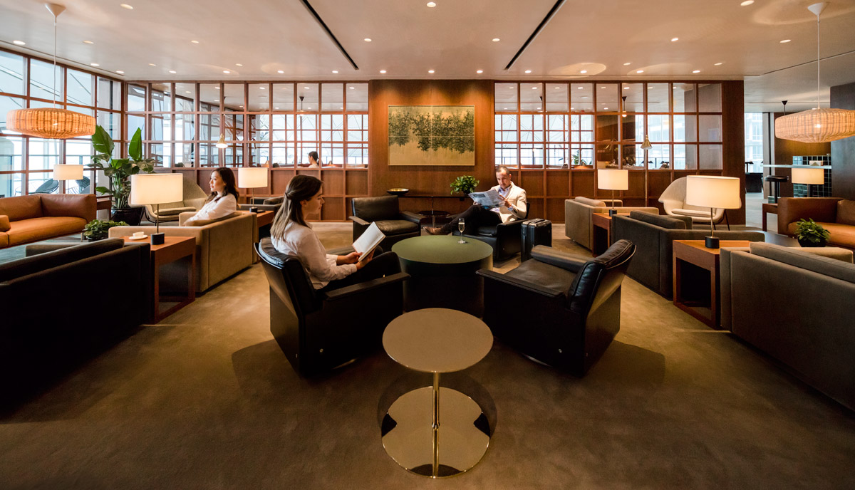
The design is based on Studioilse’s design concept for The Pier, which we helped develop. We understood the design concept very well after working on several lounges together. At the entrance, the first thing you used to see was the welcome desk where you would need to register before entering. Now, we have a zero-friction flow that allows smooth entry instead of a perpendicular design that you have to navigate around. We felt that the feeling of entering a lounge is very important for it to be welcoming, so we didn’t want the reception desk to be an obstacle.
Materials
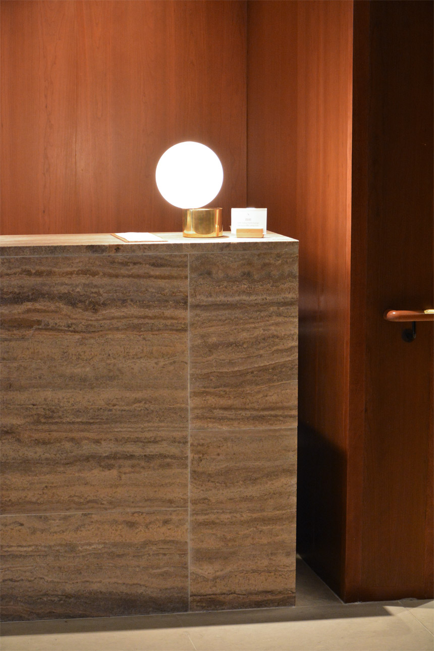
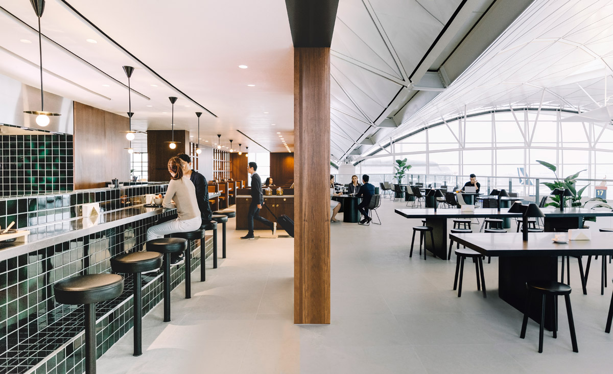
We used a lot of soft materials such as the limestone floor. When compared to other marbles, limestone is a very soft rock, which requires a little more maintenance. It looks like a hard floor, but when you step on it, there’s a little bit of give. It’s a small thing, but for people who have highly attenuated senses it makes a big difference. Apart from the main corridor, we’ll use even softer materials such as carpet for the sitting areas.
In this business-class lounge, we used cherry wood, while we used walnut in first-class to differentiate between the [passenger] classes. On the terrace, the columns aren’t actually solid wood – it’s a honeycomb panel with a timber surface laminate, due to fire safety restrictions.
Furniture
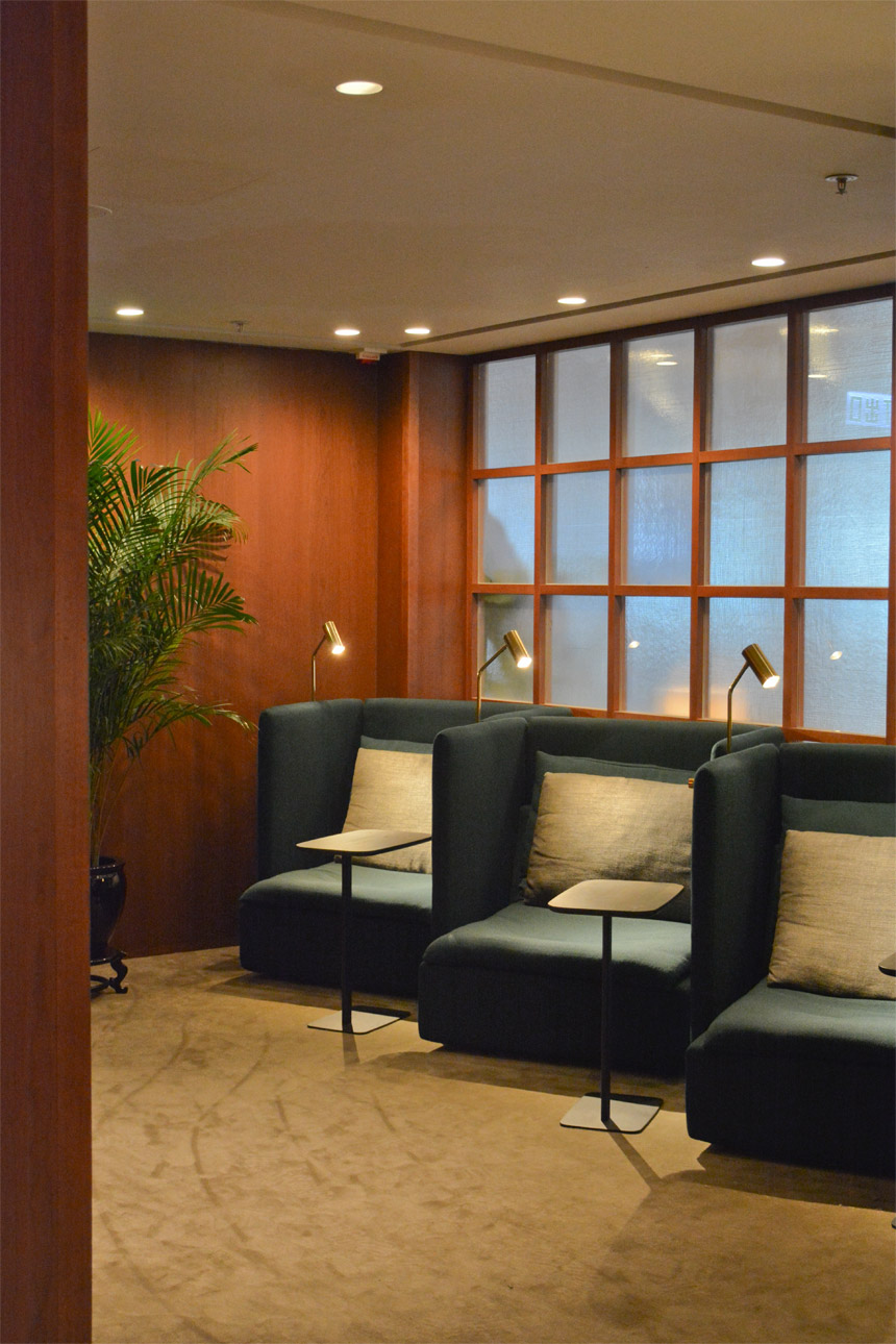
Vitsoe‘s 620 Chair is quite a well-known design but we used a custom upholstered version for this lounge. In our research, it’s been our most popular seat. In the middle area, the Drum Table was created in a collaboration with Studioilse and is a proprietary design that you can’t buy off the shelf.
Inside the Relaxation lounge is our signature Solo chair, co-designed by Studioilse and E15, which carves out a separate space for individuals. When you sit down, you’ll feel that it’s the most private part of the lounge. It’s the equivalent of the bedroom of a home.
Zoning
I used different transparent glazings to separate the different zones. Because the lounge is already quite small, I didn’t want to use solid materials to further divide the space. We wanted to blend the inside and outside spaces. The feedback we’ve gotten from customers is that they love the outdoor section because it’s very open and comfortable, but privacy is also lower.
We tried to give customers the choice of different degrees of privacy. For example, the glazing panels [for the outer wall] are transparent, but for the relaxation lounge, the glazing is pressed glass to enhance privacy.
Noodle Bar
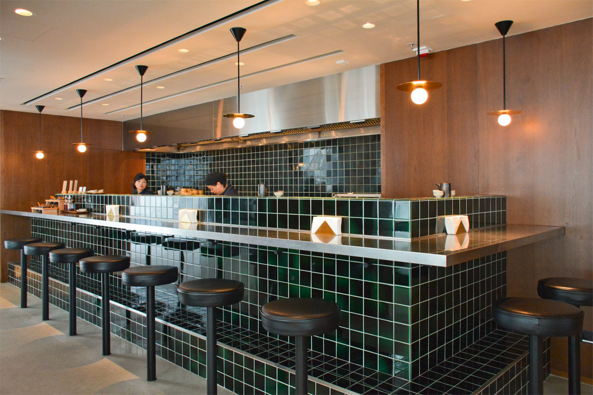
The noodle bar is a signature design – every lounge that we design going forward will have one. There’s a lot of café green tiles that we took a long time to choose, because we wanted an artisanal feel. The tiles are handmade in Europe so you’ll see slight variations in the colour and the finish – each tile is unique. It took us a very long time to find a manufacturer to make corner tiles – there’s a tile that folds on one edge, and a tile curved on two meeting edges. The space may seem quite minimal but it is actually filled with little details like these.
These [booth] seats are reminiscent of Hong Kong’s cha chaan teng restaurants. We took that feeling and further developed it along more premium materials to create a more comfortable space. We used real leather for the seating, and there are USB chargers under the table for people who want to work.
Tips to create a lounge-like home
-
Pay attention to the flow of your floorplan
Like The Deck’s zero friction” entrance, keep a central corridor clear throughout your apartment to preserve sight lines and natural light penetration for an easy, breezy atmosphere. -
Elevate through material selection
Use materials that impart a sense of refinement and timelessness – cherry wood for its warmth and tactility, limestone for a giving durability, bronze and brass for their warmth, and leather and mohair upholstered furniture for their tactility and hardwearing qualities. -
Delineate with soft” partitions
Rather than solid walls which completely block valuable views and natural light, consider using transparent or translucent partitions such as glazed or frosted glass paneling – or even a glass brick wall – to increase the appearance of light and space within a small interior. -
It’s all in the details
A minimalist home doesn’t need to be devoid of personality. Like the handcrafted tiles in the noodle bar, small touches can add an imperceptible yet meaningful layer to each room.
Don’t miss our pick of the world’s best airport lounges, and find more useful interior decoration guides under our Design section.
The post How to style your apartment like Cathay Pacific’s new The Deck airport lounge appeared first on Home Journal.


