Creating the interiors and products that we all regularly use throughout our daily lives, design studios are presented with a fascinating challenge when it comes to conceiving their own office space where all the magic happens.
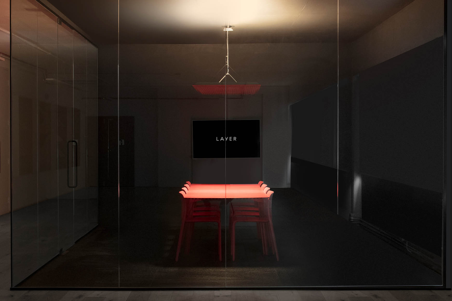
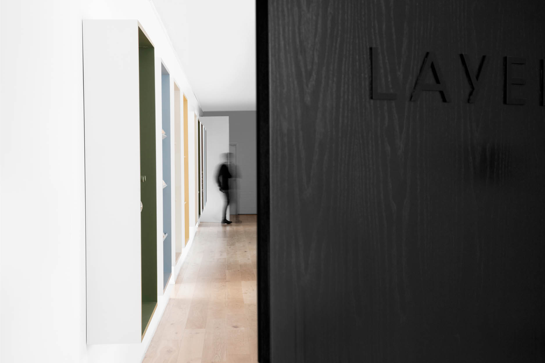
For British design agency Layer, an additional obstacle presented itself: coming up with a design that accurately reflects the versatile toolkit the company has to offer.
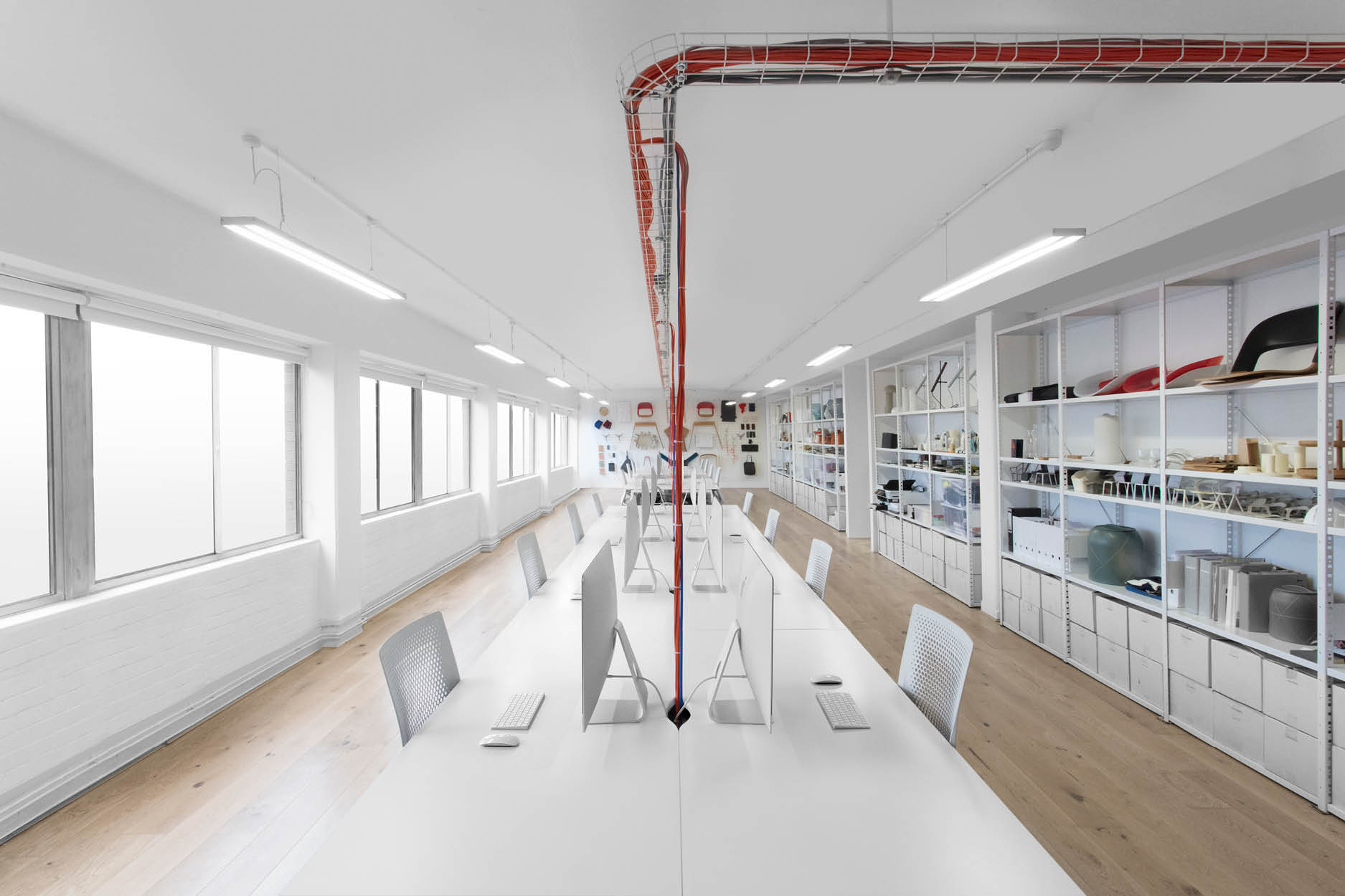
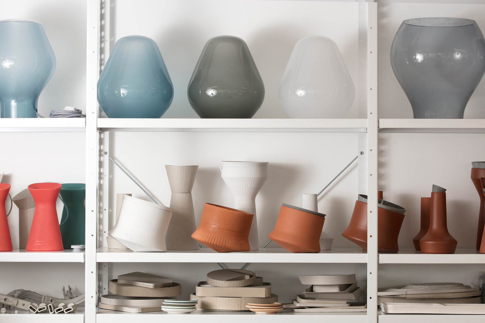
Benjamin Hubert – who was honoured as Designer of the Year at Design Shanghai 2017 – originally founded the company as a product design studio in 2010, but rebranded and expanded its range of services in 2015. Now, Layer offers everything from product and industrial design to electrical engineering – a fact that’s brought to the forefront thanks to the ample display shelves placed around the space.
These shelves showcase the various pieces Layer has created throughout the years, as well as samples, prototypes, and experiments. The agency’s award-winning GO wheelchair – the first 3D-printed wheelchair – takes pride of place at the centre of the office. Not only do the displays impress clients visiting the office and assert Layer’s identity as a company, they keep the team’s creative juices flowing.
In fact, the entire space absolutely oozes creativity, from its location (a 3,500sqft former warehouse in the artsy Hackney neighbourhood of East London) to its layout (an open office with plenty of breakout areas instead of cubicles). Step into the offices and one of the first areas you’ll encounter is a breakout space that can be rearranged thanks to room dividers according to the 20-person team’s needs.
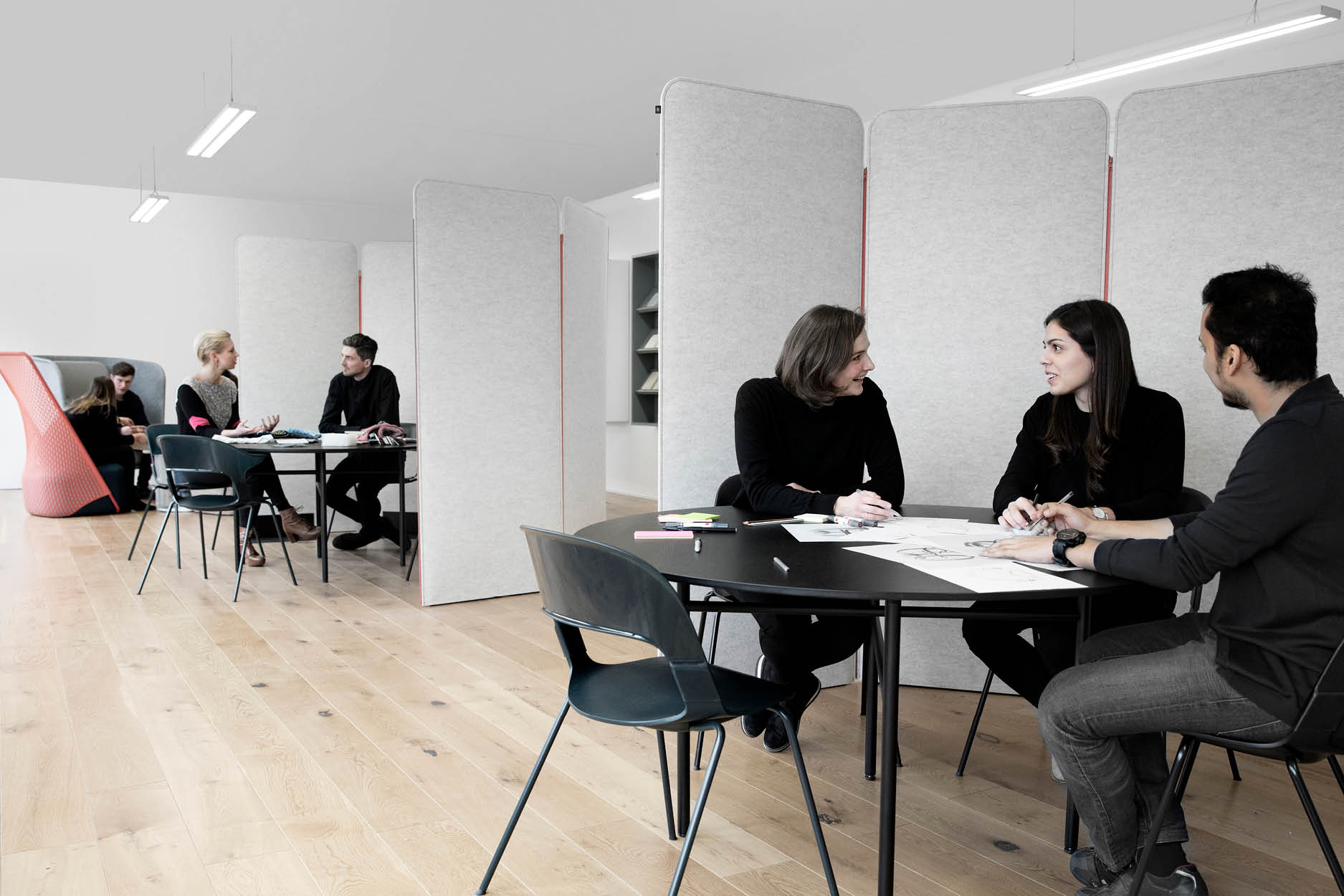
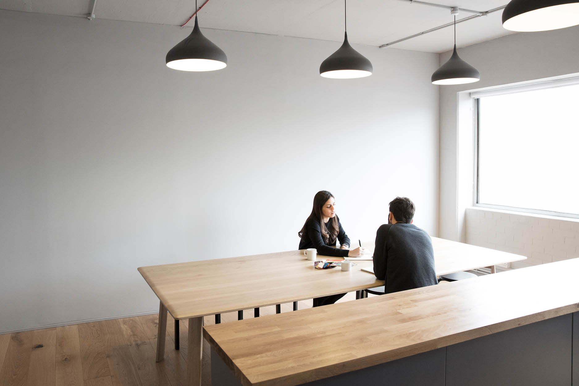
A separate kitchen and dining area – done up in a more casual, relaxing palette of oak and soft grey – provides a space for the team to socialise and have lunch together. Pops of eye-catching red effortlessly blend with more muted shades, adding interest against the office’s white walls.
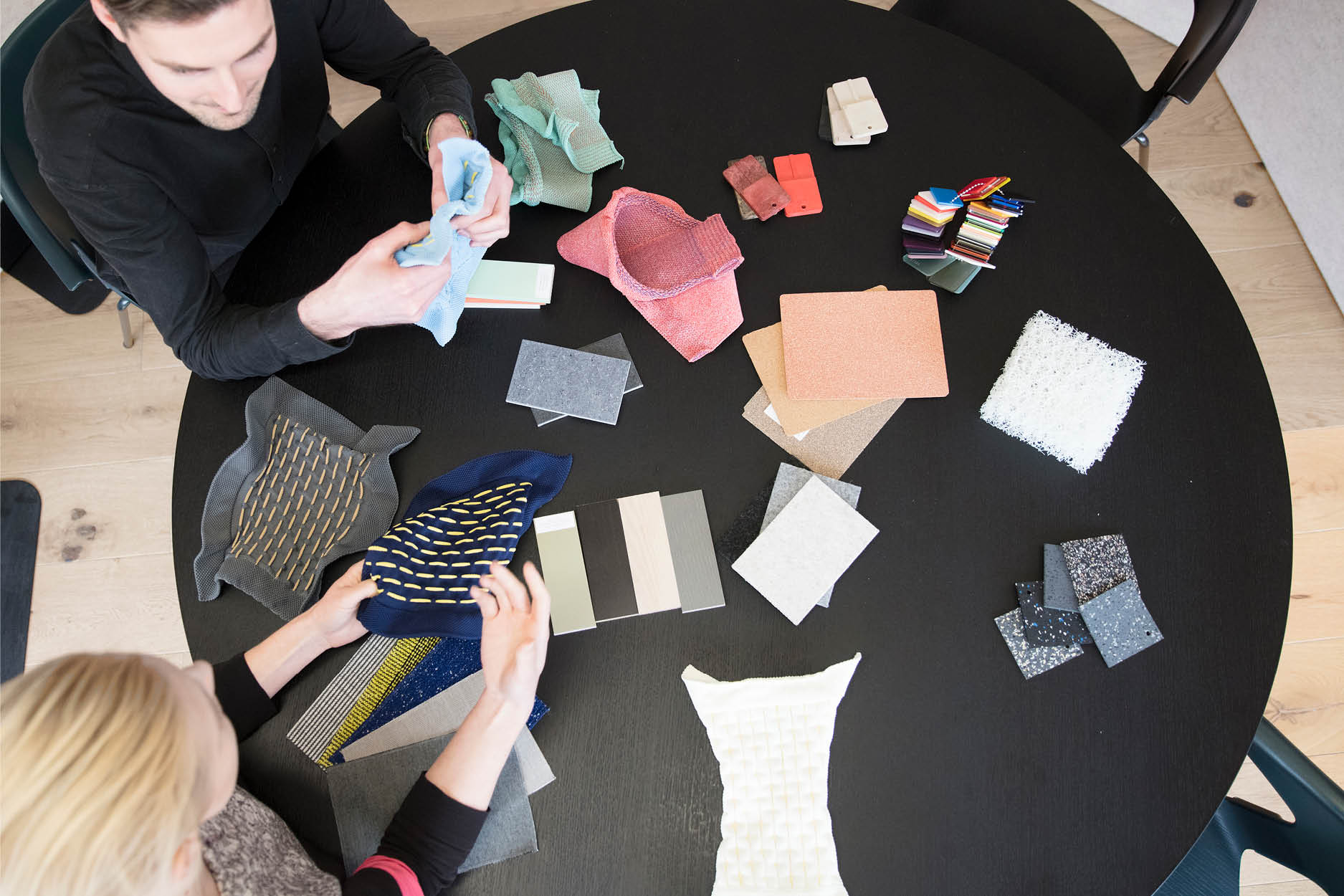
Most of the office furnishings are by Layer, too: the Pair chairs the agency created for Fritz Hansen, for instance, and the Spinning lights in the kitchen. The agency’s minimalist-industrial aesthetic is evident in more than just its products, however.
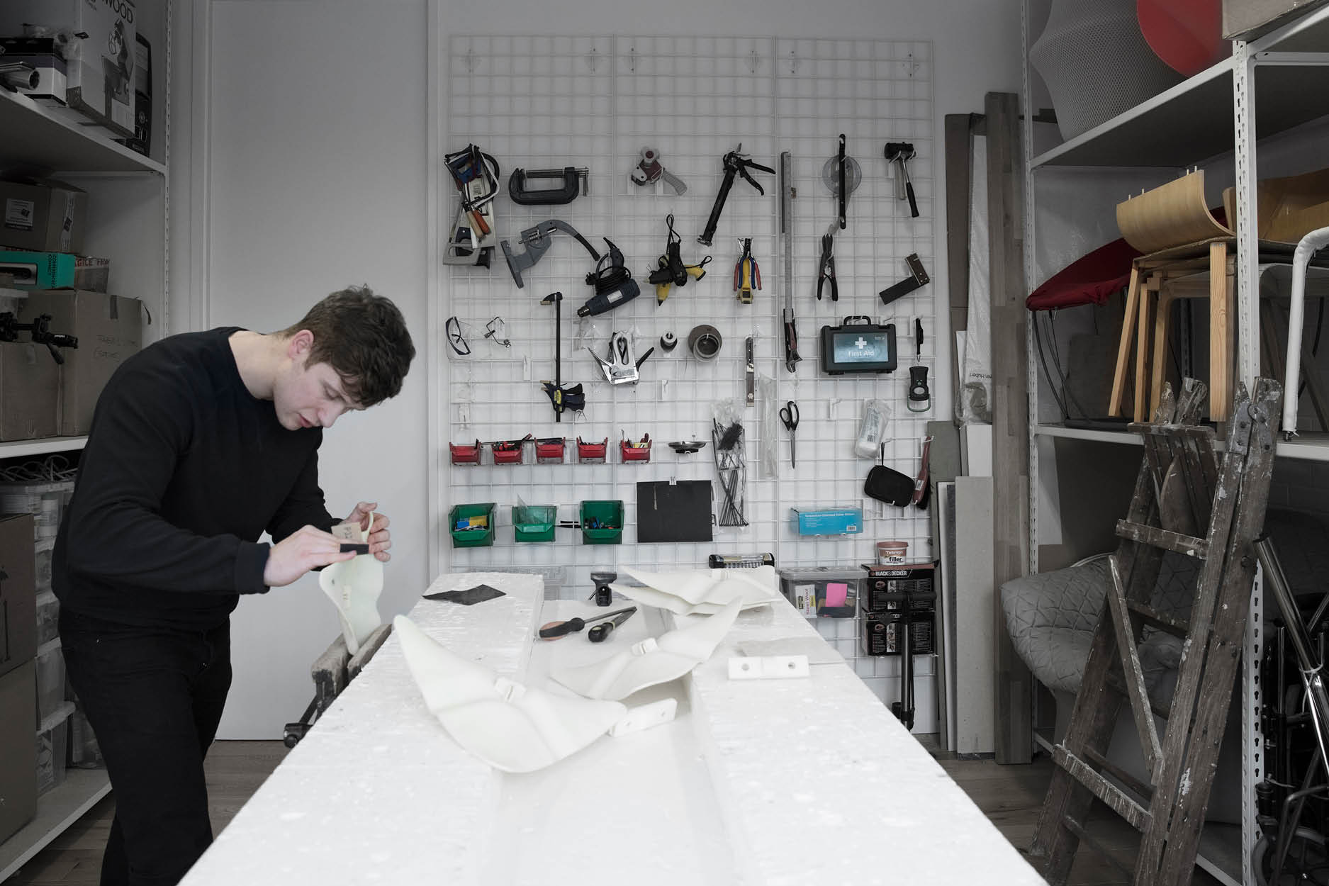
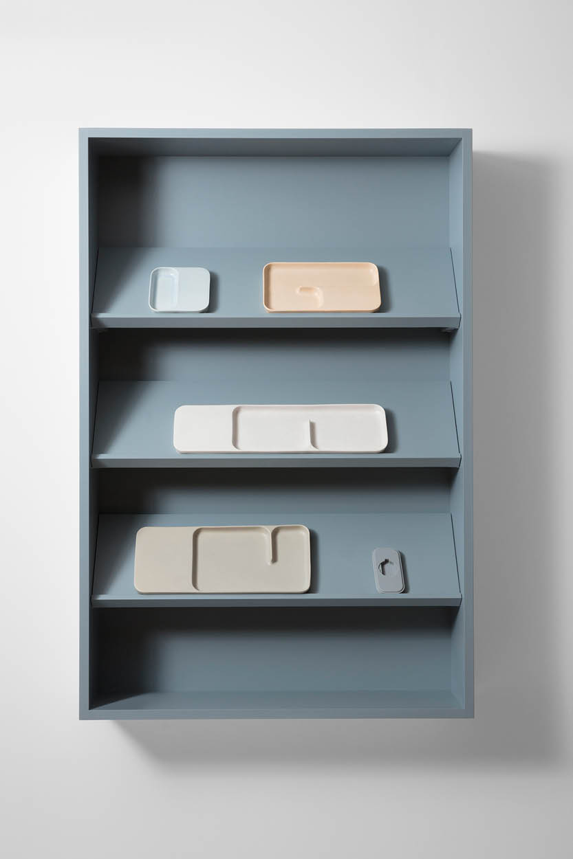
Visitors are greeted with a custom-made stained oak front door emblazoned with Layer signage, and walking through the space reveals exposed cabling that speaks to both the shell’s industrial past and the agency’s more technical work. A 50-year-old found workbench, which has been with the company since it was first founded, serves as desk space, and some of the displays are shown on converted shop fittings.
The end result is a space that both encourages creativity and keeps visitors to the space on their toes – an aesthetic that we’ll be sure to reference next time our own workspaces are due for a refresh.
A version of this story originally appeared in our June 2017 issue.
Editing: Nikey Cheng


