Western and Chinese calligraphy have traditionally been seen as completely disparate pursuits, but young calligraphers are increasingly blending these styles to create hybrid forms that are injecting cross-cultural creativity into the age-old art.
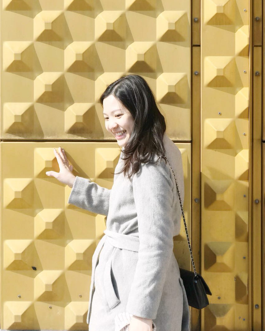
Among them, Hong Kong-based interior architect Rachel Ng shares her passion for details, design, and storytelling in Palette Scene, her calligraphy and branding concept.
An architect by training, Rachel is a specialist in luxury hospitality projects, having worked on the likes of The Venetian Macau and the Mandarin Oriental Guangzhou, and more recently, The Waldorf Astoria Kuwait and InterContinental Doha. On the side, her Palette Scene brand is slowly yet surely redefining calligraphy at the meeting point of East and West.
We chat with her to discover her interdisciplinary approach to interior design and calligraphy, as well as her inspiration. Rachel will also share ways to incorporate calligraphy into the interiors.
How did your interest in calligraphy develop?
When I was six, my mother enrolled me into traditional Chinese calligraphy classes. Little did I know that this activity, intended for fostering self-discipline and reflection, would one day become my passion project. During my teens, I switched to Western style calligraphy. Ever since, my practice, love, and fusion of both calligraphy schools have continued to expand, and to influence my work and aesthetic.
What are the main differences between Chinese and modern Western calligraphy?
One of the obvious differences between the two is the tool used. The Chinese calligraphy brush is made of animal hair, whereas Western calligraphy requires a nib pen. One of my favourite tools is the Japanese Zebra G nib, which is also suitable for beginners. Regarding style, the former is defined by distinctive, independent, and precise brush strokes, whereas the latter embodies a more flowing quality, since all the characters are linked together.
How did you start Palette Scene?
My love for design, details, and narrative led me to create Palette Scene. I have always gravitated towards the meticulous architectural aspects of interior design, and it is this attention to detail that is the cornerstone of my design and calligraphy. I was eager to combine my experience and skills in interior design with those in calligraphy. Palette Scene was thus created out of this interdisciplinary synthesis.
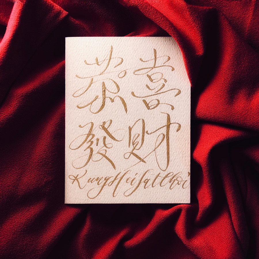
Tell us more about your signature style.
My aesthetic is the marriage of both Chinese and Western calligraphy. I write precise and intricate Chinese text using the Western technique of linking characters together. My Kung Hei Fat Choi composition illustrates this.
In your view, what is the connection between interior design and calligraphy?
Form is a key aspect in both disciplines. I am attracted to the nuances and subtleties of simple forms. For example, the slightest twist, turn, and curve in a door detail can make all the difference to the overall look of a space. The balancing of micro and macro facets of design is something I carry forth into my calligraphy. In calligraphy, the mere application of different weights on the nib when writing, as well as the direction of strokes and proportion, play an important role in the result.
Why is your brand called Palette Scene?
First, Palette is similar to the idea of an interior scheme. It can refer to the variety of materials in a designer’s material library; such as timber, textile, stone, metal, and glass, as well as a literal colour palette. Each scheme tells a story though the selection, combination, and interaction of diverse materials and colours, thus creating unique character and depth.
Secondly, Scene refers to the setting of a project. Whether it is a graphic, branding, or wedding project, my aim is that each client’s story is told through the individual lens of my calligraphy. My role is to create calligraphy that is bespoke to each special story setting.

A conceptual approach is to convert the form and silhouette of Chinese calligraphy characters into a pattern, for example. Panelling and screens are popular in both residential and hospitality projects, thanks to their versatility and aesthetic value. The dance of these diverse patterns create intricacy and interest on an otherwise plane surface, creating a decorative feature. Additionally, a more direct idea would be to make artwork out of calligraphy. Quotes, shapes, and objects can all be composed with the simple stroke of a pen. Better still, different artwork sizes bring choice and flexibility to an interior project.


