I have never met a more versatile colour than blue.


Everyone has their favourite blue – mine are the quiet ones; the lighter shades of blue that evoke a sense of tranquillity and serenity. The ones that are evocative of a dreamy mist always seem to have a calming, restorative effect on me. These are the spiritual colour tones, they will not anchor a space, but rather expand it into infinity.


The lighter blues with a lot of grey or crème in them are my favourites for the bedroom. They are peaceful, forgiving, and gentle and they help us transition between day lives and sleep. I also love surrounding myself with these colours when I am on holiday – these light blue friends inspire my mind beyond the restraints of my everyday life.


The mid-tone blues are the most versatile shades of blue as they are easy on the eyes and very compatible with a range of furnishing styles. They transcend trend.


The more greenish blues in the mid-tone world that are often associated with the Caribbean, change the most in response to light, a quality that creates more depth and interest. And these blues can swing! Equally comfortable in a contemporary or a classic interior.

The sky blues which are in a way between light and mid-tone, can be both uplifting and restful at the same time. A nice trait to have in an entertaining area of your home. The darker blues like indigo, ink and teal can be quite serious, moody, even dramatic. They somehow are able to convey both calm and turbulence simultaneously. They are best used when wanting to create an atmosphere.


Navy is crisp – especially when used with white or crème and creates a more traditional, dependable and secure feeling. For real drama, those inky blues will create the most mystery. Use them all over and do not contrast them with lighter shade accents. And dim the lights; this will create an ambience of mystery where anything can happen.


The bright blues, on the other hand, are extremely powerful. They can be energising despite being on the cool spectrum. Colours like cobalt will feel contemporary and bold and is a great colour for accents, especially against white. I like this colour when I want to make a statement that is bold yet not too bold. In a way, this blue seems to say, “I am here, so pay attention. But don’t worry, I won’t totally take over the room”.
Whatever blue you discover as yours, own it. It will its work magic on you.
***
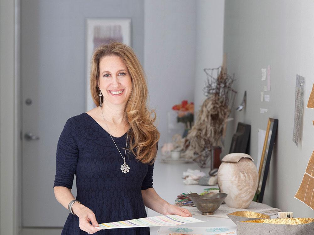
Lori Weitzner, principal and Creative Director of Lori Weitzner Design, is internationally best known for her contributions to the world of textiles, wallcoverings, rugs and passementerie. Her work is housed in the permanent collections of such museums as the Cooper-Hewitt in New York and The Victoria Albert in London and she is the recipient of more than thirty prestigious design awards. She has recently expanded into the fashion world with her first collection of textile infused jewelry and accessories under her own brand. She is the author of Ode to Color, The Ten Essential Palates for Living and Design, published by Harper Collins and lectures around the world on the effects of colour on our wellbeing. Follow Lori on Instagram and Pinterest, and take her color analysis test here.
See also: Living with Colour: Amazing Paper Flowers For Your Garden Party


