When TATE Dining Room and Bar moved from its original 26-seat digs on Elgin Street to its 3,800sqft location on Hollywood Road, it signified a pivotal point in acclaimed chef Vicky Lau’s career.
Having been awarded the coveted title of Asia’s Best Female Chef in 2015, with TATE earning a Michelin star in the same year, Lau accomplished what plenty of restaurateurs only dream of doing: owning a restaurant that’s a fixture in Central’s ever-changing landscape of bars, clubs, and F&B outlets. “Moving has been a huge experience in itself, but the timing of it all almost makes TATE 2.0 a brand new beginning,” says Vicky.
The move was a prime opportunity to grant TATE a design identity that showcased its newly achieved status without casting away its roots. With her background in graphic design, Vicky had a clear vision for what she wanted the new space to look like. She decided to sign on James JJ Acuna of boutique architecture studio JJA / Bespoke Architecture, who was introduced through a mutual friend.
“I was told that the chef was looking to open a second version of her restaurant, but this time with a separate shop just for her cakes,” recalls James, “which I thought was an interesting challenge.” The two-storey restaurant also includes a private dining room, chef’s table, and bar.
While James cast a helpful eye over Vicky’s design and oversaw its more spatial aspects, Vicky masterminded most of the project herself. Being so involved was not without its challenges – even visiting the site occasionally proved to be difficult, as Vicky was pregnant with her daughter Kory throughout most of the project.
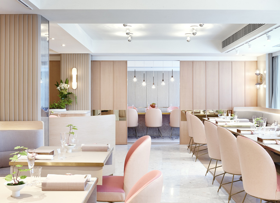
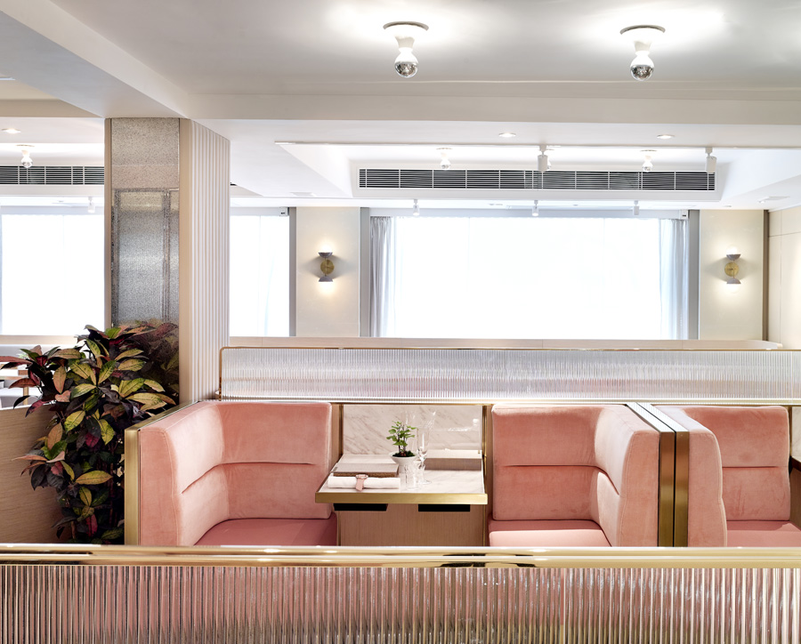
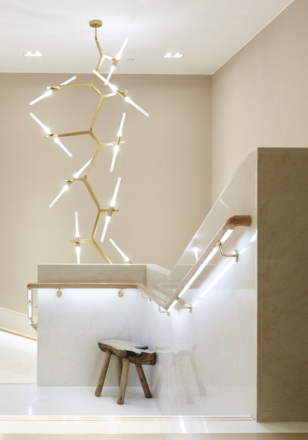
Vicky and James’s efforts eventually came to fruition, however, resulting in an airy space filled with light, natural bleached timber, soft pink pastels and metallic accents. The elegant, pared back space is the perfect setting for diners to enjoy Vicky’s similarly minimalist dishes – plenty of which are influenced by a stint Vicky took at three-Michelin-starred KITCHO in Kyoto in order to better familiarise herself with the art of kaiseki.
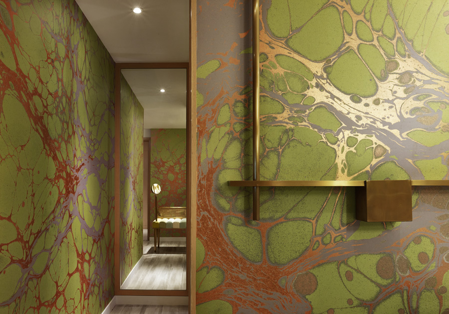
While the restaurant’s softness and sophistication is reminiscent of the original space, there are plenty of changes – colour scheme, service style, and a dedication to sustainability. The new space features more beige, pink, and natural colours, especially in the private and main dining areas.
“The final design was difficult, as we had to sieve through all these ideas we loved,” says Vicky. “In the end, we decided on what we felt our guests would enjoy most. We believe that this is the natural progression of where TATE would have eventually gone even if we had stayed on Elgin Street.” A new patisserie has since opened in the lobby, themed around old and new Hong Kong. Sounds like the icing on the cake for an already delectable destination.
Photography by James John Jettel


