First built in the 1960s for the purpose of housing government offices, The Murray has just reopened as a sleek new luxury hotel. Peter Woo, the man behind its epic transformation, tells us how he re-envisioned the iconic Hong Kong property.
1. From government offices to five-star suites
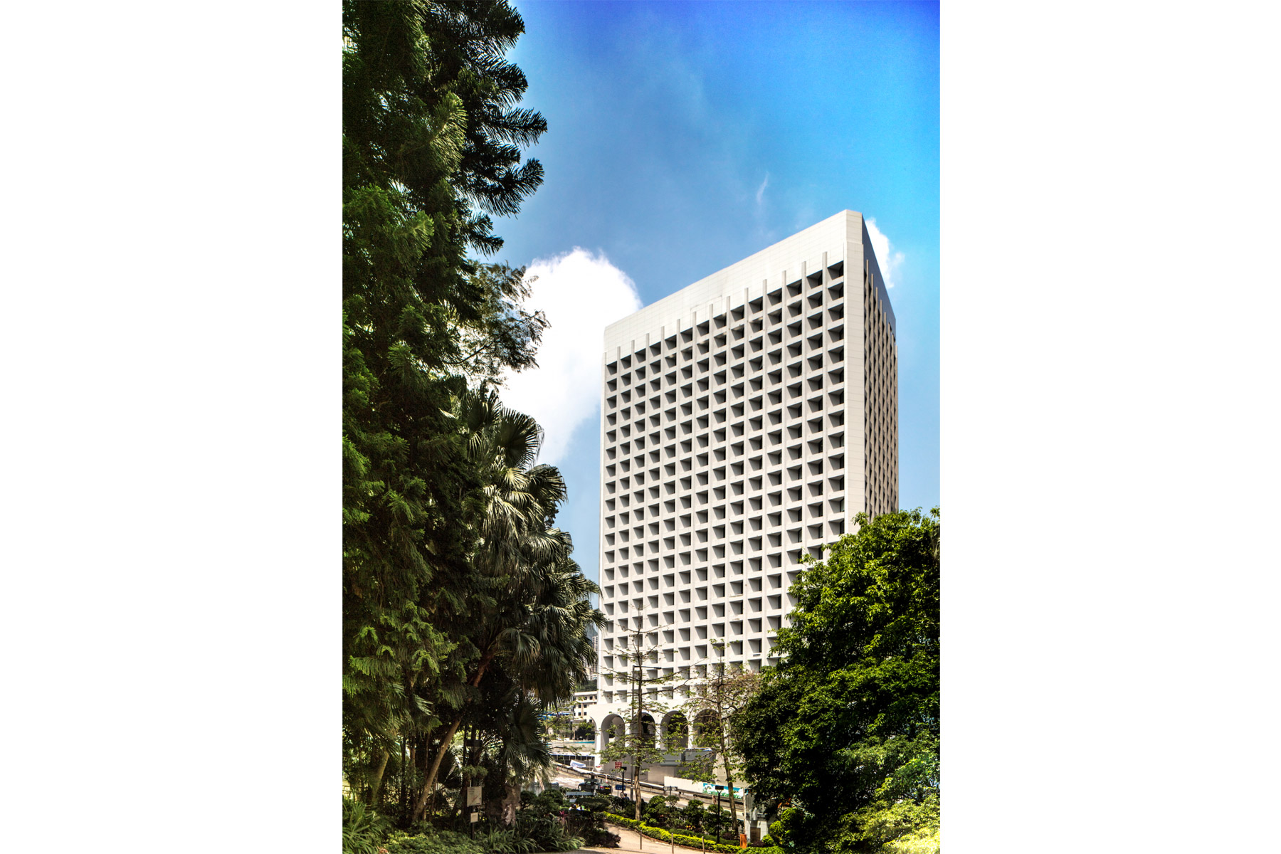
Built for the government in 1969 and named the Murray Building, the Murray has been one of the city’s most iconic edifices for almost 50 years, and a historic remnant of colonial-era Hong Kong. The site became an empty shell at the end of 2011, when its occupants decamped to the new government headquarters in Admiralty.
Two years later, Wharf Holdings—the real estate developer that Peter Woo was head of until 2015, when he handed the baton to his son Douglas—won the site at an auction for HK$4.4 billion. They injected another HK$3 billion redeveloping it into a 336-room hotel with all the bars, restaurants and amenities of a five-star establishment.
See more: Take a look at The Morgan’s Robert Cheng-designed penthouse
Woo and his team worked tirelessly on the venture with the Conserving Central Project, a government-backed initiative that works to preserve the heart of Hong Kong’s heritage.
I used to go past it as a young man and marvel at how majestic it was. To now be able to bring it back to life is an honour, says Woo of the property. The Murray, Hong Kong [the full name of the hotel] is our newest strategic long-term project and a dream come true for us.
2. Preserving a Hong Kong heritage landmark
Given its history we couldn’t touch—and wouldn’t—a number of things,” Peter says. The facade, the arches, a vehicle ramp leading to a covered car park. Even the tree in the forecourt of the main entrance: it’s one of the oldest of its kind in Hong Kong, an OVT [old and valuable tree], so of course we had to keep it.
Towering over Hong Kong Park, the Murray is an iconic modernist landmark. Its design, with distinctive ground-level arches and deeply recessed, angled windows that prevent the entry of direct sunlight and thus enhance temperature control, is an example of sustainable architecture way ahead of its time—and one of the reasons why the building was granted heritage status by the government.
Working around that during its redevelopment wasn’t an easy feat. How did they do it, you ask? Keep reading.
3. Collaborating with Foster + Partners, and the original architect
Woo hired architectural firm Foster + Partners, which has heritage experience and a strong connection with Hong Kong, to work on the redevelopment project. It was a natural match, says the tycoon of his decision. They have worked with many historic structures, so I knew they would understand our vision.
To that end, Wharf and Foster + Partners also decided to consult the building’s original architect, 90-year-old British modernist Ron Phillips, on the redevelopment. There was no better person to discuss the architectural integrity of the Murray with, Peter says, and I’m pleased to say he’s given his blessings to the changes we made.
4. Elegant, modern interiors
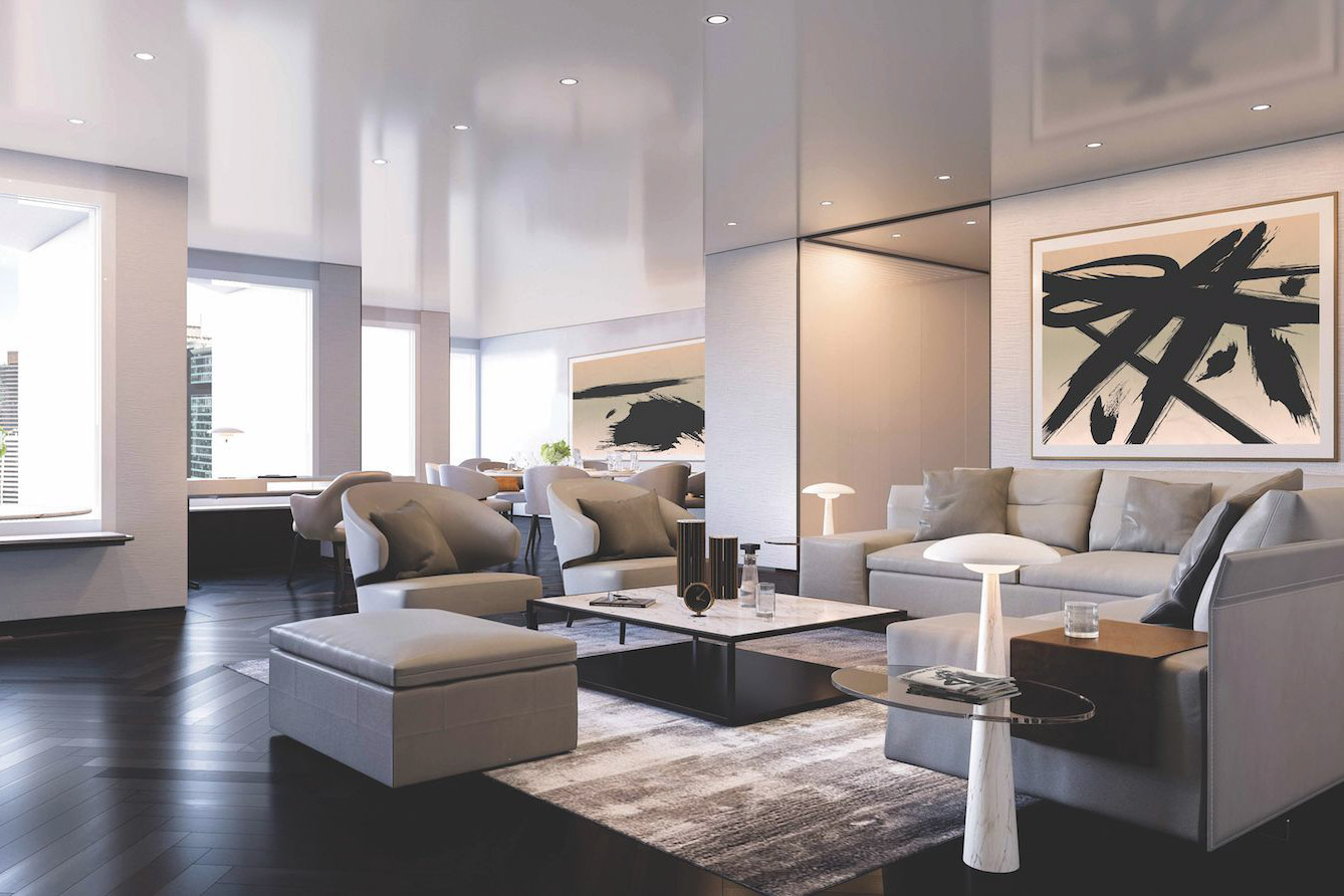
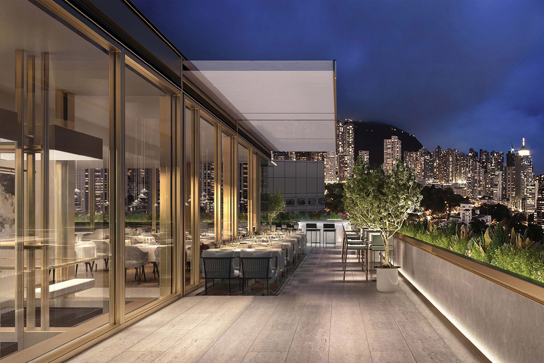
Also designed by Foster + Partners, The Murray, Hong Kong’s interiors are the epitome of sleek, contemporary design.
Floor-to-ceiling windows installed behind the arches open the hotel to guests and passers-by, bringing in natural light from the lobby and podium floors. Entrances have been added on all sides to provide easy access. Crystal glass screens rather than doors separate each space. On the roof, transparent glass pavilions house a restaurant and a bar overlooking the city.
It goes on: Rare stone, leather and plush textiles from around Asia and Italy decorate the public areas and guest rooms, while Carrara marble from Italy, neat wood panelling and polished metal surfaces serve as backdrops for different environments. The overall effect—modern, sleek, very urban chic—is uniquely Hong Kong.
We wanted to create a distinct sense of destination, Peter explains. A cohesive feel between the outside and inside of the hotel.
5. Artistic exteriors
For starters, the roofed car park was opened up to liberate the tree and create the forecourt, offering an elegant sense of arrival. All around this open space, on a circular upper deck, a series of accessible gardens have been dotted with contemporary sculptures, which are part of Wharf Holdings’ extensive art collection.
Woo intends for these to be updated regularly as part of or his plan to make the hotel a hub for art, fashion and cultural gatherings, with artists also invited to exhibit their work. A sinuous piece by Zaha Hadid is one of the first things visitors notice on arrival.
The revamp works well—the green is a soothing barrier secluding the hotel from the heavily trafficked street, and the art, updated ramp and those formidable arches add oomph to the environment. The exterior of the Murray is full of energy, while the interior, having been an office site, was quite drab, Woo says. Bringing that energy inside was pivotal.

6. Let there be light
Transforming the former office units into guest rooms was perhaps the hardest task,” Peter says, adding that the upper floors weren’t exactly a good fit for a five-star hotel.
Quite the contrary, he laughs. The angular bays of each room were quite unusual, and the light coming in was feeble. Finding a way to turn them into sizeable, sun-filled spaces took some time. We had to expand all the window frames into larger perfect squares to bring in more light while still maintaining the thermal level the building is known for and its angular frontage.
See more: 7 hottest hotel openings in Asia for 2018
The result is remarkable: minimal in its decor, all clean lines and modern fixtures, The Murray, Hong Kong’s 44-square-metre rooms have huge windows facing the green oasis of Hong Kong Park or the Central business district and, in the distance, Victoria Harbour. It was a bold undertaking, but the love and labour we put into it has paid off,” says Peter. And he’s right—go and see for yourself.
This post originally appeared on the website of our sister publication, Hong Kong Tatler.
The post 6 ways Peter Woo totally transformed The Murray appeared first on Home Journal.


